List of licensed fonts (A–E)
It has been requested that more images be uploaded for this article. Remove this notice only after the additional images have been added. Specifics: Illustrate all fonts listed
- Main article: List of fonts
This is a list of licensed typefaces and fonts (A–E) used in games and related media within the Super Mario franchise.
Aachen[edit]
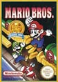
Aachen is a slab-serif typeface designed by Colin Brignall for Letraset, first released in 1969.[1] It is used for the logos in the following games:
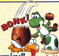
- Mario Bros. (European-exclusive Nintendo Classics re-release)
- Virtual Boy Wario Land (Japanese)
- Game & Watch Gallery (Australasian)
- Game & Watch Gallery 2 (Australasian)
- Game & Watch Gallery 3 (Australasian)
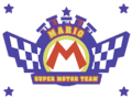
It is also used in Super Mario Odyssey on the Football Uniform, and in Mario Kart 8, Mario Kart Tour and Mario Kart 8 Deluxe on the logo of the 1-Up Fuel and Mario Super Motor Team businesses.
Mario Bros.

Game & Watch Gallery Australasian logo ("2")

Game & Watch Gallery 2 Australasian logo ("3")
Super Mario Odyssey

Mario Kart 8
Mario Kart 8


Ad Lib[edit]

Ad Lib is an uneven sans-serif typeface designed by Freeman Craw for the American Type Founders, first released in 1961. It is used for the interface in the following games:
- Luigi's Mansion: Dark Moon
- Luigi's Mansion 3
- Luigi's Mansion 2 HD
- Donkey Kong Bananza (Western and Russian languages and digits in the Japanese version)
It is also used for the text in English versions of the artworks for Helmet and Vermin from Game & Watch Gallery 2, and the balloon numbers in Cranky's Shop in Donkey Kong Country Returns and its 3DS and Switch ports, as well as the years in the copyright text for Donkey Kong Country: Tropical Freeze and its Switch port, and the Nintendo Sound Clock: Alarmo theme for Donkey Kong Bananza. Image Club's version of the font is used in the logo for WarioWare, Inc.: Mega Party Game$! as well as in the western instruction booklets for Mario Party 4 and 5.
Game & Watch Gallery 2 (Helmet)
Game & Watch Gallery 2 (Vermin)

Used for the "MEGA PARTY GAME$!" text
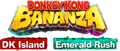
Used for the "DK Island" and "Emerald Rush" text


Adobe Fairfield LT[edit]
Adobe Fairfield LT is a serif typeface derived from Fairfield designed by Robert Slimbach for Adobe Type and Linotype. It is used for the international logo for Yoshi and the Mysterious Book.
Adobe Garamond[edit]
Adobe Garamond is a serif typeface derived from Garamond designed by Robert Slimbach for Adobe Type, first released in 1989.[2] It is used for the Japanese logo for Donkey Kong Country 2: Diddy's Kong Quest, the English in-game logo for Donkey Kong Country 3: Dixie Kong's Double Trouble!, the European logo for Donkey Kong Land 2, and the pre-release logo for Mario vs. Donkey Kong 2: March of the Minis. In Donkey Kong Country 3: Dixie Kong's Double Trouble!, it is also used for scenery text in Mekanos and Brash's Cabin.

Donkey Kong Country 3: Dixie Kong's Double Trouble! ("DOUBLE TROUBLE")
ITC Garamond[edit]

ITC Garamond is a serif typeface derived from Garamond designed by Tony Stan for ITC, first released in 1975.[3] It is used for the amiibo cards for Mario Sports Superstars.
Monotype Garamond[edit]
Monotype Garamond is a serif typeface derived from Garamond from Monotype, first released in 1922.[4] It is used for the exclamation point and question mark icons in Wario World.


Adsans[edit]
Adsans is a sans-serif typeface designed by Walter Tracy for Bitstream, first released in 1959.[5] It is used for the interface in the following games:
- Dance Dance Revolution: Mario Mix (European languages; including a rounded version for the save file warning text in those regions)
- Donkey Kong Country Returns (European languages, including numbers in all regions)
- Donkey Kong Country Returns 3D (numbers)
- Donkey Kong Country Returns HD (European languages, including almost all numbers in all regions)
It is also used for some button prompt text and the stage filter in the stage select screen and the "NEWCOMER" text in The Subspace Emissary in Super Smash Bros. Brawl, in addition to various text in the European versions. In Super Mario Odyssey, it is used for street signs and road markings in New Donk City.

Dance Dance Revolution: Mario Mix

Donkey Kong Country Returns

Aki Lines[edit]

Aki Lines is a display typeface designed by Akihiko Seki for ITC, first released around 1973.[6] A modified version is used for the logo for WarioWare: Smooth Moves, with its unmodified variant used in a prerelease logo.
Allegro[edit]

Allegro is a serif typeface designed by Hans Bohn for Ludwig & Meyer, first released in 1936. It is used in Mario Kart 8, Mario Kart Tour and Mario Kart 8 Deluxe on the logo for Fuzzy Battery. It is also used for the Banana Bagels sign in Super Mario Odyssey.
Alternate Gothic[edit]
Alternate Gothic is a sans-serif typeface designed by Morris Fuller Benton and Sol Hess for the American Type Founders, first released in 1903.[7] It is used for the North American and European/Australasian logos for Wario Land: Shake It!
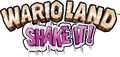
Wario Land: Shake It! ("SHAKE IT!")
Wario Land: The Shake Dimension ("THE SHAKE DIMENSION")
Amelia[edit]

Amelia is a display typeface created by Stanley Davis circa 1964, later digitized and distributed by Linotype.[8] It is used for the "SECRET ENTRANCE" sign at The Great Tree in the GameCube version of Paper Mario: The Thousand-Year Door.
American Text[edit]

American Text is a blackletter typeface designed by Morris Fuller Benton for the American Type Founders, first released in 1932.[9] It is seen in Mario Kart 8, Mario Kart 8 Deluxe and Mario Kart Tour, where it is featured on the logotype for Tropical Bakery.
American Typewriter[edit]
American Typewriter is a slab-serif typeface designed by Joel Kaden and Tony Stan for ITC, first released in 1974.[10] It is used for the logos for the following games:
- Mario's Picross
- Dr. Mario: Miracle Cure (ITC American Typewriter Pro Bold)
It is also used in Super Mario Odyssey for the logo for Tiny's Proshkis.


Used for the "Miracle Cure" text

Anito[edit]

Anito (アニト Anito) is a rounded sans-serif typeface designed by Yutaka Satō[11] for Type Labo, first released in 2001.[12] It is used for the interface in Super Mario Maker. The typeface was also used in the tentative logo for that game during E3 2014, then named Mario Maker.
Tentative logo for Super Mario Maker
Antique Olive[edit]
Antique Olive is a humanist sans-serif typeface designed by Roger Excoffon for the Fonderie Olive, first released between 1962 and 1966.[13] It is used in the logo for Yoshi Touch & Go (albeit with a modified "G" glyph) and Mario Tennis: Ultra Smash. It is also used for description text in the North American Super Mario Advance 4: Super Mario Bros. 3 e-Reader cards.
Super Mario Advance 4: Super Mario Bros. 3 e-Reader card
Yoshi Touch & Go logo ("Touch & Go")

Mario Tennis: Ultra Smash ("ULTRA SMASH")


Aokane[edit]

Aokane (あおかね Aokane) is a rounded sans-serif typeface designed by Yoshiharu Ōsaki for Fontworks, first released in 2015.[14] It is used for the interface in Tetris 99, text in WarioWatch in WarioWare Gold, text in Mona and Penny's stages in WarioWare: Get It Together!, and text in the Pool-Party Panic stage in WarioWare: Move It!. It is also used in the Nintendo Switch remake of Paper Mario: The Thousand-Year Door for the "SECRET ENTRANCE" sign at The Great Tree, replacing Amelia. It was also used for the POW Block text in an early model seen in concept art.
A-OTF Folk Pro[edit]

A-OTF Folk Pro (A-OTF フォーク Pro A - OTF Fōku Pro) is a geometric sans-serif typeface from Morisawa. It is used for the interface in Super Smash Bros. Melee, Yakuman DS, Super Smash Bros. Brawl, and Super Smash Bros. for Nintendo 3DS/Wii U, including the Smash Controller.
A-OTF Jun Pro[edit]

A-OTF Jun Pro (A-OTF じゅん Pro A - OTF Jun Pro) is a rounded sans-serif typeface from Morisawa. It is used for the difficulty slider in Super Smash Bros. Brawl.
A-OTF Maru Folk Pro[edit]

A-OTF Maru Folk Pro (A-OTF 丸フォーク Pro A - OTF Maru Fōku Pro) is a geometric sans-serif typeface from Morisawa. It is used for the units for the distance in Home-Run Contest in Super Smash Bros. Brawl, and a modified version is used for the "Wi-Fi" text in the Nintendo Wi-Fi Connection button in the game's menu.
A-OTF Shin Go Pro[edit]

A-OTF Shin Go Pro (A-OTF 新ゴ Pro A - OTF Shin Go Pro) is a geometric sans-serif typeface from Morisawa. Its Latin characters are similar to Eurostile. It is used for the interface in Super Smash Bros. Brawl.
A-OTF Shin Maru Go Pro[edit]

A-OTF Shin Maru Go Pro (A-OTF 新丸ゴ Pro A - OTF Shinmarugo Pro) is a rounded sans-serif typeface from Morisawa. It is used for the logo for Home-Run Contest in Super Smash Bros. Brawl.
AR DieYuan[edit]
AR DieYuan (文鼎疊圓體 Wén Dǐng Dié Yuán Tǐ) is a rounded display typeface from Arphic. It is used for display text in the Simplified Chinese version of Dr. Mario 64.
AR Hei[edit]

AR Hei (文鼎黑體 Wén Dǐng Hēitǐ) is a geometric sans-serif typeface for Chinese released by Arphic. It is used for the Random icon in the stage select screen in the Simplified Chinese version of Super Smash Bros.
AR NewHei[edit]
AR NewHei (文鼎新黑體 Wén Dǐng Hēitǐ) is a geometric sans-serif typeface for Chinese released by Arphic. It is used for course names and the copyright text in the Simplified Chinese version of Mario Kart 64.
Arrus[edit]
Arrus is a serif typeface designed by Richard Lipton for Bitstream, first released in 1991.[15] It is used for the ? mark and text in Frantic Factory in Donkey Kong 64.
AR ShuiGuan[edit]
AR ShuiGuan (文鼎酷字集 Wén Dǐng Kù Zì Jí) is an uneven serif typeface for Chinese released by Arphic. It is used for the header in Trial Mode in the Simplified Chinese version of Yoshi's Story.
AR ShuLinSong[edit]

AR ShuLinSong (文鼎书林宋体 Wén Dǐng Shū Lín Sòngtǐ) is a serif typeface for Simplified Chinese released by Arphic. It is used for the no controller screen in the Simplified Chinese version of Super Smash Bros..
AR XingKai[edit]
AR XingKai (文鼎行楷 Wén Dǐng Xíngkǎi) is a script typeface from Arphic. It is used for text in the Screen Adjust menu in the Simplified Chinese version of Super Smash Bros.
AR XinYi[edit]
AR XinYi (文鼎新藝體 Wén Dǐngxīn Yì Tǐ) is a geometric sans-serif typeface from Arphic. It is used for the "START" text in the title screen of the Simplified Chinese version of Dr. Mario 64, interface text for modes in the Simplified Chinese version of Mario Kart 64, and display text in the Simplified Chinese version of Paper Mario. It is also used for the logo for Mario Bros. in the Simplified Chinese versions of the Super Mario Advance series.
Dr. Mario 64

Super Mario Advance


AR Yuan[edit]

AR Yuan (文鼎圓體 Wén Dǐng Yuán Tǐ) is a rounded sans-serif typeface for Chinese released by Arphic. It is used for the interface in the Simplified Chinese versions of Mario Kart 64 and Dr. Mario 64, as well as text in How to Play and some interface text in the Simplified Chinese version of Super Smash Bros. It is also used for text in the ad in the ending cutscene in the Simplified Chinese version of Wario Land 4.
Mario Kart 64
Super Smash Bros.

Arial[edit]

Arial is a sans-serif typeface designed by Patricia Saunders and Robin Nicholas for Monotype, first released in 1981.[16] It was used for the HUD of the E3 preview of New Super Mario Bros. Wii.
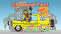
Arial Black is used in Super Smash Bros. Melee for display text (with a modified 1 for the countdown), as well as various text in Super Smash Bros. Brawl. It is also used in the logos of Dr. Mario Express and the Game Boy Camera and Game Boy Printer, course icons in Mario Golf, text in Mini-Game Stadium in Mario Party 2, text in Mario's Puzzle Party in Mario Party 3, the Coin Slots numbers and "VS" icon in Mario Party 4, the "OFF" text in the music selection artwork in Dr. Mario 64 (and its Nintendo Puzzle Collection appearance) when the music options is set to it, the Candy's Dance Studio sign in the Game Boy Advance version of Donkey Kong Country, text in Funky's Flights II and numbers in Cranky's Video Game Heroes in the Game Boy Advance version of Donkey Kong Country 2, cutscene text in Mario vs. Donkey Kong, text in the puzzle game in Mario & Luigi: Bowser's Inside Story, and text in The Super Mario Bros. Movie. A modified version is also used for the pre-release logo for Donkey Kong: Barrel Blast. It is also used for the logo for Next Level Games. It is also used for interface text in Nintendo Puzzle Collection, with modifications for some of its appearances. It is also used for a logo for the iQue Player and the copyright text in the Simplified Chinese version of Super Smash Bros. It is also used for European Player's Choice Nintendo 64 box art.
In Mario Kart DS and Mario Kart Wii, Arial Black is also used for the Dangerous!!! service logo. In Mario Kart Arcade GP, it was used for the Mario Motors advertisements. In Mario Kart Arcade GP 2, it is used on the logos for the following businesses:
- Diamond City (Arial and Arial Black)
- King Castle (Arial Black)
- Mario World (Arial Black)
- Yoshi Company (Arial Black)

Game Boy Camera ("camera")

Dr. Mario Express ("Express")

"DANGEROUS!!!"

"MARIO MOTORS"

Donkey Kong: Barrel Blast early logo for its GameCube iteration, DK Bongo Blast ("Bongo Blast")
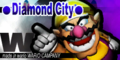
"Diamond City", "made in wario WARIO CAMPANY"
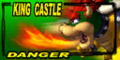
"KING CASTLE", "DANGER"
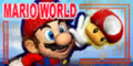
"MARIO WORLD"
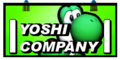
"YOSHI COMPANY"


Arial Rounded[edit]


Arial Rounded is a sans-serif typeface derived from Arial. It is used for interface text in Nintendo Puzzle Collection and Mario vs. Donkey Kong 2: March of the Minis. It is also used for the logo of Dr. Mario Online Rx.

Dr. Mario Online Rx ("online")
Arnold Böcklin[edit]

Arnold Böcklin is a serif typeface released in 1904 by the Otto Weisert foundry.[17] It is seen in Mario Kart 8, Mario Kart Tour and Mario Kart 8 Deluxe on the logo for Undead Motors.
Atomic Suck[edit]
Atomic Suck is an uneven typeface designed by Don Synstelien for SynFonts, first released in 1995.[18] A modified version is used for the logo of Nintendo Wi-Fi Connection.
Aurea Ultra[edit]

Aurea Ultra is a slab-serif typeface designed by Mário Feliciano for T-26, first released in 1997.[19] It is used for the logo for Mario Super Sluggers.
Aurora Grotesk V[edit]
Aurora Grotesk V is a sans-serif typeface designed by Wagner & Schmidt, first released in 1914.[20] It is used for the Japanese logos of the Donkey Kong Country series (including its GBA remakes) and the Japanese logo of Donkey Kong Land. It is also used for the Mario's Cement Factory logo.

Super Donkey Kong ("SUPER")
Super Donkey Kong GB ("SUPER", "GB")
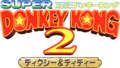
Super Donkey Kong 2: Dixie & Diddy ("SUPER")
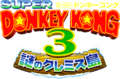
Super Donkey Kong 3: Mysterious Kremis Islands ("SUPER")
Mario's Cement Factory

Avenir[edit]
Avenir is a geometric sans-serif typeface designed by Adrian Frutiger for Linotype, first released in 1988.[21] It is used for the logo for WiiConnect24.
Avenir Next[edit]
Avenir Next is an alternative version of Avenir designed by Adrian Frutiger and Akira Kobayashi, for Linotype, first released in 2003.[22] It is commonly used on the labels of Nintendo consoles and controllers as well as the text for button displays appearing in-game in various Mario games since the release of the Nintendo DS Lite. It is also used for the SD Card image in the Wii's Photo Channel. Avenir Next Bold is used for the "i" in the Nintendo DSi logo and the "cube" in the second NDcube logo. It is also used for the logo for Treehouse. It was also the primary on-screen font used in Nintendo Directs and related presentations until 2017. Modified versions are also used for the "U" in the logo for the Wii U and the logos of New Super Mario Bros. U, New Super Luigi U and New Super Mario Bros. U Deluxe. It is also used for the labels on My Nintendo Points.

New Super Mario Bros. U ("U")

New Super Luigi U ("U")
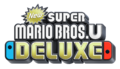
New Super Mario Bros. U Deluxe ("U")
AZ Cut Script[edit]

AZ Cut Script is a script typeface from Artist of Design, first released in 2011.[23] It is used for Spike's nametag in The Super Mario Bros. Movie.
!Baegmug-Jemogche[edit]
!Baegmug-Jemogche ("!백묵-제목체", !baegmug-jemogche) is a sans-serif typeface for Korean released by Baekmuk. It is used for the interface in the Korean version of Super Smash Bros. Brawl.
Baby Pop[edit]

Baby Pop (ベビポップ Bebi Poppu) is a Point of Purchase typeface from Fontworks, first released in 2015.[24] It is used for text in Ashley's stage and Pumpkin Panic in WarioWare Gold, text in the Variety Towers and the logo for High Five in WarioWare: Get It Together!.
Banco[edit]

Banco is a sans-serif display typeface designed by Roger Excoffon for the Founderie Olive, first released in 1951.[25] It is used for the Super Mario Bros. Special logo on the boxart for the game.
Bank Gothic[edit]
Bank Gothic is a geometric sans-serif typeface designed by Morris Fuller Benton for the American Type Founders, first released between 1930 and 1933.[26] Modified versions are used for the logos for the Game Boy Advance line, the Nintendo GameCube, the Game Boy Player, and the Nintendo DS and Nintendo 3DS lines. The regular version is used for various branding for both platforms, such as the "ONLY FOR", "GET CONNECTED", and "PLAYER'S CHOICE" labels on several GBA and GameCube boxarts, as well as the "WAVEBIRD" labeling in the GameCube WaveBird Wireless Controller. It is also used for the "CUBE" in the first NDcube logo.

Game Boy Advance ("ADVANCE")

Nintendo GameCube ("GAMECUBE")

Game Boy Player ("PLAYER")

Nintendo DS ("NINTENDO")

Nintendo 3DS ("NINTENDO")
Bauhaus[edit]
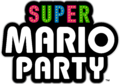
Bauhaus is a sans-serif typeface designed by Joe Taylor for FotoStar, first released in 1969.[27] It is used in the logo for amiibo, the "new" in the Nintendo 3DS lineup, the logos for Virtual Console, WiiWare, and DSiWare, as well as in the logos for the following games:
- Yoshi's Island: Super Mario Advance 3
- Nintendo Land
- Mini Mario & Friends: amiibo Challenge
- Super Mario Party (ITC Bauhaus Pro Bold; modified)
- Super Mario Party Jamboree (ITC Bauhaus Pro Bold; modified)
- Super Mario Party Jamboree – Nintendo Switch 2 Edition + Jamboree TV (ITC Bauhaus Pro Bold; modified)
It is also used for the HUD in Super Smash Bros. and text in the "SPECIAL ITEM" power-up cards of the Japanese Super Mario Advance 4: Super Mario Bros. 3 e-Reader cards. A modified version is also use for the Dixie Theater sign in New Donk City in Super Mario Odyssey.
it is also seen in Mario Kart Tour and Mario Kart 8 Deluxe on the Green Fuel advertisement posters.
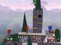
Super Smash Bros.
Yoshi's Island: Super Mario Advance 3 ("3")
Super Mario Advance 4: Super Mario Bros. 3 e-Reader card ("SPECIAL ITEM")

Virtual Console

WiiWare ("Ware")

DSiWare ("Ware")

Nintendo Land

Mini Mario & Friends: amiibo Challenge ("CHALLENGE" lettering along with the "amiibo" logo)
Super Mario Party ("MARIO PARTY")

"Light Your Life" set in Bauhaus

New Nintendo 3DS ("new")
Super Mario Party Jamboree ("MARIO PARTY")


Beachwood[edit]
Beachwood is a blocky sans-serif typeface designed by John Roshell for Swell Type, first released in 2022.[28] It is used for the interface for Mario Tennis Fever.
Beaufonte[edit]
Beaufonte is a script typeface from the Morgan Sign Machine Company. It is used for the text for "Stage Select" and "Option" in Super Smash Bros.
Belwe Roman[edit]
Belwe Roman is a serif display typeface designed by Georg Belwe for the Schelter & Giesecke Type Foundry, first released in 1907.[29] It is seen in Mario Kart 8 and Mario Kart 8 Deluxe in the logos for the following businesses:
It is also used in the map in Super Mario Odyssey.


Berlin Sans[edit]


Berlin Sans is a sans serif typeface designed by David Berlow, Lucian Bernhard and Matthew Butterick for the Font Bureau and FontFont, first released in 1992.[30][31] It is used in its heavier variants for the KONG Letters, including DK's Tree House's KONG sign in Donkey Kong Country games starting with Donkey Kong Country Returns. It is also used for text in the opening cutscene for Mario vs. Donkey Kong 2: March of the Minis.
Berthold Block[edit]
Berthold Block is a sans-serif typeface designed by Hermann Hoffmann for H. Berthold, first released in 1908.[32] It is used for the logo for Wario Blast: Featuring Bomberman!.
Binner[edit]

Binner is a sans-serif typeface designed by Joseph W. Phinney for the American Type Founders, first released in 1899.[33] It is used for the Game & Watch Donkey Kong Jr. logo.
Blackplotan[edit]
Blackplotan is a sans-serif typeface designed by Situjuh Nazara for 7NTypes, first released in 2014.[34] It is used in the logos for The Super Mario Bros. Movie and The Super Mario Galaxy Movie.
The Super Mario Bros. Movie ("THE", "SUPER", "MOVIE")

The Super Mario Galaxy Movie ("THE", "SUPER", "MOVIE")
Blippo[edit]
- Possible alternatives include: Bauhaus 93.

Blippo is a sans-serif typeface designed by Joe Taylor as a facsimile of Bauhaus and first released by Fotostar in 1969.[35] It is seen in Mario Kart Tour on the badge design for Wendy's Car Interiors. A modified version is also used for the logo for Mario Party: The Top 100.
Mario Party: The Top 100 ("THE TOP")
Blue Global[edit]
Blue Global is a sans-serif typeface designed by Benoit Desprez for T-26, first released in 2001.[36] Blue Global Orbital is used for the logo for WarioWare: Snapped!.
Bodoni Poster[edit]

Bodoni Poster[37] or Poster Bodoni[38] is a serif typeface designed by Chauncey H. Griffith, released by Linotype in 1929.[38]
It is used in Super Mario Odyssey for the logo of New Donk City seen in the New Donk City logo and the New Donk City Festival ad as well as its sticker, town hall, and power plant, as well as being used for the Power Pizza sign. It is seen in Mario Kart Tour and Mario Kart 8 Deluxe on the poster for Chase!: Mario's Adventure.
"CHASE!" set in Bodoni Poster in Mario Kart 8 Deluxe

Boink[edit]
Boink is an uneven sans-serif typeface designed by Robert Petrick for ITC, first released in 1994.[39] It is used for the European/Australasian logo for Yoshi Topsy-Turvy.
Bonedigger[edit]
Bonedigger is a geometric sans-serif typeface from Hanoded, first released in 2017.[40] Its Inline variat is used for the English logo for WarioWare: Move It!.
Bookman Old Style[edit]
Bookman or Bookman Old Style is a serif typeface designed for Miller & Richard, first released in 1869.[41] It is used for the Western Land logo and text within the board in Mario Party 2, and the Bookman Bold font is used for the Peach Castle sponsor in Mario Kart Arcade GP 2.

Western Land logo (Mario Party 2)
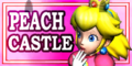
Peach Castle (Mario Kart Arcade GP 2).

ITC Bookman[edit]
ITC Bookman is an alternative version of Bookman Old Style designed by Ed Benguiat for ITC, first released in 1975.[42] It is a variant of Bookman and is used in The Adventures of Super Mario Bros. 3 for episode title cards, in its Bold variant. It is also used for the ? Switch in Yoshi's Story.
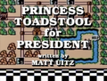
The Adventures of Super Mario Bros. 3
Yoshi's Story


Broadway[edit]
Broadway is a sans-serif display typeface designed by Morris Fuller Benton for the American Type Founders, first released in 1928.[43] It is used for the display text of "SELECT GAME" in Super Mario All-Stars and the year headings in Super Mario 3D All-Stars on the game-selection screens. It is also used for ranked badges in Mario Kart Tour.
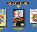
Super Mario All-Stars
Super Mario 3D All-Stars


Broken English[edit]

Broken English is a geometric sans-serif typeface designed by Steven Fabian for Chartpak, first released in 1986.[44] It is used for the logo for the NES Advantage.
Brush Script[edit]

Brush Script is a casual script typeface designed by Robert E. Smith for the American Type Founders, first released in 1942.[45]
It is used in Super Mario Odyssey on the Forgotten Isle sticker. In Mario Kart 8, Mario Kart Tour and Mario Kart 8 Deluxe, it is seen in the logo for Wario Billionaires.
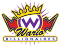
"Wario" in Brush Script in Mario Kart 8

Brushstroke 35[edit]
.jpg)
Brushstroke 35 is a script typeface used for the countdown on the bomb in Target Blast in Super Smash Bros. for Nintendo 3DS / Wii U.
Budo[edit]

Budo (ぶどう Budō) is a rounded sans-serif typeface designed by Tetsuji Kokin for Fontworks, first released in 2004.[46] A slightly boldened variant is used for the number on the Billiard Ball in Paper Mario: Sticker Star.
Cafeteria[edit]

Cafeteria is a sans-serif typeface designed by Tobias Frere-Jones for Frere-Jones Type, first released in 1993.[47] It is used in the logo for Donkey Kong Country 3: Dixie Kong's Double Trouble!
Calcite[edit]
Calcite is a typeface designed by Akira Kobayashi for Adobe Type, first released in 2000.[48] Calcite Black is used for the logo of Striker Times in Mario Strikers Charged.
Cancun[edit]
Cancun is a sans-serif typeface designed by Howard A. Trafton for Corel, first released in 1992.[49] It is used in the logo for Paper Mario: The Thousand-Year Door.
Carat[edit]
Carat (カラット Karatto) is a typeface from Fontworks, first released in 2010.[50] It is used for text in Disco in Game & Wario, text in the Punch-Out microgame, the logo for WarioWatch, text in WarioWatch and Cruise Controls, and card letters in the Potluck Gang stage in WarioWare Gold, as well as in Wario's and Dribble & Spitz's levels and in the Play-o-Pedia in WarioWare: Get It Together!, and the logo for Galactic Conquest in WarioWare: Move It!.
WarioWare: Get It Together! Wario stage
WarioWare: Get It Together! Dribble & Spitz stage
WarioWare: Get It Together! Play-o-pedia


Caslon Antique[edit]
Caslon Antique is a serif typeface designed by Berne Nadall for Barnhart Brothers & Spindler, first released around 1896.[51] It is used for the logo for Bowser's Seizures Palace Hotel in Hotel Mario.
Adobe Caslon[edit]

Adobe Caslon is an alternative version of Caslon designed by Carol Twombly and William Caslon for Adobe Type, first released in 1990.[52] It is used for the logo for The Legend of Zelda: Battle Quest in Nintendo Land and the "Donkey Kong Country" text in the Donkey Kong Island map in Donkey Kong Country.
Catchup[edit]

Catchup is an uneven sans-serif typeface from Bay Animation, first released in 1994. It is used for the interface in Yoshi's New Island in western languages.
Cezanne[edit]
Cezanne (セザンヌ Sezannu) is a sans-serif typeface designed by Toshiyasu Satō for Fontworks, first released in 1993.[53] It is used for text in The Closer microgame in WarioWare: Smooth Moves, text in the Fire Emblem Awakening and Top Notch microgames in WarioWare Gold, and text in Mona's stage in WarioWare: Get It Together!. It is also used for the coin HUD in Wario Land: Shake It!, as well the coin counter at the end of the Character Roll Call as well as distance signs in Home-Run Contest in Super Smash Bros. Brawl.
New Cezanne[edit]

New Cezanne (ニューセザンヌ Nyū Sezannu) is an alternative version of Cezanne, first released in 2008.[54] It is used for button icons in Mario Super Sluggers and text on the Cell Phone thing in Paper Mario: Sticker Star. It is also used for the Japanese logo for Taxi in Game & Wario. It is used for text in the Safecracker and the English version of the Character Development microgames in WarioWare Gold. It is also used in WarioWare: Get It Together! and WarioWare: Move It! for display text.
Chalk[edit]
Chalk is an uneven typeface. Chalk Condensed is used for the logo for Brownie Brown.
Chiaro[edit]

Chiaro (キアロ Kiaro) is a sans -serif typeface from Fontworks, first released in 1997.[55] It is used for controller setting texts in Luigi's Mansion, the Bianco Hills map in the Super Mario Sunshine guideboook, the interface in Nintendo Land, the Japanese logo for Islands in Game & Wario, and text in the Fire Emblem Awakening microgame in WarioWare Gold.
City[edit]
City is a geometric slab-serif typeface designed by Georg Trump, first released in 1930.[56] It is used for the Expresso Espresso logo in New Donk City in Super Mario Odyssey. A modified version is used for the logo for Tetris Attack, while its unmodified version is used on the game's box art.
Clamiro UD[edit]
Clamiro UD is a Universal Design sans-serif typeface from Morisawa. Its Latin characters and numerals are similar to Frutiger. Its ThaiModern variant is used for the font for the logos and interface of all Nintendo games, and some promotional material in the Thai language since 2025, beginning with Donkey Kong Bananza.
Cloister Black[edit]

Cloister Black is a script typeface designed by Joseph W. Phinney and Morris Fuller Benton for the American Type Founders, first released in 1904.[57] A modified version is used for display text in the Game Boy Advance version of Donkey Kong Country 2.
Comet[edit]

Comet (コメット Kometto) is a geometric sans-serif typeface from Fontworks, first released in 2010.[58] It is used for the Japanese logo of Arrow in Game & Wario, text in the Basic Training microgame in WarioWare Gold, the logo for Sly Angle in WarioWare: Get It Together!, and the text in the Volcano Wario stage in WarioWare: Move It!.
Comic Sans[edit]
Comic Sans is an uneven sans-serif typeface designed by Vincent Connare for Microsoft, first released in 1994.[59]
In Mario Party, it is used on the logo for Bowser's Magma Mountain, and is also seen in the Mini-Game Stadium circular field and the background graphic for the "START" sign; it is also used for all boards' names when viewing the post-game results. In Nintendo Puzzle Collection, it is used for the "Yoshi's Cookie" story scenery text. In Donkey Konga, it is used for the "TO BEACH" sign in the title screen. In Diddy Kong Racing DS, it is used for interface text. In WarioWare: Smooth Moves and WarioWare Gold, it is used for text in both Nintendogs microgames, respectively. In Super Mario RPG for the Nintendo Switch, it is used on the "Welcome" sign in the Mushroom Castle area.[60] It is also used for description text in the Mario Party-e cards, and is present in the Bonus Barrel artwork for the Game Boy Advance port of Donkey Kong Country.
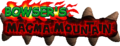
Mario Party ("BOWSER'S" in the Bowser's Magma Mountain logo)
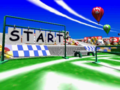
Mario Party ("START" in the Mini-Game Stadium)
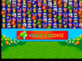
Nintendo Puzzle Collection
Donkey Konga ("TO BEACH" sign in the title screen)
Diddy Kong Racing DS (file select screen)
WarioWare Gold (Nintendogs microgame)
Mario Party-e
Donkey Kong Country


Compacta[edit]
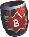
Compacta is a condensed sans-serif typeface designed by Fred Lambert for Letraset, first released in 1963.[61] Compacta Regular is used in Super Smash Bros. Brawl for player numbers in the background of the slots in the fighter select screen, and text in The Subspace Emissary in the Japanese language, with a squished and modified version being used for display text in western languages, with modifications to text used for the player indicators in battle, random stock icons, and the counter in Coin Battles and Multi-Man Brawl. It is also used in Super Mario Odyssey in a New Donk City ad. It is also used in the logos for Super Mario Land 2 - 6 Golden Coins, Mario's Tennis along with its pre-release logo, and Donkey Kong Country 2: Diddy's Kong Quest. It is also used for the copyright text in the Simplified Chinese version of Dr. Mario 64.
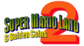
Super Mario Land 2 - 6 Golden Coins ("6 Golden Coins")
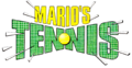
Mario's Tennis
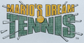
Mario's Tennis early logo
Donkey Kong Country 2: Diddy's Kong Quest ("DIDDY'S KONG QUEST")
Cooper Black[edit]

Cooper Black, released in 1922, is a serif typeface and a heavy weight derivative of Cooper, released in 1919, designed by Oswald Cooper.[62] It is used for Trial Mode in Yoshi's Story and cutscene text in Mario vs. Donkey Kong. It is also used in Mario Kart 8, Mario Kart Tour and Mario Kart 8 Deluxe on the banner ads for Wendy's Car Interiors.
Mario vs. Donkey Kong

Copperplate Gothic[edit]
Copperplate Gothic is a wedge serif typeface designed by Frederic W. Goudy for American Type Founders, first released in 1901.[63] It is used on the Mystery Land logo and text within the board in Mario Party 2.
Corporate[edit]
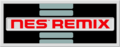
Corporate is a geometric sans-serif typeface designed by Roc Mitchell for Alphabet Innovations, first released in 1971.[64] It is used for the logo for the Nintendo Entertainment System and labels on the console, controller, and accessories, and various other media related to it, such as the logo for the NES Remix series. It is also used for the header on the box of the Super NES Classic Edition and the labels on the original Game Boy. A modified version is also used for "TAP" in the logo for Amiibo tap: Nintendo's Greatest Bits.


Original NES controller ("A", "B", "START" and "SELECT")
"Dogbone" NES controller ("A", "B", "START" and "SELECT")
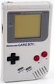
Original Game Boy ("A", "B", "START" and "SELECT")
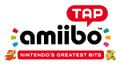
Amiibo tap: Nintendo's Greatest Bits logo ("TAP")


Cosmos[edit]

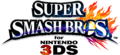
Cosmos is a sans-serif typeface designed by Gustav Jäger for Berthold, first released in 1982.[65] A modified version of Cosmos Bold is used for the "for" and "NINTENDO" for the logo for Super Smash Bros. for Nintendo 3DS / Wii U.
Courier[edit]

Courier is a fixed-pitch typeface designed by Howard Kettler for IBM, created circa 1956.[66] It is used in Super Mario RPG: Legend of the Seven Stars for the artwork of the Save Block.
Crackhouse[edit]

Crackhouse is a sans-serif typeface designed by Jeremy Dean for House Industries in 1995.[67] It was used in Heads-Up, an Adobe Flash game made to promote Super Mario Strikers.
Croissant[edit]

Croissant is a display typeface designed by Philip Kelly for Letraset, first released in 1978.[68] It is used for the display text to represent the Queque music setting in the Simplified Chinese version of Dr. Mario 64.
Cruz Swinger[edit]
Cruz Swinger or Swinger is a decorative typeface designed by Ray Cruz originally published by John N. Schaedler circa 1970.[69] It is used in WarioWare: Touched! for the illustrative title cards seen in many Souvenirs, such as Kitchen Timer, Clacker and Yo-Yo.


Cuckoo[edit]

Cuckoo (カッコウ Kakkō) is a Point of Purchase typeface designed by Tomomi Kanda for Fontworks, first released in 2021.[70] It is used for text in Dribble & Spitz's stage in WarioWare: Move It! and interface text in Yoshi and the Mysterious Book.
DF Dian[edit]

DF Dian (華康電晶體 Huá Kāng Diàn Jīngtǐ) is a display typeface for Traditional Chinese released by DynaComware. It is used for text in the Pool-Party Panic stage in the Traditional Chinese version of WarioWare: Move It!.
DF Duan Dai[edit]
DF Duan Dai (華康緞帶體 Huá Kāng Duàn Dài Tǐ) is a display typeface for Traditional Chinese released by DynaComware. It is used for text in COpycat Mirror in the Traditional Chinese version of WarioWare: Move It!.
DF Hai Bao[edit]
DF Hai Bao is a Point of Purchase typeface for Chinese released by DynaComware. It is generally used in place of the Super Mario font in Chinese localizations of games. Its Simplified Chinese variant, DFP Hai Bao-GB (华康海报体 Huá kāng hǎibào tǐ), is used for the interface in the following games:
- Super Mario 64 DS (title screen buttons; Simplified Chinese language)
- Super Mario Galaxy (Simplified Chinese language)
- New Super Mario Bros. Wii (Simplified Chinese language)
- Donkey Kong Country Returns (Simplified Chinese language)
- Super Mario 3D Land (Simplified Chinese language)
- Mario Tennis Open (Simplified Chinese language)
- New Super Mario Bros. 2 (Simplified Chinese language)
- Paper Mario: Sticker Star (Simplified Chinese language)
- Super Mario Odyssey (Simplified Chinese language)
- New Super Mario Bros. U Deluxe (Simplified Chinese language)
- Yoshi's Crafted World (Simplified Chinese language)
- Dr. Mario World (Simplified Chinese language)
- Paper Mario: The Origami King (Simplified Chinese language)
- Super Mario 3D World + Bowser's Fury (Simplified Chinese language)
- WarioWare: Get It Together! (Simplified Chinese language)
- WarioWare: Move It! (Simplified Chinese language)
- Mario vs. Donkey Kong (Nintendo Switch) (Simplified Chinese language)
- Paper Mario: The Thousand-Year Door (Nintendo Switch) (Simplified Chinese language)
- Mario & Luigi: Brothership (Simplified Chinese language)
Its Traditional Chinese variant, DF Hai Bao-B5 (華康海報體 Huá kāng Hǎibào Tǐ), is used for the interface in the following games:
- New Super Mario Bros. Wii (Traditional Chinese language)
- Super Mario 3D Land (Traditional Chinese language)
- Mario Party 9 (Traditional Chinese language)
- Mario Tennis Open (Traditional Chinese language)
- New Super Mario Bros. 2 (Traditional Chinese language)
- Paper Mario: Sticker Star (Traditional Chinese language)
- Super Mario Run (Traditional Chinese language)
- Super Mario Odyssey (Traditional Chinese language)
- New Super Mario Bros. U Deluxe (Traditional Chinese language)
- Yoshi's Crafted World (Traditional Chinese language)
- Dr. Mario World (Traditional Chinese language)
- Paper Mario: The Origami King (Traditional Chinese language)
- Super Mario 3D World + Bowser's Fury (Traditional Chinese language)
- WarioWare: Get It Together! (Traditional Chinese language)
- WarioWare: Move It! (Traditional Chinese language)
- Mario vs. Donkey Kong (Nintendo Switch) (Traditional Chinese language)
- Paper Mario: The Thousand-Year Door (Nintendo Switch) (Traditional Chinese language)
- Mario & Luigi: Brothership (Traditional Chinese language)

Mario Party 9
Paper Mario: The Origami King

DF Hei[edit]
DF Hei is a sans-serif typeface for Chinese released by DynaComware in 1988. Its Simplified Chinese variant, DFP Hei-GB (华康黑体 Huá kāng Hēitǐ), is used for the interface in the following games:
- Punch-Out! (Wii) (Simplified Chinese language)
- Super Mario 3D Land (Simplified Chinese language)
- Mario Kart 7 (Simplified Chinese language)
- New Super Mario Bros. 2 (Simplified Chinese language)
- Super Smash Bros. Ultimate (Simplified Chinese language)
- Super Mario Maker 2 (Simplified Chinese language)
- Mario Kart Tour (Simplified Chinese language)
- Mario Kart Live: Home Circuit (Simplified Chinese language)
- Super Mario 3D World + Bowser's Fury (Simplified Chinese language)
- WarioWare: Get It Together! (Simplified Chinese language; including "2" in multiplayer rankings in the Korean version and "第" in multiplayer rankings in the Traditional Chinese version)
- Mario Strikers: Battle League (Simplified Chinese language)
- WarioWare: Move It! (Simplified Chinese language)
- Super Mario RPG (Nintendo Switch) (Simplified Chinese language)
- Nintendo World Championships: NES Edition (Simplified Chinese language)
- Donkey Kong Country Returns HD (Simplified Chinese language)
Its Traditional Chinese variant, DF Hei-B5 (華康黑體 Huá kāng Hēitǐ), is used for the interface in the following games:
- Super Mario 3D Land (Traditional Chinese language)
- Mario Kart 7 (Traditional Chinese language)
- New Super Mario Bros. 2 (Traditional Chinese language)
- Super Smash Bros. Ultimate (Traditional Chinese language)
- Mario Kart Tour (Traditional Chinese language)
- Mario Kart Live: Home Circuit (Traditional Chinese language)
- Super Mario 3D World + Bowser's Fury (Traditional Chinese language)
- Mario Golf: Super Rush (Traditional Chinese language)
- WarioWare: Get It Together! (Traditional Chinese language)
- Mario Strikers: Battle League (Traditional Chinese language)
- Nintendo World Championships: NES Edition (Traditional Chinese language)
- Donkey Kong Country Returns HD (Traditional Chinese language)
DF Hei-B5 is also used for the interface in the Nintendo 3DS system software in the Traditional Chinese language. A modified version of DFP Hei-GB is used for the logo in the title screen background in the Simplified Chinese version of Super Mario 64.
DF Hua Yi[edit]
DF Hua Yi (華藝体 Huá Yì Yǐ) is a geometric sans-serif typeface from DynaComware. It is used for the interface of the Japanese version of the Wii version of Punch-Out!!. Its Traditional Chinese variant, DF Hua Yi-B5 (華康華藝體 Huá kāng Huá Yì Tǐ), is used for the interface in the Traditional Chinese version of Luigi's Mansion 3.
DF Kyo Geki[edit]
DF Kyo Geki (DF京劇体 DF Jīngjù Tǐ) is an uneven sans-serif typeface from DynaComware. It is used for the interface in the following games:
- Mario Party 8 (American and Japanese versions)
- Captain Rainbow
- Luigi's Mansion: Dark Moon (Japanese and Russian versions)
- Luigi's Mansion Arcade
- Mario + Rabbids Sparks of Hope (Japanese language)
- Luigi's Mansion 2 HD (Japanese and Russian versions)
Its Traditional Chinese variant, Hua Kangping Theater (華康平劇體 Huá kāngpíng Jù Tǐ), is used for the interface in the Traditional Chinese versions of Luigi's Mansion: Dark Moon and its Nintendo Switch remaster, the logo for Puck 'er Up in the Traditional Chinese version of WarioWare: Get It Together!, sticker text in the Traditional Chinese version of Mario Party Superstars, and text in Wario's stage in the Traditional Chinese version of WarioWare: Move It!.
Mario Party 8

DF Li King Hei[edit]
DF Li King Hei (華康儷金黑 Huá kāng Lì Jīn Hēi) is a serif typeface for Traditional Chinese released by DynaComware. It is used for the interface in the following games:
- WarioWare: Get It Together! (Traditional Chinese language)
- WarioWare: Move It! (Traditional Chinese language)
DF Li Hei[edit]
DF Li Hei (華康儷黑 Huá kāng Lì Hēi) is a sans-serif typeface for Traditional Chinese released by DynaComware. It is used for the interface in the following games:
- Mario Tennis Aces (Traditional Chinese language)
- Super Mario Maker 2 (Traditional Chinese language)
- WarioWare: Get It Together! (Traditional Chinese language)
- WarioWare: Move It! (Traditional Chinese language)
- Super Mario RPG (Nintendo Switch) (Traditional Chinese language)
- Mario Kart World (Traditional Chinese language)
DF Li Yuan[edit]

DF Li Yuan (華康儷圓 Huá kāng Lì Yuán) is a rounded sans-serif typeface for Traditional Chinese released by DynaComware.[71] It is used for the interface in the following games:
- Mario Strikers: Battle League (Traditional Chinese language)
- Princess Peach: Showtime! (Traditional Chinese language)
It is also used for the Bonus Stage text and multiplayer rankings in the Traditional Chinese version of WarioWare: Get It Together!, including the "第" in multiplayer rankings in the Simplified Chinese version.
It is also used for the interface for Alarmo in the Traditional Chinese language.
DF Ming[edit]
DF Ming (華康明體 Huá kāngmíng Tǐ) is a serif typeface for Traditional Chinese by DynaComware and was first released in 1988. It is used for text in the Fire Emblem: Three Houses microgame, dialogue for The Supreme Developer, and the logo for Gotta Bounce and text in Rising Star in the Traditional Chinese version of WarioWare: Get It Together!.
DF Mo[edit]
DF Mo (華康墨字體 Huá kāng Mò Zìtǐ) is a typeface for Traditional Chinese released by DynaComware. It is used for the logo for Balloon Bang in the Traditional Chinese version of WarioWare: Get It Together!.
DF Pop Mix[edit]

DF Pop Mix (DF POPミックス DF Poppu Mikkusu) is a Point of Purchase typeface from DynaComware. It is used for the interface in the following games:
- Mario Party 8 (Japanese language)
- Mario Party DS
- Luigi's Mansion 3 (Japanese language)
It is also used for controller names when selecting controllers in controller settings in Super Smash Bros. Brawl. A modified version is used for the Memory Card icon for Super Smash Bros. Melee and the logo for Gamer in Game & Wario.
DF Renga[edit]

DF Renga (DFレンガ体 DF Renga-tai) is a display typeface from DynaComware. It is used for the Japanese logo for Gamer in Game & Wario.
DF Roman Otori[edit]

DF Roman Otori (DFロマン鳳 DF Roman Ōtori) is a serif typeface from DynaComware. It is used for the Japanese logo for Ashley in Game & Wario.
DF Shi Yi[edit]
DF Shi Yi is a display typeface from DynaComware. Its Simplified Chinese variant, DF Shi Yi-GB (华康饰艺体 Huá Kāng Shì Yì Tǐ) is used for text in Jimmy's stage and the logos for Medusa March and Copycat Mirror in the Simplified Chinese version of WarioWare: Move It!, while its Traditional Chinese variant, DF Shi Yi-B5 (華康飾藝體 Huá Kāng Shì Yì Tǐ), is used for text in the Pool-Party Panic stage in the Traditional Chinese version of WarioWare: Move It!.
DF Tan Li[edit]
DF Tan Li is a script typeface for Chinese released by DynaComware. Both variants, DFP Tan Li-GB (华康唐风隶 Huá kāng Tángfēng Lì) and DF Tan Li-B5 (華康唐風隸 Huá kāng Tángfēng Lì) are used for text in Duelius Maximus in the Simplified and Traditional Chinese versions of WarioWare: Get It Together!, respectively. Both variants are also used for text for the Forms in the Simplified and Traditional Chinese versions of WarioWare: Move It!, respectively, and Orbulon's stage in the Traditional Chinese version of WarioWare: Move It!.
DF Taru Gothic[edit]

DF Taru Gothic (DF樽ゴシック体 DF Taru Goshikkukarada) is a display typeface from DynaComware. It is used for the logo of Bowling in Game & Wario. Its Traditional Chinese variant, DF Taru Gothic-B5 (華康酒桶體 Huá kāng Jiǔ Tǒng Tǐ), is used for text in the Traditional Chinese version of WarioWare: Get It Together! and the mode selector and text in the Not-So-Relaxing Rapids stage and the logo for Listen to the Doctor! in the Traditional Chinese version of WarioWare: Move It!.
DF UD Gothic[edit]
DF UD Gothic (華康UD黑 Huá kāng UD Hēi) is a Universal Design sans-serif typeface from DynaComware. It is used for the interface in Super Mario Maker 2 for the Japanese language.
DF Wa Wa[edit]
DF Wa Wa is a typeface for Chinese released by DynaComware. Both variants, DFP Wa Wa-GB (华康娃娃体 Huá kāng Wáwá Tǐ) and DF Wa Wa-B5 (華康娃娃體 Huá kāng Wáwá Tǐ) are used for the logo for High Five in the Simplified and Traditional Chinese versions of WarioWare: Get It Together!, respectively. DFP Wa Wa-GB is also used for the logo for Balloon Bang in the Simplified Chinese version of WarioWare: Get It Together! and text in Mona's stage in the Simplified Chinese version of WarioWare: Move It!, while DF Wa Wa-B5' is also used for text in Ashley's stage in the Traditional Chinese version of WarioWare: Move It!.
DF Yan Kai[edit]
DF Yan Kai (華康正顏楷體 Huá kāngzhèng Yán Kǎitǐ) is a script typeface for Traditional Chinese released by DynaComware. It is used for text in Duelius Maximus and in the Traditional Chinese version of WarioWare: Get It Together!. A heavily modified version is also used for the logos for Duelius Maximus and Rising Star in the Traditional Chinese version of said game. It is also used for text in Cricket and Mantis' and Kat & Ana's stages and the logos for Showdown and Go the Distance in the Traditional Chinese version of WarioWare: Move It!.
DF Ying[edit]
DF Ying (華康硬黑體 Huá Kāng Yìng Hēitǐ) is a display typeface for Traditional Chinese released by DynaComware. It is used for text in the Variety Towers in the Traditional Chinese version of WarioWare: Move It!.
DF Yuan[edit]
DF Yuan (華康圓體 Huá kāng Yuán Tǐ) is a rounded sans-serif typeface for Chinese released by DynaComware. Its Simplified Chinese variant, DFP Yuan-GB (华康圆体 Huá kāng Yuán Tǐ), is used for the interface in the following games:
- Dr. Mario Express (Simplified Chinese language)
- Game & Watch DSiWare games (Simplified Chinese language)
- Paper Mario: Sticker Star (Simplified Chinese language)
- Mario + Rabbids Kingdom Battle (Simplified Chinese language)
- Super Mario Odyssey (Simplified Chinese language)
- Super Mario Party (Simplified Chinese language)
- Dr. Mario World (Simplified Chinese language)
- Luigi's Mansion 3 (Simplified Chinese language)
- Paper Mario: The Origami King (Simplified Chinese language)
- WarioWare: Get It Together! (Simplified Chinese language)
- Mario Party Superstars (Simplified Chinese language)
- Mario Strikers: Battle League (Simplified Chinese language)
- Mario + Rabbids Sparks of Hope (Simplified Chinese language)
- WarioWare: Move It! (Simplified Chinese language)
- Super Mario RPG (Nintendo Switch) (Simplified Chinese language)
- Princess Peach: Showtime! (Simplified Chinese language)
- Paper Mario: The Thousand-Year Door (Nintendo Switch) (Simplified Chinese language)
- Super Mario Party Jamboree (Simplified Chinese language)
- Mario & Luigi: Brothership (Simplified Chinese language)
- Super Mario Party Jamboree – Nintendo Switch 2 Edition + Jamboree TV (Simplified Chinese language)
It is also used for the interface for Alarmo in the Simplified Chinese language.
Its Traditional Chinese variant, DF Yuan-B5 (華康圓體 Huá kāng Yuán Tǐ), is used for the interface in the following games:
- Mario Party 9 (Traditional Chinese language)
- Paper Mario: Sticker Star (Traditional Chinese language)
- Super Mario Run (Traditional Chinese language)
- Mario + Rabbids Kingdom Battle (Traditional Chinese language)
- Super Mario Odyssey (Traditional Chinese language)
- Super Mario Party (Traditional Chinese language)
- Dr. Mario World (Traditional Chinese languages)
- Paper Mario: The Origami King (Traditional Chinese language)
- Mario Golf: Super Rush (Traditional Chinese language)
- WarioWare: Get It Together! (Traditional Chinese language)
- Mario Party Superstars (Traditional Chinese language)
- Mario + Rabbids Sparks of Hope (Traditional Chinese language)
- WarioWare: Move It! (Traditional Chinese language)
- Super Mario RPG (Nintendo Switch) (Traditional Chinese language)
- Paper Mario: The Thousand-Year Door (Nintendo Switch) (Traditional Chinese language)
- Super Mario Party Jamboree (Traditional Chinese language)
- Mario & Luigi: Brothership (Traditional Chinese language)
- Super Mario Party Jamboree – Nintendo Switch 2 Edition + Jamboree TV (Traditional Chinese language)
Paper Mario: The Origami King. The font is used for the item names and descriptions.

DFP Bu Ding[edit]
DF Bu Ding is a display typeface from DynaComware. Its Simplified Chinese variant, DF Bu Ding-GB (华康布丁 Huá kāng Bùdīng), is used for text in Wario and Cricket and Mantis' stages in the Simplified Chinese version of WarioWare: Move It!.
DFP Craft Sumi[edit]
DFP Craft Sumi (DFPクラフト墨 DFP Kurafuto Sumi) is an uneven typeface from DynaComware. It is used for several business graphics in Mario Kart Wii:
- Fun Flower (returns in Mario Kart 7)
- The Mushroom Moon
- Nintendo Moo Moo Farm
Being also used for interface text in Pikmin games, it is present in WarioWare: Smooth Moves and WarioWare Gold in the microgame Pikmin 2.


DFP Fang Yuan[edit]
DFP Fang Yuan is a Point of Purchase typeface from DynaComware. Its Simplified Chinese variant, DFP Fang Yuan-GB (华康方圆体 Huá kāng Fāngyuán Tǐ), is used for the interface in the following games:
- Super Mario Galaxy (Simplified Chinese language)
- Super Mario Galaxy + Super Mario Galaxy 2 (Simplified Chinese language)
Its Traditional Chinese variant, DF Fang Yuan-B5 (華康方圓體 Huá kāng Fāngyuán Tǐ), is used for the interface in the following games:
- Mario Tennis Open (Traditional Chinese language)
- Super Mario Galaxy + Super Mario Galaxy 2 (Traditional Chinese language)
It is also used for location text in the Traditional Chinese version of WarioWare: Move It!.
DFP Fūun[edit]


DFP Fūun (DFP風雲体 DFP Fēngyún Tǐ) is a typeface from DynaComware. It is seen in Mario Kart Wii in the poster ads for Coco Coffee and Green Fuel for the "with flower-friendly" portion. It is also used for the circular "?" symbol in Wario World, and text in the Iggy cards of the Japanese Super Mario Advance 4: Super Mario Bros. 3 e-Reader cards.
DFP Gothic[edit]

DFP Gothic (DFP華康ゴシック体 DFP Kakō Goshikku-karada) is a sans-serif typeface from DynaComware.[72] It is used for text for the Forms in WarioWare: Smooth Moves in the Japanese language, as well as on the title screen and credits text of Captain Rainbow. It was also primarily used in Super Smash Bros. games until Nintendo 3DS / Wii U, with it being also used for distance numbers in Training in Ultimate.
DFP Gothic-EB[edit]
DFP Gothic-EB (DFP特太ゴシック体 DFP Tokubuto Goshikku-karada) is an alternative variant of DFP Gothic used in Melee and Brawl for How to Play in both titles and some interface text for the latter, and the interface in Nintendo 3DS / Wii U. It is also used for text in Card-e Cards in WarioWare, Inc.: Mega Party Game$! (altough slightly modified), clock numbers in the microgame Five More Minutes, text in Jimmy T and Jimmy P.'s stages, the numbers on Dribble's taxi car radio, and various UI text in minigames in WarioWare: Smooth Moves, background text in Nintendo Badge Arcade, and text in the Bowser cards of the Japanese Super Mario Advance 4: Super Mario Bros. 3 e-Reader cards. It is also used for various text for the UI, items, and buttons in Mario Party 4 in western languages, and the interface for the Wii version of Punch-Out! in the Japanese language.
DFP Gothic-EB is also used for the "3" for the logo for Super Smash Bros. for Nintendo 3DS.
It also has minor usage in Mario Kart 8 and Mario Kart 8 Deluxe on the Bullet Bill Speed Trials logo.
Super Smash Bros. for Nintendo 3DS ("3")


DFP HS Gothic[edit]
DFP HS Gothic (DFP平成ゴシック体 DFP Heisei Goshikku-karada) is an alternative variant of DFP Gothic used in the original Super Smash Bros. for pre-match loading screens in the 1P Game, as well as unlock messages and How to Play. It is also used for text in Mini-Game Island in Mario Party, text in Rules Land in Mario Party 2, and WarioWare: D.I.Y. as one of the font styles available for use in the Super MakerMatic 21, called Bold, as well as comics text in the Japanese language. It is also used for certain text in several microgames in D.I.Y. and D.I.Y. Showcase.

DFP Gyo Kaisho[edit]
DFP Gyo Kaisho (DFP行楷書 DFP Xíng Kǎishū) is a script typeface from DynaComware.
It is used for text from the Temple of Form in WarioWare: Smooth Moves in Japanese and languages using the Latin script. It is also used in WarioWare: D.I.Y. as one of the font styles available for use in the Super MakerMatic 21, called Calligraphy.
WarioWare: Smooth Moves
WarioWare: Smooth Moves (Japanese version)
WarioWare: D.I.Y.


DFP Hei[edit]
DFP Hei-GB (华康黑体 Huá kāng Hēitǐ) is a sans-serif typeface for Simplified Chinese released by DynaComware. It is used for the interface in Mario Tennis Aces in the Simplified Chinese language. It is also used for some text in the interface in the iQue DSi system software, and the interface in the iQue 3DS and the unreleased iQue Wii system software in the Simplified Chinese language.
DFP Kai[edit]
DFP Kai (华康楷体 Huá kāng Kǎitǐ) is a serif typeface for Simplified Chinese released by DynaComware. It is used for the interface in the unreleased iQue Wii system software in the Simplified Chinese language.
DFP Kai Sho[edit]

DFP Kai Sho (DFP中太楷書体 DFP Zhōng Tài Kǎishū Tǐ) is a serif typeface from DynaComware. It is used for display text in Super Smash Bros. Melee in western languages.
DFP Kan[edit]

DFP Kan Tei Ryu (DFP勘亭流 DFP Kāntíngliú) is a script typeface from DynaComware. It is used for the interface in the following games:
- Wario World
- Nintendo Land
In Mario Kart Wii, it is used on the Tropical Mart logo. It is also used for text in the Japanese Super Mario Advance 4: Super Mario Bros. 3 e-Reader cards.
Its Chinese variants, DFP Kan Ting Liu-GB (华康勘亭流 Huá kāng Kāntíngliú) and DF Kan Ting Liu-B5(華康勘亭流 Huá kāng Kāntíngliú) are used for text in Kat and Ana's stage in the Simplified and Traditional Chinese versions of WarioWare: Get It Together!, respectively, as well as text in Duelius Maximus in the Simplified Chinese version of WarioWare: Get It Together!. A heavily modified version is also used for the logos for Duelius Maximus and Rising Star in the Simplified Chinese version of said game. It is also used for text in Kat & Ana's stage and the logos for Showdown and Go the Distance in the Simplified Chinese version of WarioWare: Move It!.
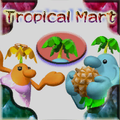
Mario Kart Wii

DFP Koln[edit]

DFP Koln (DFP康印体 DFP kāng Yìn Tǐ) is a rounded typeface from DynaComware. It is used in WarioWare: D.I.Y. as one of the font styles available for use in the Super MakerMatic 21, called Ghostly.
Its Traditional Chinese version, DF Gu Yin (華康古印體 Huá Kāng Gǔ Yìn Tǐ), is used for text in 9-Volt's stage in the Traditional Chinese version of WarioWare: Move It!.
DFP Lei Ga So[edit]

DFP Lei Ga So (DFP麗雅宋 DFP Lì Yǎ Sòng) is a serif typeface from DynaComware. It is based on Times New Roman. It is used for the interface in the following games:
- Dance Dance Revolution: Mario Mix (American and Japanese languages)
- Mario Party 8 (American and Japanese languages)
It is also used for numbers for bonus results in the results screen in Super Smash Bros.
DFP Lei Sho[edit]

DFP Lei Sho (DFP隷書体 DFP Reisho-tai) is a script typeface from DynaComware. It is used for text in Tortoise & Hare in WarioWare: Smooth Moves.
DFP Li Jin Hei[edit]
DFP Li Jin Hei (华康俪金黑 Huá kāng Lì Jīn Hēi) is a serif typeface for Simplified Chinese released by DynaComware. It is used for the interface in the following games:
- WarioWare: Get It Together! (Simplified Chinese language)
- WarioWare: Move It! (Simplified Chinese language)
DFP Maru Gothic[edit]
DFP Maru Gothic (DFP中太丸ゴシック体 DFP-chū Tamaru Goshikku-karada) is a rounded sans-serif typeface from DynaComware. It is used for the interface in the following games:
- Mario Kart Wii (Korean language; including the Mario Kart Channel)
- Mario vs. Donkey Kong: Minis March Again! (Japanese language)
- Donkey Kong Country Returns 3D (Japanese language)
It is also used for numbers in Home-Run Contest in Super Smash Bros. Melee and text in Pyoro S in WarioWare: Smooth Moves. A modified version is used for the logo for Kat and Ana's Sky Patrol in WarioWare: D.I.Y. Showcase,
DFP Maru Moji[edit]
DFP Maru Moji (DFPまるもじ体 DFP Maru-mojitai) is a Point of Purchase typeface from DynaComware. It is used for the interface in the Japanese and Russian versions of Yoshi's New Island, text on the sign in the opening cutscene of Wrecking Crew '98, and text in the Japanese Super Mario Advance 4: Super Mario Bros. 3 e-Reader cards. A modified version is used for the interface in the Japanese version of Diddy Kong Racing for Latin characters.
DFP Mincho[edit]

DFP Mincho (DFP華康明朝体 DFP Huá kāngmíng Cháo Tǐ) is a serif typeface from DynaComware. It is used for the interface in the following games:
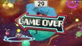
- Super Smash Bros. Melee (Japanese language, including the Game Over screen in western languages)
- Super Smash Bros. Brawl
- WarioWare: D.I.Y.
- Super Smash Bros. for Wii U
It is also used for the icon for online strangers in Super Smash Bros. Ultimate. It is also used for the World of Light subtitle in the Japanese, Simplified Chinese, and Traditional Chinese versions of Super Smash Bros. Ultimate.
DFP HS Mincho[edit]
DFP HS Mincho (DFP平成明朝体 DFP Píngchéng Míng Cháo Tǐ) is an alternative version of DFP Mincho used for the interface in the Japanese version of Super Smash Bros., including some interface text in the European versions, and How to Play, the no controller screen, and the bonus results screen in western languages. It is also used for the paper in the Japanese version of Slice of Life in WarioWare: Smooth Moves, and in WarioWare: D.I.Y. as one of the font styles available for use in the Super MakerMatic 21, called Elegant.
DFP Pop[edit]

DFP Pop (DFP POP体 DFP Poppu-tai) is a Point of Purchase typeface from DynaComware. It is used for the interface in the following games:
- Diddy Kong Racing (modified; Japanese language)
- Mario no Photopi
- Dance Dance Revolution: Mario Mix (English and Japanese languages)
- Mario Kart Arcade GP
- Mario Kart Arcade GP 2
- WarioWare: D.I.Y. Showcase
It is also used for credits text in Super Mario Sunshine, the "SELECT A FILE" text in the Japanese version of Mario Party 4, numbers on the dartboard in Object D'Art in WarioWare: Smooth Moves, and the text on the knob on the title screen of Captain Rainbow. A variant, DFP Pop 2, is used for text in the Lemmy cards of the Japanese Super Mario Advance 4: Super Mario Bros. 3 e-Reader cards. Its Simplified Chinese variant, DFP Pop-GB (华康POP体 Huá kāng POP Tǐ), is used for the interface in the following games:
- Mario Tennis Open (Simplified Chinese language)
- Luigi's Mansion: Dark Moon (Simplified Chinese language)
- Yoshi's Crafted World (Simplified Chinese language)
- WarioWare: Get It Together! (Simplified Chinese language)
- Mario Party Superstars (sticker text; Simplified Chinese language)
- WarioWare: Move It! (Simplified Chinese language)
- Princess Peach: Showtime! (Simplified Chinese language)
- Luigi's Mansion 2 HD (Simplified Chinese language)
- Super Mario Party Jamboree (reaction text; Simplified Chinese language)
- Super Mario Party Jamboree – Nintendo Switch 2 Edition + Jamboree TV (reaction text; Simplified Chinese language)
Its Traditional Chinese variant, DF Pop-B5 (華康POP體 Huá kāng POP Tǐ), is used for the interface in the following games:
- Super Mario Galaxy 2 (Traditional Chinese language)
- Yoshi's Crafted World (Traditional Chinese language)
- WarioWare: Get It Together! (Traditional Chinese language)
- Princess Peach: Showtime! (Traditional Chinese language)
- Super Mario Party Jamboree (reaction text; Traditional Chinese language)
- Super Mario Party Jamboree – Nintendo Switch 2 Edition + Jamboree TV (reaction text; Traditional Chinese language)
Super Mario Sunshine

DFP Ru Lei[edit]
DFP Ru Lei (DFP流隷体 DFP Liú Lìtǐ) is a script typeface from DynaComware. It is used for the interface in the following games:
- Wrecking Crew '98
- Wario World
It is also used for text in the paper in Slice of Life in WarioWare: Smooth Moves.
DFP Ryu Seki[edit]
DFP Ryu Seki (DFP龍門石碑体 DFP Lóngmén Shíbēi Tǐ) is a display typeface from DynaComware. It is used for numbers on the dartboard in Darts in WarioWare: Smooth Moves. Its Traditional Chinese variant, DF Lung Men (華康龍門石碑 Huá Kāng Lóngmén Shíbēi), is used for the logos for Medusa March and Copycat Mirror in the Traditional Chinese version of WarioWare: Move It!.
DFP So Gei[edit]
DFP So Gei (DFP綜藝体 DFP Zōngyì Tǐ) is a geometric sans-serif typeface from DynaComware. Its Latin characters are similar to ITC Bolt. It is used for the interface in the following games:
- Super Smash Bros. Melee
- Mario Superstar Baseball
- Mario Party 8
- Super Smash Bros. Brawl (Multi-Man Brawl and Coin Launcher)
- Mario Super Sluggers
- Super Mario Maker (Japanese and Russian languages)
- Super Mario Maker for Nintendo 3DS (Japanese and Russian languages)
- Super Mario Maker 2 (Japanese language)
- Luigi's Mansion 3 (Japanese language)
In Mario Superstar Baseball, it is used for the special move logos.
It is also minorly seen in Mario Kart Arcade GP 2, where it is seen on Lakitu's sign, WarioWare: Smooth Mooves, for text in Darts, WarioWare: D.I.Y. Showcase, for Wario-Man's level title screen, text in Dribble & Spitz's stage, as well as the Diamond Taxi ad screen, and Nintendo Badge Arcade on the "PLAYS" text in the arcade machine. It is also used for text on the Action Pad for Dance Dance Revolution: Mario Mix. It is also used for number text on the platform in Islands in Game & Wario.
Its Simplified Chinese variant, DFP Zong Yi-GB (华康新综艺 Huá kāng Xīn Zōngyì), is used for the interface in the following games:
- Super Mario 64 (Simplified Chinese language)
- Punch-Out! (Wii) (Simplified Chinese language)
- Mario Kart 8 Deluxe (Simplified Chinese language)
- New Super Mario Bros. U Deluxe (Simplified Chinese language)
- Super Mario Maker 2 (Simplified Chinese language)
- Luigi's Mansion 3 (Simplified Chinese language)
- WarioWare: Get It Together! (Simplified Chinese language)
- Mario Party Superstars (Simplified Chinese language)
- WarioWare: Move It! (Simplified Chinese language)
- Super Mario Party Jamboree (Simplified Chinese language)
- Donkey Kong Bananza (Simplified Chinese language)
- Super Mario Party Jamboree – Nintendo Switch 2 Edition + Jamboree TV (Simplified Chinese language)
It is also used for some display text in the Simplified Chinese version of Super Mario Advance, the "THANK YOU" text in the ending picture in the Simplified Chinese version of Super Mario 64 DS, and the copyright text in the Simplified Chinese version of Super Mario Galaxy.
Its Traditional Chinese variant, DFP Zong Yi-B5 (華康新綜藝體 Huá kāng xīn Zōngyì Tǐ), is used for the interface in the following games:
- Mario Kart 8 Deluxe (Traditional Chinese language)
- New Super Mario Bros. U Deluxe (Traditional Chinese language)
- Super Mario Maker 2 (Traditional Chinese language)
- Luigi's Mansion 3 (Traditional Chinese language)
- WarioWare: Get It Together! (Traditional Chinese language)
- Mario Party Superstars (Traditional Chinese language)
- WarioWare: Move It! (Traditional Chinese language)
- Super Mario Party Jamboree (Traditional Chinese language)
- Donkey Kong Bananza (Traditional Chinese language)
- Super Mario Party Jamboree – Nintendo Switch 2 Edition + Jamboree TV (Traditional Chinese language)
- Mario Tennis Fever (Traditional Chinese language)
Modified versions of both Chinese variants are used for the logos for Friendless Battle in the Simplified and Traditional Chinese versions of WarioWare: Get It Together!, respectively.
Interface text in Mario Superstar Baseball

Killer Ball logo in Mario Superstar Baseball
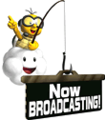
"Now BROADCASTING" Lakitu sign (Mario Kart Arcade GP 2)
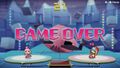
"Wario-Man" (WarioWare: D.I.Y. Showcase)
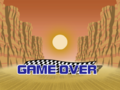
"GAME OVER" (WarioWare: D.I.Y. Showcase)
"Diamond Taxi" (WarioWare: D.I.Y. Showcase)


DFP Song[edit]
DFP Song (华康宋体 Huá kāng Sòngtǐ) is a serif typeface for Simplified Chinese from DynaComware. It is used for player control indicators in the fighter select screen, How to Play, and backup text in the Simplified Chinese version of Super Smash Bros., and the text in the Fire Emblem: Three Houses microgame, dialogue for The Supreme Developer, text in Rising Star, and the logo for Gotta Bounce in the Simplified Chinese version of WarioWare: Get It Together!.
DFP TF Lei Sho[edit]
DFP TF Lei Sho (DFP唐風隷書体 DFP Tángfēng Lìshū Tǐ) is a script typeface from DynaComware. It is used for text in the Mordon cards of the Japanese Super Mario Advance 4: Super Mario Bros. 3 e-Reader cards.
DFP Ya Yi[edit]
DFP Ya Yi (华康雅艺体 Huá kāngyǎ Yì Tǐ) is a slab-serif for Simplified Chinese released by DynaComware. It is used for the logo for Sly Angle in the Simplified Chinese version of WarioWare: Get It Together! and text in the mode select and the Not-So-Relaxing Rapids stage in the Simplified Chinese version of WarioWare: Move It!.
DNP Shuei Antique[edit]

DNP Shuei Antique (DNP 秀英アンチック DNP Shūei Anchikku) is a sans-serif typeface designed by Dai Nippon Printing for Fontworks, first released in 2017.[73] It is used for text in Dribble & Spitz's stage in WarioWare: Get It Together!.
Dom Casual[edit]

Dom Casual is a casual script typeface designed by Peter Dom for American Type Founders, first released in 1963.[74] It is used both in The Super Mario Bros. Super Show! and the Donkey Kong Country television series (in its bold variant) for general text, including title cards and credits information. It is also used in the Super Mario World television series for credits only. It is also used for the logo for Larry's Chillton Hotel in Hotel Mario and the logo for Balloon Trip Breeze in Nintendo Land, albeit with a modified "Z".
Dot Gothic 12[edit]

Dot Gothic 12 (ドットゴシック 12 Dotto Goshikku 12) is a pixelated sans-serif typeface from Fontworks, first released in 2006.[75] it is used in the logo for Sneaky Gamer in WarioWare Gold, text in 9-Volt's stage in WarioWare: Move It!, text at the start of the credits in the Nintendo Switch remake of Super Mario RPG, and Patissiere Peach's stage in Princess Peach: Showtime!.
Dot Gothic 16[edit]

Dot Gothic 16 (ドットゴシック 16 Dotto Goshikku 16) is a pixelated sans-serif typeface from Fontworks, first released in 2006.[76] It is used for text in 9-Volt's stage in WarioWare: Get It Together!.
Duke[edit]
Duke is a serif typeface from Bay Animation, first released in 1994. It is based on Times New Roman. It is used for the interface in the following games:
- Dance Dance Revolution: Mario Mix (European languages)
- Mario Party 8 (European languages)
Earth[edit]
Earth is a geometric sans-serif typeface, first released around 1974.[77] It is used for the logo for the Famicom 3D System.
Eckmann[edit]

Eckmann, Eckmann-Type or Eckmann-Schrift is a typeface designed by Otto Eckmann and first released by Klingspor Type Foundry in 1900.[78] In Mario Kart Tour and Mario Kart 8, it is used in the logo for Blooper's Seafood Bar.
Eclat[edit]
Eclat is a script typeface designed by Doyald Young for Letraset, first released in 1986.[79] It is used for the European/Australasian logo for DK: King of Swing.
Elektrix[edit]

Elektrix is an uneven display typeface designed by Zuzana Licko for Emigre, first released in 1989.[80] It is used for the logo for Morton's WoodDoor-Hysteria Hotel in Hotel Mario.
El Grande[edit]
El Grande is a sans-serif typeface designed by Jim Parkinson for The Font Bureau, first released in 1993.[81] It is used for the North American logo for Mario & Luigi: Dream Team.
Empire[edit]
.png)
Empire is a sans-serif typeface designed by Morris Fuller Benton for the American Type Founders, first released in 1937.[82] It is used for the Steam Gardens ad in New Donk City in Super Mario Odyssey.
Enge Wotan-Grotesk[edit]
Enge Wotan-Grotesk is a sans-serif typeface developed by German company Wagner & Schmidt circa 1914.[83] It serves as the basis for the logo of Super Mario Land 2 - 6 Golden Coins and Wario Land: Super Mario Land 3, with alterations to the bars of the A, E, and the 3, and the bowl of the P, which are angled upward.
Super Mario Land 2 - 6 Golden Coins logo ("SUPER MARIO LAND")
Wario Land: Super Mario Land 3 logo ("SUPER MARIO LAND 3")

Eras[edit]
Eras is a humanist sans-serif typeface designed by Albert Boton and Albert Hollenstein for ITC, first released in 1976.[84] Eras Bold is used in Super Smash Bros. for display text and text in menu backgrounds and the title screen and Super Smash Bros. Melee for the ordinal number suffixes on the winner screen.
Eras Bold is also seen for the number "2" in the end screen of the demo version of Mario vs. Donkey Kong 2: March of the Minis. It is also used for the "Arcade GP" text in the Mario Kart Arcade GP series logo and Diddy Kong Racing DS for the word "DS" on the logo and text on the Discovery Card.
Mario Kart Arcade GP logo
The number "2" in the Mario vs. Donkey Kong 2: March of the Minis demo set in Eras Bold.

Estro[edit]
Estro is a serif typeface designed by Aldo Novarese for Nebiolo, first released in 1961.[85] It is seen in Mario Kart 8, Mario Kart Tour, Mario Kart 8 Deluxe and Yoshi's Crafted World for the logo for Princess Orange, and in Tour for the Ludwig Painting logo.

Excelsior[edit]

Excelsior is a slab-serif typeface designed by Chauncey H. Griffith for Linotype, first released in 1931.[86] It is used for the logo for Wario Land II.
References[edit]
- ^ Fonts In Use. Aachen in use. https://fontsinuse.com/typefaces/1585/aachen. Retrieved June 29, 2024.
- ^ Fonts In Use. Adobe Garamond in use. https://fontsinuse.com/typefaces/4081/adobe-garamond. Retrieved September 21, 2024.
- ^ Fonts In Use. ITC Garamond in use. https://fontsinuse.com/typefaces/1772/itc-garamond. Retrieved November 1, 2024.
- ^ Fonts In Use. Monotype Garamond in use. https://fontsinuse.com/typefaces/8863/monotype-garamond. Retrieved April 12, 2025.
- ^ Fonts In Use. Adsans in use. https://fontsinuse.com/typefaces/13121/adsans. Retrieved November 1, 2024.
- ^ Fonts In Use. Aki Lines in use. https://fontsinuse.com/typefaces/7854/aki-lines. Retrieved March 20, 2025.
- ^ Fonts In Use. Alternate Gothic in use. https://fontsinuse.com/typefaces/1591/alternate-gothic. Retrieved July 21, 2024.
- ^ Fonts In Use. Amelia in use. https://fontsinuse.com/typefaces/1138/amelia. Retrieved July 21, 2024.
- ^ Fonts In Use. American Text in use. https://fontsinuse.com/typefaces/12501/american-text. Retrieved June 19, 2024.
- ^ Wikipedia. (2024). American Typewriter. https://en.wikipedia.org/wiki/American_Typewriter. Retrieved June 13, 2024.
- ^ Fontworks. Yutaka Sato. https://en.fontworks.co.jp/company/designer/sato-y/. Retrieved June 15, 2024.
- ^ Type Labo. https://www.type-labo.jp/. Retrieved June 15, 2024.
- ^ Wikipedia. (2024) Antique Olive. https://en.wikipedia.org/wiki/Antique_Olive. Retrieved June 13, 2024.
- ^ Fontworks. あおかね Std. https://lets.fontworks.co.jp/fonts/309. Retrieved June 15, 2024.
- ^ Fonts In Use. Arrus in use. https://fontsinuse.com/typefaces/223/arrus. Retrieved April 16, 2025.
- ^ Wikipedia. (2024). Arial. https://en.wikipedia.org/wiki/Arial. Retrieved June 13, 2024.
- ^ Fonts In Use. Arnold Böcklin in Use. https://fontsinuse.com/typefaces/1142/arnold-boecklin. Retrieved June 29, 2024.
- ^ Fonts In Use. AtomicSuck in use. https://fontsinuse.com/typefaces/14183/atomic-suck. Retrieved July 27, 2024.
- ^ Fonts In Use. Aurea Ultra in use. https://fontsinuse.com/typefaces/6410/aurea-ultra. Retrieved March 20, 2025.
- ^ Fonts In Use. Annonce / Aurora-Grotesk V in use. https://fontsinuse.com/typefaces/13730/annonce-aurora-grotesk-v. Retrieved September 21, 2024.
- ^ Wikipedia. (2025). Avenir (typeface). https://en.wikipedia.org/wiki/Avenir_(typeface). Retrieved April 27, 2025.
- ^ Wikipedia. (2025). Avenir Next. https://en.wikipedia.org/wiki/Avenir_(typeface)#Avenir Next. Retrieved April 27, 2025.
- ^ Fonts In Use. AZ Cut Script in use. https://fontsinuse.com/typefaces/14317/az-cut-script. Retrieved September 8, 2024.
- ^ Fontworks. ベビポップ Std. https://lets.fontworks.co.jp/fonts/220. Retrieved June 15, 2024.
- ^ Wikipedia. (2024) Banco (typeface). https://en.wikipedia.org/wiki/Banco_(typeface). Retrieved June 21, 2024.
- ^ Wikipedia. (2024). Bank Gothic. https://en.wikipedia.org/wiki/Bank_Gothic. Retrieved July 19, 2024.
- ^ Wikipedia. (2024). Bauhaus (typeface). https://en.wikipedia.org/wiki/Bauhaus_(typeface). Retrieved June 13, 2024.
- ^ Fonts In Use. Beachwood in use. https://fontsinuse.com/typefaces/188595/beachwood. Retrieved June 8, 2025.
- ^ Wikipedia. (2024). Belwe Roman. https://en.wikipedia.org/wiki/Belwe_Roman. Retrieved June 21, 2024.
- ^ Wikipedia. (2024). Berlin Sans. https://en.wikipedia.org/wiki/Matthew_Butterick. Retrieved June 23, 2024.
- ^ Fonts In Use. Berlin Sans in Use. https://fontsinuse.com/typefaces/2178/berlin-sans. Retrieved June 23, 2024.
- ^ Wikipedia. (2024). Berthold Block. https://en.wikipedia.org/wiki/Berthold_Block. Retrieved September 15, 2024.
- ^ Fonts In Use. Binner in use. https://fontsinuse.com/typefaces/4880/binner. Retrieved September 21, 2024.
- ^ 7NTypes. Blackplotan. https://7ntypes.com/blackplotan-font/. Retrieved June 20, 2024.
- ^ Fonts In Use. Blippo in use. https://fontsinuse.com/typefaces/3801/blippo. Retrieved June 29, 2024.
- ^ MyFonts. (2024). Blue Global. https://www.myfonts.com/collections/blue-global-font-t-26. Retrieved July 15, 2024.
- ^ My Fonts. Bodoni Poster. https://www.myfonts.com/collections/poster-bodoni-font-linotype. Retrieved June 21, 2024.
- ^ a b Wikipedia. (2021). Chauncey H. Griffith. https://en.wikipedia.org/wiki/Chauncey_H._Griffith. Retrieved June 21, 2024.
- ^ Fonts In Use. Boink in Use. https://fontsinuse.com/typefaces/7958/boink. Retrieved July 24, 2024.
- ^ MyFonts. (2025). Bonedigger. https://www.myfonts.com/collections/bonedigger-font-hanoded. Retrieved April 16, 2025.
- ^ Wikipedia. (2024). Bookman (typeface). https://en.wikipedia.org/wiki/Bookman_(typeface). Retrieved June 21, 2024.
- ^ Wikipedia. (2024). Bookman (typeface). https://en.wikipedia.org/wiki/Bookman_(typeface). Retrieved June 19, 2024.
- ^ Wikipedia. (2024). Broadway (typeface). https://en.wikipedia.org/wiki/Broadway_(typeface). Retrieved June 20, 2024.
- ^ Fonts In Use. Broken English in use. https://fontsinuse.com/typefaces/94233/broken-english. Retrieved April 27, 2025.
- ^ Wikipedia. (2024). Brush Script. https://en.wikipedia.org/wiki/Brush_Script. Retrieved June 19, 2024.
- ^ Fontworks. ぶどう Std. https://lets.fontworks.co.jp/fonts/281. Retrieved April 13, 2025.
- ^ TypeNetwork. (2024). Cafeteria. https://store.typenetwork.com/foundry/frerejonestype/fonts/cafeteria. Retrieved July 26, 2024.
- ^ Fonts In Use. (2024). Calcite. https://fontsinuse.com/typefaces/3839/calcite. Retrieved July 18, 2024.
- ^ Fonts In Use. (2024). Cancun. https://fontsinuse.com/typefaces/32025/cancun. Retrieved June 20, 2024.
- ^ Fontworks. カラット Std. https://lets.fontworks.co.jp/fonts/158. Retrieved June 19, 2024.
- ^ Fonts In Use. Caslon Antique in use. https://fontsinuse.com/typefaces/16044/caslon-antique. Retrieved May 25, 2025.
- ^ Fonts In Use. Adobe Caslon in use. https://fontsinuse.com/typefaces/65/adobe-caslon. Retrieved September 8, 2024.
- ^ Fontworks. セザンヌ Pro. https://lets.fontworks.co.jp/fonts/81. Retrieved July 23, 2024.
- ^ Fontworks. ニューセザンヌ Pro. https://lets.fontworks.co.jp/fonts/84. Retrieved July 23, 2024.
- ^ Fontworks. キアロ Std. https://lets.fontworks.co.jp/fonts/196. Retrieved June 19, 2024.
- ^ Fonts In Use. City in use. https://fontsinuse.com/typefaces/67/city. Retrieved January 7, 2025.
- ^ Fonts In Use. Cloister Black in use. https://fontsinuse.com/typefaces/7875/cloister-black. Retrieved November 5, 2024.
- ^ Fontworks. コメット Std. https://lets.fontworks.co.jp/fonts/160. Retrieved June 19, 2024.
- ^ Wikipedia. (2024). Comic Sans. https://en.wikipedia.org/wiki/Comic_Sans. Retrieved June 15, 2024.
- ^ Shesez (December 1, 2024). Out of Bounds Secrets. YouTube. Retrieved June 15, 2024.
- ^ Wikipedia. (2024). Compacta (typeface). https://en.wikipedia.org/wiki/Compacta_(typeface). Retrieved June 19, 2024.
- ^ Fonts In Use. Cooper Black in Use. https://fontsinuse.com/typefaces/7357/cooper-black. Retrieved June 29, 2024.
- ^ Wikipedia. (2024). Copperplate Gothic. https://en.wikipedia.org/wiki/Copperplate_Gothic. Retrieved June 21, 2024.
- ^ Fonts In Use. Corporate in use. https://fontsinuse.com/typefaces/42847/corporate. Retrieved July 17, 2024.
- ^ Fonts In Use. Cosmos in use. https://fontsinuse.com/typefaces/16972/cosmos. Retrieved July 17, 2024.
- ^ Wikipedia. Courier (typeface). https://en.wikipedia.org/wiki/Courier_(typeface). Retrieved August 5, 2025.
- ^ Fonts In Use. Crackhouse in use. https://fontsinuse.com/typefaces/45165/crackhouse. Retrieved May 29, 2025.
- ^ Fonts In Use. Croissant in use. https://fontsinuse.com/typefaces/12092/croissant. Retrieved April 1, 2025.
- ^ Fonts In Use. Cruz Swinger in Use. https://fontsinuse.com/typefaces/17158/cruz-swinger. Retrieved June 21, 2024.
- ^ Fontworks. カッコウ Std. https://lets.fontworks.co.jp/fonts/3371. Retrieved June 19, 2024.
- ^ DFLiYuan(華康儷圓). DynaComware. Retrieved 21 June 2024.
- ^ Fontworks. DFゴシック体 Pro. https://lets.fontworks.co.jp/fonts/645. Retrieved June 20, 2024.
- ^ Fontworks. DNP 秀英アンチック Std. https://lets.fontworks.co.jp/fonts/261. Retrieved June 19, 2024.
- ^ Wikipedia. (2024). Dom Casual. https://en.wikipedia.org/wiki/Dom_Casual. Retrieved June 19, 2024.
- ^ Fontworks. ドットゴシック 12 Std. https://lets.fontworks.co.jp/fonts/182. Retrieved June 19, 2024.
- ^ Fontworks. ドットゴシック 16 Std. https://lets.fontworks.co.jp/fonts/184. Retrieved June 19, 2024.
- ^ Fonts In Use. Earth in use. https://fontsinuse.com/typefaces/76826/earth. Retrieved April 27, 2025.
- ^ Fonts In Use. (2024). Eckmann in use. https://fontsinuse.com/typefaces/6802/eckmann. Retrieved June 27, 2024.
- ^ Fonts In Use. (2024). Eclat. https://fontsinuse.com/typefaces/40345/eclat. Retrieved June 20, 2024.
- ^ Fonts In Use. Elektrix in use. https://fontsinuse.com/typefaces/2011/elektrix. Retrieved May 25, 2025.
- ^ TypeNetwork. (2024). El Grande. https://store.typenetwork.com/foundry/designerstudio/fonts/el-grande. Retrieved July 4, 2024.
- ^ Fonts In Use. Empire in use. https://fontsinuse.com/typefaces/2222/empire. Retrieved January 7, 2025.
- ^ @Letter_Library. (December 4, 2017).Enge Wotan-Grotesk. (2017). X. Retrieved June 30, 2024.
- ^ Wikipedia. (2024). Eras (typeface). https://en.wikipedia.org/wiki/Eras_(typeface). Retrieved June 19, 2024.
- ^ Fonts In Use. (2024). Estro in use. https://fontsinuse.com/typefaces/7862/estro. Retrieved June 29, 2024.
- ^ Fonts In Use. Excelsior in use. https://fontsinuse.com/typefaces/4041/excelsior. Retrieved April 17, 2025.