List of licensed fonts (L–Z)
It has been requested that more images be uploaded for this article. Remove this notice only after the additional images have been added. Specifics: Illustrate all fonts listed
- Main article: List of fonts
This is a list of licensed typefaces and fonts (L–Z) used in games and related media within the Super Mario franchise.
LineG[edit]
LineG (ラインG RainG) is a geometric sans-serif typeface designed by Kyoko Katsumoto and Shigeru Katsumoto for Visual Design Laboratory, first released in 2000.[1] It is used for the interface in Super Mario Bros. Wonder and its Switch 2 Edition for the kanji.
Lithos[edit]
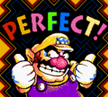
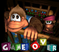
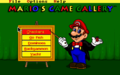
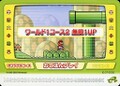
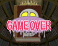
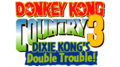
Lithos is a sans-serif typeface designed by Carol Twombly for Adobe Type, first released in 1989.[2] The font, in its Black variant, is employed for certain display and scenery text in Donkey Kong Country 3: Dixie Kong's Double Trouble!, Donkey Kong Land III, Diddy Kong Racing and its DS remake and Wario Land 3 and for general interface text and some scenery texr in Donkey Kong 64. A modified version is used for interface text in the GBA versions of the Donkey Kong Country series. Mario's Game Gallery also features Lithos Black for the game's title on the main menu, and Super Mario 64 uses it for the "COURSE" text on course icons.
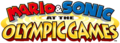
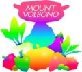
More recently, it has been used for the logo of the Mario & Sonic games, in Mario Kart 8, Mario Kart Tour and Mario Kart 8 Deluxe on the logo of the Coconut Cafe business (in the form of Lithos Black in these cases), and also in Super Mario Odyssey as part of the Mount Volbono sticker and its New Donk City ad. It is also used for text on an artwork for Mario Pinball Land.
Lithos Black was also employed for the pre-release Japanese logo for Super Mario Advance. It was also originally used in the interface in Yoshi's Woolly World before being replaced by New Rodin in the final release.
Wario Land 3
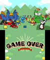
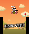
Donkey Kong Country 3: Dixie Kong's Double Trouble! Game Over screen

Super Mario 64
Mario's Game Gallery main menu
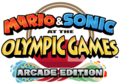
Used for the "OLYMPIC GAMES" text in the logo for Mario & Sonic at the Olympic Games
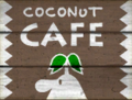
"CAFE" in Lithos Black in Mario Kart 8

"MARIO ADVANCE" in Lithos Black


LogoG[edit]
LogoG (ロゴG RogoG) is a geometric sans-serif typeface designed by Kyoko Katsumoto and Shigeru Katsumoto for Visual Design Laboratory, first released in 2000.[3] Its Latin characters are similar to Eurostile. It is used for the interface in Super Mario Bros. Wonder and its Switch 2 Edition for the kana.
LogoJr[edit]
LogoJr (ロゴJr RogoJr) is a geometric sans-serif typeface designed by Kyoko Katsumoto and Shigeru Katsumoto for Visual Design Laboratory, first released in 2000.[4] It is used for the interface in the Simplified Chinese version of Mario Tennis Fever.
Logona[edit]

Logona (ロゴナ Rogona) is a geometric sans-serif typeface designed by Kyoko Katsumoto and Shigeru Katsumoto for Visual Design Laboratory, first released in 2015.[5] Its Latin characters are similar to Eurostile. It is used for the interface in the following games:
- Mario Golf: Super Rush (Japanese language)
- Super Mario RPG (Nintendo Switch)
- Super Mario Party Jamboree (Japanese language)
- Super Mario Party Jamboree – Nintendo Switch 2 Edition + Jamboree TV (Japanese language)
- Mario Tennis Fever
Lucida Blackletter[edit]

Lucida Blackletter is a script typeface designed by Charles Bigelow and Kris Holmes, first released in 1992.[6] It is used for the background in the Lottery Shop in Mario Party 4
Lucida Grande[edit]
Lucida Grande is a humanist sans-serif typeface designed by Charles Bigelow and Kris Holmes, first released in 1999.[7] A modified version of Lucida Grande Bold is used for the logos of the Nintendo DS and Nintendo 3DS systems, and being used for these logos, it is also used for the logo of Tetris DS. It is also used for cutscene text in the Nintendo Switch remake of Mario vs. Donkey Kong, and the "ND" in the second NDcube logo.

Nintendo DS logo ("DS")

Nintendo 3DS logo ("3DS")

NDcube logo ("ND")
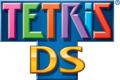
Tetris DS logo ("DS")
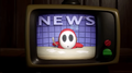
Mario vs. Donkey Kong ("NEWS")

Maiandra[edit]
Maiandra is a typeface designed by Dennis Pasternak by Galapagos.[8] It is used for the year text in the logo for the Nintendo Campus Challenge.
Manito LP[edit]

Manito LP is an uneven typeface designed by Garrett Boge for LetterPerfect, first released in 1990.[9] It is used for the logo for Donkey Kong's Crash Course in Nintendo Land.
Manyo Gyosho[edit]
Manyo Gyosho (万葉行書 Man'yō Gyōsho) is a scipt typeface from Hakushu Shota. It is used for the GOAL! text in Kung Fu in Game & Wario.
Mason Serif[edit]

Mason Serif is a serif display typeface designed by Jonathan Barnbrook for Emigre, first released in 1992.[10] Both Mason Serif and Mason Alternate are used for the logo for Ludwig's Thump Castle Hotel in Hotel Mario.
Matisse[edit]
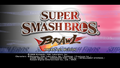
Matisse (マティス Matisu) is a serif typeface from Fontworks designed by Toshiyasu Satō for Fontworks, first released in 1992.[11] It is used for the logo of the Super Smash Bros. series since Super Smash Bros. Brawl. It is also used in the series for various interface text in Brawl. It is also used for text in the file select and results screen of Luigi's Mansion, the Isle Defino maps in the Super Mario Sunshine guidebook, background text in the Luigi's Card Games minigame in Super Mario 64 DS, text in Nintendo DSi Metronome, interface text in Game & Wario, and text in Rising Star in WarioWare: Get It Together!.
Matisse Eleganto[edit]
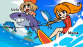
Matisse Eleganto (マティスえれがんと Matisu Ereganto) is an alternative version of Matisse designed by Yutaka Sato for Type Labo, first released in 1997.[12] It is Matisse with Eleganto Kana. It is used for text in Mona's stage and the icon denoting locked unlockables in WarioWare Gold and text in Jimmy T.'s stage in WarioWare: Move It!.
Matisse V[edit]

Matisse V (マティスV Matisu V) is an alternative version of Matisse designed by Toshiyasu Satō, first released in 1992.[13] It is Matisse with V Type Kana. It is used for text for winner names and Challenger's Approach in Super Smash Bros. Melee, text for the song lyrics in Super Smash Bros. Brawl, and the logo for Super Hard in WarioWare Gold.
Mystery[edit]
Mystery (ミステリ Misuteri)is an alternative version of Matisse released in 1998.[14] It is used for the location name HUD in Luigi's Mansion and text in 9-Volt's stage in WarioWare: Move It!.
Luigi's Mansion

Comic Mystery[edit]

Comic Mystery (コミックミステリ Komikkumisuteri) is an alternative version of Mystery released in 2008.[15] It is used for text for Bowser's invitation in Mario Superstar Baseball, text in Ashley in Game & Wario, text in Ashley's stage, Pumpkin Panic, and the logo for Sneaky Gamer in WarioWare Gold, and the interface in the Nintendo 3DS remake of Luigi's Mansion.
Mayberry[edit]
Mayberry is a geometric sans-serif typeface designed by Steve Matteson for Ascender Corp., first released in 2006.[16] It is used for the logo for Donkey Kong Country Returns 3D.
Memphis[edit]
Memphis is a geometric slab-serif typeface designed by Rudolf Wolf for Stempel, first released in 1929.[17] It is used for the interface for the Wii version of Punch-Out! in western langauges.
Méridien[edit]

Méridien is a serif typeface designed by Adrian Frutiger for Deberny & Peignot, first released in 1957.[18] It is used for the "D.K." sign on Donkey Kong's Treehouse and the Lost Mines sign in an artwork in Donkey Kong Country.


Microgramma[edit]
Microgramma is a geometric sans-serif typeface designed by Alessandro Butti for Nebiolo, first released in 1952.[19] It is used for labels on various Famicom accessories, such as R.O.B. and the Family Computer Disk System. A modified version is also used for text on the Game Boy Micro, albeit having gaps in the "A" and "R". It is also used for button labels on the iQue Player and its Multiplayer controller. It is also used for artwork of the golf clubs in the Mario Golf series until Advance Tour.
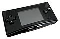
Game Boy Micro ("a", "b", "L", "R", "START", "SELECT")

Eurostile[edit]
Eurostile is an alternative version of Microgramma designed by Aldo Novarese for Nebiolo, first released in 1962.[20] It is used for labels on the Family Basic Data Recorder. It is also used for background text in Super Smash Bros. A modified version is used for the first logo for Nintendo Power, which was reused for its podcast.
Eurostile Condensed is used for the interface in Mario Kart 64 in western languages.
Mingo Gothic SG[edit]

Mingo Gothic SG is a geometric sans-serif typeface designed by Jim Spiece for Spiece Graphics, first released in 1991.[21] A modified version is used for the logo for Nintendo PowerFest '94.
Mister Earl[edit]
Mister Earl is a typeface designed by Jennifer Maestre and Jim Byles for Bitstream, first released in 1991.[22] It is used for the Moo Moo Milk logo seen in Mario Kart 8 and Mario Kart 8 Deluxe.
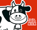
Moo Moo Milk logo

Mode Mincho A[edit]
Mode Mincho A (モード明朝A Mōdo Minchō A) is a serif typeface designed by Shigenobu Fujita for Fontworks, first released in 2010.[23] It is used for the credits text in the Super Mario 3D All-Stars version of Super Mario 64.
Modula Serif[edit]

Modula Serif is a slab-serif typeface designed by Zuzana Licko for Emigre, first released in 1985.[24] It is used for the logo for Nintendo Challenge.
Monaco[edit]

Monaco is a monospaced sans-serif typeface designed by Susan Kare for Apple Inc, first released in 1984.[25] It is used for pause text in Super Smash Bros. Melee.
Moore Computer[edit]

Moore Computer is a geometric typeface designed by James H. Moore for VGC, first released in 1968.[26] A modified version is used for text in the stage select screen in Super Smash Bros. Melee.
MOSuuji[edit]
MOSuuji is a numeral-only typeface from Morisawa. It is used in Super Smash Bros. Brawl, with its H A DGn variant used for numbers in ruleset settings, its H C AFn variant used for numbers in the aspect ratio settings, its H C IDn variant used for the stage select cursor in online mode in the Japanese language, its H E AAn variant used for general number text, its H D AJn variant used for the coin HUD in Spectator Mode, and its H D JHn variant used for the distance in Home-Run Contest.
Motoya Cedar[edit]
Motoya Cedar (モトヤシーダ Motoyashīda) is a sans-serif typeface from Motoya. It is used for text for the Japanese Nintendo Wi-Fi USB Connector and its corresponding disc.
MP ARUDJingxiheiGb4[edit]
MP ARUDJingxiheiGb4 is a sans-serif typeface designed by Arphic for Morisawa. It is used for the interface in the Traditional Chinese version of the Nintendo Switch remake of Mario vs. Donkey Kong.
MS Gothic[edit]
MS Gothic is a sans-serif typeface designed by RICOH for Microsoft, first released in 1993.[27] It is used for the interface in Yoshi's Woolly World for the Japanese language.
Munhwabangsong[edit]
Munhwabangsong ("문화방송", Munhwa Broadcasting Corporation) is a display typeface for Korean released by Hanfont. It is based on Banco. It is used for world names and warning alerts in the Korean version of Wario Land: Shake It! and the mode select and text in the Not-So-Relaxing Rapids stage in the Korean version of WarioWare: Move It!.
Myriad[edit]
Myriad is a humanist sans-serif typeface designed by Robert Slimbach and Carol Twombly for Adobe Type, first released in 1992.[28] It is used for the logos and branding for the Nintendo 64, including the "64" in the 64DD logo, Super Mario 64 and its DS remake, StreetPass Mii Plaza, and SpotPass. It is also used for How to Play and Training Mode text in Super Smash Bros. in western languages and stat text in European languages. It is also used for text in the ending advertisement in Wario Land 4 and text in Punch-Out Pizzeria in The Super Mario Bros. Movie. Additionally, it is the primary font in the American and Australian instruction booklets for Mario Party 6.
Super Mario 64 ("64")
Super Mario 64 ("64")

StreetPass Mii Plaza ("StreetPass", "PLAZA")
Nadianne[edit]

Nadianne is a humanist typeface designed by Aldo Novarese for Monotype, first released in 1994.[29] It is used for text in opponent screens in Super Smash Bros.
Naru[edit]
Naru (ナール Nāru) is a rounded sans-serif typeface designed by Yukihiro Nakamura for Sha-Ken, first released in 1972.[30] It is used for Japanese labels on the Family Computer console and accessories.
Neo Sans[edit]

Neo Sans is a geometric sans-serif typeface designed by Sebastian "Seb" Lester for Monotype, first released in 2004.[31] Neo Sans Pro is used for the interface in Mario & Sonic at the Olympic Games Tokyo 2020 for Western languages.
Neuland[edit]
- Possible alternatives include: Nueland.

Neuland is a display typeface designed by Rudolf Koch for Klingspor, first released in 1923.[32]
It is used in Donkey Kong Country Returns and Donkey Kong Country: Tropical Freeze for display text, such as menu titles and level titles on the map and loading screens, as well as menu text in Returns. It is also used for an artwork of Toad holding a sign for Mario Party.
In Mario Kart 8, Mario Kart Tour and Mario Kart 8 Deluxe, it is used in the logo for Bullet Bill Speed Trial, Wild Yoshi Sanctuary and Yoshi Runners.
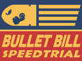
Mario Kart 8
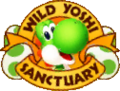
Mario Kart 8
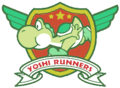
Mario Kart 8


New Cinema[edit]
New Cinema (ニューシネマ Nyūshinema) is a slab-serif typeface designed by Hideo Satō for Fontworks, first released in 2007.[33] It is used for text in the Ashley and Pirates stages in Game & Wario.
New Inspiration - Crazy Style[edit]
New Inspiration - Crazy Style (新灵感-狂草体 Xīn Línggǎn-kuángcǎo Tǐ) is a script typeface used for the logo and text for Foiled! in WarioWare Gold.
New Rodin[edit]

New Rodin (ニューロダン Nyū Rodan) is a geometric sans-serif typeface from Fontworks, first released in 2002.[34] Its Latin characters are similar to Eurostile. It is used for the interface in the following games:
- Tetris DS
- Mario & Sonic at the Olympic Games
- Mario Super Sluggers (minigames and credits text)
- Nintendo DSi Metronome
- Club Nintendo Picross (hint icon)
- Mario & Luigi: Dream Team
- Mario Kart Arcade GP DX
- NES Remix games
- Mario Kart 8
- Club Nintendo Picross+ (hint icon)
- Dr. Mario: Miracle Cure
- Yoshi's Woolly World
- Mario Tennis: Ultra Smash
- Mario & Luigi: Paper Jam
- All Arcade Archives titles
- Mario Sports Superstars
- Mario Kart 8 Deluxe
- Mario & Luigi: Superstar Saga + Bowser's Minions
- Mario Tennis Aces
- WarioWare Gold
- Super Mario Party
- Mario & Luigi: Bowser's Inside Story + Bowser Jr.'s Journey
- New Super Mario Bros. U Deluxe (Korean language)
- Mario Kart Tour
- Mario Kart Live: Home Circuit
- Mario Golf: Super Rush (Western languages)
- WarioWare: Get It Together!
- Mario Party Superstars
- Nintendo World Championships: NES Edition
- Super Mario Party Jamboree
- Super Mario Party Jamboree – Nintendo Switch 2 Edition + Jamboree TV
It is also used for the interface in the Mii Channel, text on the Cell Phone thing in Paper Mario: Sticker Star, and in the Japanese logo of Fortune Street. It is also used for chapter names in the Wii Virtual Console Japanese version of Yoshi's Story. It is also used for the Japanese logo for Disco in Game & Wario.
News Gothic[edit]

News Gothic is a sans-serif typeface designed by Morris Fuller Benton for the American Type Founders, first released in 1908.[35] It is used for the Squaks Park sign in New Donk City in Super Mario Odyssey and in Mario Strikers: Battle League for body text. It is also used on the Official Nintendo Seal of Quality as it was known from 1989–2003.
Noto Sans[edit]
Noto Sans is a humanist sans-serif typeface designed by Steve Matteson for Google, first released in 2012.[36] It is also used for the icon when adding friends via codes on the Nintendo Switch app.
Noyh[edit]

Noyh is a geometric sans-serif typeface designed by Chatnarong Jingsuphatada for Typesketchbook, first released in 2015.[37] It is used in Mario + Rabbids Sparks of Hope in its R Medium variant for body text in western and Russian languages.
OL Butterfly[edit]

OL Butterfly is a sans-serif typeface designed by Dennis Ortiz-Lopez, first released in 2003.[38] It is used for heading text on the Mario Party-e cards. A modified version is used in the western logos for Mario & Luigi: Superstar Saga + Bowser's Minions.
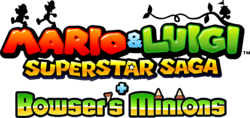
Mario & Luigi: Superstar Saga + Bowser's Minions ("Bowsers Minions")
![Mario & Luigi: Superstar Saga + Bowser's Minions [French] ("Les sbires de Bowser")](https://mario.wiki.gallery/images/thumb/4/4e/M%26LSSBM_French_logo.png/250px-M%26LSSBM_French_logo.png)
Mario & Luigi: Superstar Saga + Bowser's Minions [French] ("Les sbires de Bowser")
![Mario & Luigi: Superstar Saga + Bowser's Minions [Spanish] ("Secuaces de Bowser")](https://mario.wiki.gallery/images/thumb/7/70/MLSS_BM-ESEULogo.png/250px-MLSS_BM-ESEULogo.png)
Mario & Luigi: Superstar Saga + Bowser's Minions [Spanish] ("Secuaces de Bowser")
![Mario & Luigi: Superstar Saga + Bowser's Minions [German] ("Bowsers Schergen")](https://mario.wiki.gallery/images/thumb/b/b0/MLSS_BM-GermanyLogo.png/250px-MLSS_BM-GermanyLogo.png)
Mario & Luigi: Superstar Saga + Bowser's Minions [German] ("Bowsers Schergen")
![Mario & Luigi: Superstar Saga + Bowser's Minions [Spanish] ("Secuaces de Bowser")](/File:MLSS_BM-ESEULogo.png)
![Mario & Luigi: Superstar Saga + Bowser's Minions [German] ("Bowsers Schergen")](/File:MLSS_BM-GermanyLogo.png)
Othello[edit]
Othello is a geometric sans-serif display typeface designed by Gustave F. Schroeder for Central, first released in 1884.[39] It is used for the logo for the Family Computer Disk System.
Optima[edit]
Optima is a humanist sans-serif typeface designed by Hermann Zapf for the Stempel Type Foundry, first released in 1958.[40] Optima LT is used for the logo for Princess Peach: Showtime!. A modified version of Optima Bold is also used for the Tostarena sticker in Super Mario Odyssey.
Orbit-B[edit]
'Orbit-B is a geometric typeface designed by Stan Biggenden for VGC, first released in 1972.[41] It is used for the "Select" text in the background of the fighter select screen in Super Smash Bros. Melee.
Overmuch[edit]

Overmuch is a rounded sans-serif typeface from Digital Graphic Labs, first released in 1998. It is used for the closing screen in the demo of Mario vs. Donkey Kong 2: March of the Minis, with modifications to characters, such as the "Y" and "!".
Oz Handicraft[edit]
Oz Handicraft is a sans-serif typeface designed by George Ryan for Bitstream, first released in 1991.[42] It is used on the logo for the Game & Watch Gallery series' and its games' logos, and is also used for text on the boxarts of the first two installments.
PalRamune[edit]

PalRamune (パルラムネ ParuRamune) is a Point of Purchase typeface designed by Akiko Ochi for Fontworks, first released in 2017.[43] It is used for the logo for Balloon Bang in WarioWare: Get It Together! and text in Mona's stage in WarioWare: Move It!.
PalRetron[edit]

PalRetron (パルレトロン ParuRetoron) is a typeface designed by Akiko Ochi for Fontworks, first released in 2019.[44] It is used for the logos for Medusa March and Copycat Mirror in WarioWare: Move It!.
Park Avenue[edit]

Park Avenue is a script typeface designed by Robert E. Smith for the American Type Founders, first released in 1933.[45] It is used for song lyrics in the English version of Super Smash Bros. Brawl.
Peachy Keen JF[edit]
Peachy Keen JF is a sans-serif typeface designed by Jason Walcott for Jukebox Type, first released in 2008.[46] It is used for the "Jamboree" text in the Super Mario Party Jamboree logo and its Switch 2 Edition.
Pepita[edit]

Pepita is a script typeface designed by Imre Reiner for Monotype, first released in 1959.[47] It is used for text for artwork of Peach's Birthday Cake in Mario Party.
Phosphate[edit]

Phosphate is a sans-serif typeface designed by Steve Jackaman and Jakob Erbar for Red Rooster.[48] Its Inline variant is used for the "Gold" text in the WarioWare Gold logo.
PiePie[edit]
PiePie is a sans-serif typeface designed by Ryoichi Tsunekawa for Dharma Type, first released in 2014.[49] It is used for the logo for WarioWare: Get It Together!
Pop Fury[edit]

Pop Fury (Popフューリ Pop Fyūri) is a Point of Purchase typeface from Fontworks, first released in 1998.[50] It is used for the controller setting label and the letters labeling the controller buttons in Luigi's Mansion and the wanted posted text in the Wanted minigame in Super Mario 64 DS.
Pop Happiness[edit]
Pop Happiness (Popハッピネス Pop Happinesu) is a Point of Purchase typeface from Fontworks, first released in 1997.[51] It is used for the interface in the following games:
- Luigi's Mansion
- Super Mario Sunshine (Western languages)
- Mario Power Tennis
- Donkey Kong Jungle Beat
- Donkey Kong: Barrel Blast
- Super Mario Galaxy (Western languages)
- Super Mario Galaxy 2 (Western languages)
- Mario Tennis Open
- Mario Kart Arcade GP DX
- WarioWare Gold
- Luigi's Mansion (Nintendo 3DS)
- WarioWare: Move It!
It is also used for the logos for the following games:
- Luigi's Mansion
- Donkey Kong Country (Game Boy Color) (Japanese logo)
- Luigi's Mansion: Dark Moon
- Luigi's Mansion 3
- Luigi's Mansion 2 HD
It is used for display text or some interface text in the following games:
- Mario Tennis (Nintendo 64) (on the court selection screen when listing ball speed and bounce)
- Mario Golf: Toadstool Tour
- Mario Kart: Double Dash!! (credits text)
- Mario Golf: Advance Tour (hole data and shot names in end of hole animations)
- Yakuman DS
- Mario Superstar Baseball (timer, item names, and Diddy Kong's team names)
- Mario Tennis: Power Tour (display text and disconnect screen)
- Mario Super Sluggers (Luigi's Mansion)
- Wario Land: Shake It! (world names)
- Nintendo Land (Luigi's Ghost Mansion)
Luigi's Mansion
Super Mario Sunshine
Super Mario Sunshine
Mario Power Tennis
Donkey Kong: Jungle Beat
Super Mario Galaxy
Super Mario Galaxy 2

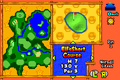
Hole, yard and par info in Pop Happiness in Mario Golf: Advance Tour
Mario Golf: Advance Tour


Pop Joy[edit]
Pop Joy (Popジョイ Pop Joi) is a rounded Point of Purchase typeface from Fontworks, first released in 1998.[52] It has been most prominently used as the Western-language text font for the Paper Mario series since Paper Mario: The Thousand-Year Door. It is also used for interface text in Dr. Mario 64 (including the Dr. Mario portion in Nintendo Puzzle Collection), decorative text in the Super Mario Sunshine guidebook (the Gelato Beach, Pinna Park, Pianta Village, and Corona Mountain pages), interface text in Mario Golf: Toadstool Tour, some text in Dr. Mario & Puzzle League, interface text in DK: Jungle Climber, and text in Penny's stage in WarioWare Gold.
Dr. Mario 64
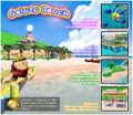
Super Mario Sunshine ("Gelato Beach")
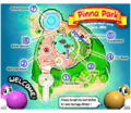
Super Mario Sunshine ("Pinna Park", "WELCOME!")
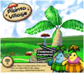
Super Mario Sunshine ("Pianta Village")
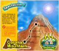
Super Mario Sunshine ("Spectacular!")
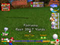
Mario Golf: Toadstool Tour ("Fairway Rest 284.7 Yards")
Paper Mario: The Thousand-Year Door
Dr. Mario & Puzzle League
Super Paper Mario
DK: Jungle Climber
Paper Mario: Sticker Star
Paper Mario: Color Splash

WarioWare Gold
Paper Mario: The Origami King
Paper Mario: The Thousand-Year Door (Nintendo Switch)


Poplar[edit]
Poplar is a sans-serif typeface designed by Barbara Lind for Adobe Type, first released in 1990.[53] It is used in the logo for Mario vs. Donkey Kong: Mini-Land Mayhem! in western languages.
Present[edit]

Present is a script typeface designed by Friedrich Karl Sallwey for Linotype, first released in 1974.[54] It is used for text in a dartboard in Frantic Factory in Donkey Kong 64 and for the logo for Takamaru's Ninja Castle in Nintendo Land.
Princetown[edit]

Princetown is a geometric slab-serif typeface designed by Dick Jones for Letraset, first released in 1981.[55] It is used in the logo for Nintendo Campus Challenge. Princetown Solid is used for jerseys in Super Mario Strikers and Mario Strikers Charged.
Super Mario Strikers ("1" on Mario's jersey)

Super Mario Strikers ("2" on Luigi's jersey)

Super Mario Strikers ("10" on Peach's jersey)

Super Mario Strikers ("9" on Daisy's jersey)
Super Mario Strikers ("8" on Yoshi's jersey)
Super Mario Strikers ("55" on DK's jersey)
Super Mario Strikers ("00" on Wario's jersey)
Super Mario Strikers ("0" on Waluigi's jersey)


Pritchard[edit]
Pritchard is a sans-serif typeface designed by Martin Wait for Letraset, first released in 1970.[56] It is used for the logo of Super Smash Bros.
Puffin Display Soft[edit]
Puffin Display Soft is a sans-serif display typeface designed by Pieter van Rosmalen for Bold Monday, first released in 2021.[57] Its Black font is used for the logo for Super Mario Bros. Wonder and its Switch 2 Edition.
Pump[edit]
Pump is a sans-serif typeface designed by Bob Newman for Letraset, first released in 1970.[58] It is used for the logos for the following games:
- Mario Bros. (Atari 2600) (Pump Bold)
- Super Mario World 2: Yoshi's Island (Pump Demi)
- New Super Mario Bros. 2 (Pump Bold)
- Nintendo Badge Arcade (Pump Bold)
It is also used for the logo for the Game Boy Micro. A modified version is used for the logo for the Nintendo DS Lite (Pump Light) and the North American logo for Punch-Out on the Nintendo Entertainment System, which is used for the logo for Punch-Out Pizzeria in The Super Mario Bros. Movie.
Mario Bros.
Super Mario World 2: Yoshi's Island ("2")
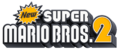
New Super Mario Bros. 2 ("2")

Nintendo Badge Arcade ("BADGE ARCADE")
The Super Mario Bros. Movie


Quagmire[edit]
Quagmire is a geometric sans-serif typeface designed by Rian Hughes for Device, first released in 1997.[59] It is used in the logo for Wario: Master of Disguise.
Quartz[edit]

Quarts is a typeface mean to resemble LCD clock displays.[60] It is used for text in Training Mode in Super Smash Bros. in western languages.
Raijin[edit]
Raijin (雷神 Léishén) is a script typeface from Koei Signworks. It is used for text in Duelius Maximus in WarioWare: Get It Together!, albeit with a different "ラ" glyph.
Rat Fink Gothic[edit]

Rat Fink Gothic is a display typeface designed by Ed "Big Daddy" Roth for House Industries, and named after his Kustom Kulture cartoon rat creation, Rat Fink.[61] It is used in the pre-release logo for Mario vs. Donkey Kong 2: March of the Minis.
Rat Fink Heavy[edit]

Rat Fink Heavy is an uneven serif typeface designed by Ken Barber and Ed "Big Daddy" Roth for House Industries, first released in 1993 and named after Roth's cartoon rat character.[62] It is used for the English-language Animal Crossing logo, which appears in the logo for Animal Crossing: Sweet Day in Nintendo Land, and as the starting banner of the Animal Crossing course in Mario Kart 8 and Mario Kart 8 Deluxe.
Remedy[edit]

Remedy is an uneven display typeface designed by Frank Heine for Emigre, first released in 1991.[63] It is used for the logo for Roy's HardBrick Hotel in Hotel Mario.
Revue[edit]
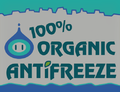
Revue is a sans-serif typeface designed by Colin Brignall for Stephenson Blake, first released in 1968.[64] Its bold font is used for the logo of Mario Kart: Double Dash!! and the PocketCamera of the 64DD, and in Mario Kart 8, Mario Kart Tour and Mario Kart 8 Deluxe on the logos of 100% Organic Antifreeze and Bowser Oil (also seen in Super Mario Odyssey).
Super Mario Odyssey
Mario Kart 8

Mario Kart 8


Riffic[edit]
Riffic is a sans-serif typeface designed by Nini Prower for Ink Type, first released in 2016.[65] It is used on the logo for the Mario + Rabbids Kingodom Battle DLC, Donkey Kong Adventure.
Rio2016[edit]

Rio2016 is a script typeface from Dalton Maag, designed in 2010. As the name implies, was used as the typeface for the 2016 Summer Olympics and was used for the interface for the Wii U version of Mario & Sonic at the Rio 2016 Olympic Games in western languages.
Rockwell[edit]
Rockwell is a slab-serif typeface from Monotype, first released in 1934.[66]
Rockwell Extra Bold is used for the logo for Mario Superstar Baseball.
Rockwell is used for the challenger logos in the Wii version of Punch-Out!.
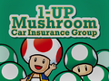
In Mario Kart 8, Mario Kart Tour and Mario Kart 8 Deluxe, Rockwell Bold is used on the logo of 1-Up Mushroom Car Insurance Group.
In Super Mario Odyssey, Rockwell Condensed is used for the text in the Bonneton sticker.
Mario Kart 8

Super Mario Odyssey


Rodin[edit]
Rodin (ロダン Rodan) is a sans-serif typeface designed by Toshiyasu Satō for Fontworks, first released in 1990.[67] It is used for text in Trial Mode in the Japanese version of Yoshi's Story, text in the Brain Age microgame in the japanese version of WarioWare: Smooth Moves, and the interface in the Game & Watch DSiWare games.
Rodin Cattleya[edit]
Rodin Cattleya (ロダンカトレア Rodan Katorea) is an alternative version of Rodin designed by Toshiyasu Satō, first released in 1995.[68] It is Rodin with Cattleya kana. It is used for the interface in the following games:
- Super Mario Strikers
- Tetris DS
- WarioWare Gold
It is also used for text in the Japanese version of the Character Development microgame in WarioWare Gold and text in Jimmy T's stage in WarioWare: Get It Together!.
Rodin Happy[edit]
Rodin Happy (ロダンハッピ Rodan Happi) is an alternative version of Rodin designed by Yutaka Satō for Type Labo, first released in 1995.[69] It is Rodin with Happy kana. It is used for the logos for Micro Golf Open and Micro Golf Tour in WarioWare Gold.
Rodin Maria[edit]
Rodin Maria (ロダンマリア Rodan Maria) is an alternative version of Rodin released in 1995.[70] It is Rodin with Maria kana. It is used for the interface in the following games:
- Luigi's Mansion (Japanese language)
- Super Mario Sunshine (Japanese language)
- Yoshi Topsy-Turvy
- Super Mario Galaxy (Japanese language)
- Super Mario Galaxy 2 (Japanese language)
- Mario Sports Mix
- Game & Wario
- Mario Party 10 (Japanese language)
- WarioWare Gold (Japanese language)
It is also used for text in the Mario vs. Donkey Kong e-Reader cards.
Rodin NTLG[edit]

Rodin NTLG (ロダンNTLG Rodan NTLG) is an alternative version of Rodin designed by Yutaka Satō for Type Labo, first released in 1997.[71] It is Rodin with New Type Labo Gothic kana. The kana stroke ends are horizontal or vertical. Rodin NTLG is the system font on Nintendo GameCube, Wii, Nintendo DSi (including the Nintendo WFC menu in the standard DS), Nintendo 3DS, Wii U and the Classics consoles in western and Japanese languages, including its built-in software and several of those softwares' logos, and the menus for the Virtual Console, as well as being used in media that references the Wii Menu, such as the microgame in WarioWare Gold. It is used for the interface in the following games:
- Super Mario Sunshine (opening cutscene and smalltext on the Isle Delfino map)
- Nintendo Puzzle Collection (Yoshi's Cookie)
- Wario World
- Mario Kart: Double Dash!! (LAN Mode icon)
- Donkey Konga (video and save data menu)
- Mario Superstar Baseball
- Yoshi's Island DS (Western languages)
- WarioWare: Smooth Moves (Dribble & Spitz's stage)
- Wario: Master of Disguise (alongside modified rounded version; Western languages)
- Mario Strikers Charged
- Mario & Sonic games from Mario & Sonic at the Olympic Games to the Nintendo 3DS version of Mario & Sonic at the Rio 2016 Olympic Games for Western languages and the Wii U version of Mario & Sonic at the Rio 2016 Olympic Games for the Japanese language
- Super Smash Bros. Brawl
- Dr. Mario Online Rx
- Mario Kart Wii
- Bird & Beans
- Paper Airplane Chase
- Dr. Mario Express
- New Super Mario Bros. Wii (scores)
- Mario Kart 7
- Fortune Street
- Mario Party 9
- Mario Tennis Open
- Nintendo Land
- New Super Mario Bros. U (scores)
- Luigi's Mansion: Dark Moon (Japanese language; furigana)
- Mario and Donkey Kong: Minis on the Move (player names)
- Game & Wario
- NES Remix games
- Dr. Luigi
- Mario Golf: World Tour
- Super Smash Bros. for Nintendo 3DS, including Smash Controller
- Super Smash Bros. for Wii U
- Nintendo Badge Arcade
- Mario vs. Donkey Kong: Tipping Stars
- Dr. Mario: Miracle Cure
- Super Mario Maker
- Mario Tennis: Ultra Smash
- Mini Mario & Friends: amiibo Challenge
- Amiibo tap: Nintendo's Greatest Bits
- Super Mario Maker for Nintendo 3DS
- Poochy & Yoshi's Woolly World
- Mario Sports Superstars
- Mario + Rabbids Kingdom Battle (Japanese language)
- Super Mario Odyssey
- WarioWare Gold (Japanese language)
- Super Mario Party (Japanese language)
- Super Smash Bros. Ultimate
- Super Mario Maker 2 (scores in the New Super Mario Bros. U theme)
- Super Mario 3D World + Bowser's Fury
- WarioWare: Get It Together!
- Mario Party Superstars (Japanese language)
- Mario Strikers: Battle League (Japanese and Russian languages)
- Super Mario Bros. Wonder (player names)
- WarioWare: Move It!
- Mario vs. Donkey Kong (Nintendo Switch)
- Luigi's Mansion 2 HD (Japanese language; furigana)
- Mario Kart World (Japanese language; kanji, and secondary interface font in other languages)
- Donkey Kong Bananza (Japanese language; furigana)[72]
- Super Mario Bros. Wonder – Nintendo Switch 2 Edition + Meetup in Bellabel Park (player names)
In Mario Kart 8, it is used on various signs in tracks, such as in Super Bell Subway. It is also used for text on the Boom Box and the D-Cell Battery Things and the end screen for the Curling Stone Thing, as well as the "REPLAY" text that appears when using the Bowling Ball Thing in Strike Lake in Paper Mario: Sticker Star, Thing text and Replica Card labels in Paper Mario: Color Splash, and the "E" icon in Mario & Luigi: Brothership. It is also used for the text on the Peach Dome jumbotron in Mario Power Tennis and Mario Tennis: Power Tour. It is also used for the logos for Mini Mario & Friends: amiibo Challenge and the first logo for the Nintendo eShop. It is also used on the Japanese amiibo cards for Mario Sports Superstars.
Rodin Rose[edit]
Rodin Rose (ロダンローズ Rodan Rōzu) is an alternative version of Rodin released in 1995.[73] It is Rodin with Rose kana. It is used for the interface in Princess Peach: Showtime! for display text.
Rodin Wanpaku[edit]
Rodin Wanpaku (ロダンわんぱく Rodan Wanpaku) is an alternative version of Rodin designed by Yutaka Satō for Type Labo, first released in 1998.[74] It is Rodin with New Wanpaku Gothic kana. It is used for the interface in the following games:
- Mario Super Sluggers
- Wario Land: Shake It! (cutscene subtitles and warning alerts)
- Donkey Kong Country Returns (Japanese language)
- Mario Party 9 (Japanese language)
- Mario Party: Island Tour
- Donkey Kong Country: Tropical Freeze (Japanese language)
- Yoshi's Crafted World
- WarioWare: Get It Together!
- WarioWare: Move It!
- Donkey Kong Country Returns HD (Japanese language)
Raglan[edit]
Raglan (ラグラン Raguran) is an alternative version of Rodin released in 1995.[75] It is an Ultra Bold derivative of Rodin. It is used for text in Darts in WarioWare: Smooth Moves. It is also used for interface text in DK: Jungle Climber and Yoshi's Woolly World and its Nintendo 3DS port. In Mario Superstar Baseball, it is used for the logo for Toy Field. In Mario Super SLuggers, it is again used for the logo for Toy Field, in addition to being used for the balloon numbers in the balloon popping minigame. In Wario Land: Shake It!, it is used for the "STAGE CLEAR" text. In Paper Mario: Sticker Star, it is used for text on the Soda Thing. In WarioWare Gold, it is used in the logos for Cruise Controls and for text in Dancing Team and Orbulon's stages. In WarioWare: Get it Together!, it is used for the title screen logo for Frenemy Frenzy. In WarioWare: Move It!, it is used for text in Dr. Crygor's stage and text in Switching Gears.
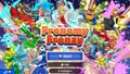
WarioWare: Get it Together! Frenemy Frenzy

Raglan Punch[edit]
Raglan Punch (ラグランパンチ Raguranpanchi) is an alternative version of Raglan released in 2011.[76] It is used for interface text in Captain Toad: Treasure Tracker (except the Nintendo 3DS version). In Game & Wario, it is used for text for Islands. In Paper Mario: Color Splash, it is used for the logo of Snifit or Whiffit: Seabed Edition (with a modified "ム"). In Mario Sports Superstars, it is used for ranks in horse riding races. In WarioWare Gold, it is used for text in the western version of Getcha Groove On, in the logos for Wario Interrupts, and for text in Wario Deluxe and the Wario Interrupts stages. In WarioWare: Get it Together!, it is used for text in Orbulon's stage, the Showdown stage, and for the title screen logo for Puck 'er Up. WarioWare: Move It!, it is used for numbers for Copycat Mirror.
Railway[edit]

Railway (レイルウェイ Reiruwei) is an outlined sans-serif typeface designed by Toshiyasu Satō for Fontworks, first released in 1995.[77] It is based on Rodin. It is used for text in Ski in Game & Wario, and text in Jimmy T.'s and the Dancing Team stages in WarioWare Gold.
Reggae[edit]
Reggae (レゲエ Regē) is a typeface from Fontworks, first released in 1995.[78] It is based on Rodin. It is used for the credits text in Luigi's Mansion and its 3DS remake. It is also used in Super Mario Sunshine for the numbered gates in Ricco Harbor and Mario Superstar Baseball for Bowser Jr.'s team logos. It is also used for text in the Japanese Super Mario Advance 4: Super Mario Bros. 3 e-Reader cards.
Comic Reggae[edit]

Comic Reggae (コミックレゲエ Komikku Regē) is an alternative version of Reggae released in 2008.[79] It is used for the logo of Thrill Ride in WarioWare Gold.
RocknRoll[edit]

RocknRoll (ロックンロール Rokkunrōru) is a Point of Purchase typeface from Fontworks, first released in 1995.[80] It is based on Rodin. It is used for the interface in Mario Party 10 for Western languages, text in party minigames in WarioWare: Get It Together!, and text in for results in WarioWare: Move It!. It is also used for text in the Ludwig cards of the Japanese Super Mario Advance 4: Super Mario Bros. 3 e-Reader cards.
Rowdy[edit]

Rowdy (ロウディ Rōdi) is a sans-serif typeface designed by Toshiyasu Satō for Fontworks, first released in 1995.[81] It is based on Rodin. It is used for the interface in the following games:
- Donkey Kong: Barrel Blast
- Game & Wario
- Mario Party: Star Rush
- Mario Party: The Top 100
- Mario & Luigi: Brothership
In Super Mario Sunshine, Rowdy is used for the logo for Corona Mountain in the Isle Defino guidebook. In Mario Tennis: Power Tour, it is used for the HUD numbers for score and time. In Mario Superstar Baseball, it is used for the logos for Princess Peach's and Princess Daisy's teams and some HUD text. In Mario Super Sluggers, it is once again used for the logos for Peach and Daisy's teams in addition to being used for the logos for Peach Ice Garden and Daisy Cruiser and text in Wario City. In Wario Land: Shake It!, it is used for the credits, exclamation text, and the "ON" and "OFF" on Certainty Switches in the Japanese version only. In Game & Wario, it is used for various text in Sketch, Fruit, and Islands. In WarioWare Gold, it is used for text in Dirbble & Spitz's and the Potluck Gang stage, and the logo for Pumpkin Panic. In WarioWare: Move It!, it is used for text in Wario's stage. It is also used for the "Puzzle & Dragons" portion of the Puzzle & Dragons: Super Mario Bros. Edition logo, and the "Arcade Edition" portion of the logo for Mario & Sonic at the Olympic Games Tokyo 2020 - Arcade Edition. It is also used for text in the Japanese Super Mario Advance 4: Super Mario Bros. 3 e-Reader cards and text for the Yarn Yoshi and Poochy iMessage stickers.
In Mario Kart Wii, it is used for the logos of the following sponsors:
- Yoshi Kart
- Luigi Kart
- Mario Grand Prix
- Yoshi (reappears in Mario Kart 7)
It is also used for text in Mario Circuit in the game.
Super Mario Advance 4: Super Mario Bros. 3 e-Reader card

Peach Roses in Mario Superstar Baseball

Daisy Lillies in Mario Superstar Baseball
Mario Tennis: Power Tour

Yoshi Kart in Mario Kart Wii
Luigi Kart in Mario Kart Wii

Mario Grand Prix in Mario Kart Wii
Yoshi in Mario Kart Wii
Yoshi in Mario Kart 7
Puzzle & Dragons: Super Mario Bros. Edition ("PUZZLE & DRAGONS")
Mario & Sonic at the Olympic Games Tokyo 2020 - Arcade Edition ("ARCADE EDITION")
Mario Party: The Top 100
WarioWare Gold
Mario & Luigi: Brothership


Samgaghedeu[edit]
Samgaghedeu ("삼각헤드", Triangular Head) is a rounded typeface for Korean released by Hanfont. It is used for character and location names, text in Orbulon's stage, and other miscellaneous text in the Korean version of WarioWare: Move It!.
Script Bold[edit]

Script Bold is a script typeface designed by Fritz Max Steltzer for Monotype, first released in 1931.[82] It is used for Bowser and Princess Peach's wedding posters seen in Super Mario Odyssey.
Seagull[edit]

- Possible alternatives include: Bitstream Seagull, EF Seagull, Seagull SB, TS Seagull and URW Seagull.
Seagull is a serif typeface designed by Adrian Williams an Bob McGrath for Fonts/Ingrama, first released in 1978.[83] It is used in Mario Kart 8 and Mario Kart 8 Deluxe on the logo for Peach & Daisy Royal Patisserie.
Serpentine[edit]
Serpentine is a geometric typeface designed by Dick Jensen for the Visual Graphics Corporation, first released in 1972.[84] It is used in the European and Australasian logo for Donkey Kong: Barrel Blast. It is also used for the "PRESS ANY BUTTON" text in the title screen of Super Smash Bros. Brawl.
Super Smash Bros. Brawl ("PRESS ANY BUTTON")

Seurat[edit]

Seurat (スーラ Sūra) is a rounded sans-serif typeface from Fontworks, first released in 1993.[85] It is used for the interface in the following media:
- Mario no Photopi
- Mario Artist series
- Luigi's Mansion
- Mario Golf: Toadstool Tour (credits text)
- Donkey Konga (Japanese language)
- Donkey Konga 2
- Donkey Konga 3
- Yakuman DS
- WarioWare: Smooth Moves (Mona's stage and certain text in international versions of Pyoro S)
- Dr. Mario Online Rx
- Wario Land: Shake It!
- Bird & Beans (locked mode)
- Game & Watch DSiWare games
- Nintendo DSi Metronome
- New Super Mario Bros. Wii
- New Super Mario Bros. Wii Coin World
- Super Mario 3D Land
- Mario Party 9 (Japanese language; including some text in western languages)
- New Super Mario Bros. 2
- Club Nintendo Picross
- New Super Mario Bros. U
- Paper Mario: Sticker Star (Japanese language, including the end banner of the Billiard Ball in western languages)
- Photos with Mario
- New Super Luigi U
- Super Mario 3D World
- Dr. Luigi
- Mario Golf: World Tour
- Captain Toad: Treasure Tracker
- Mario Party 10
- Puzzle & Dragons: Super Mario Bros. Edition
- Dr. Mario: Miracle Cure
- Yoshi's Woolly World
- Mario & Luigi: Paper Jam
- Paper Mario: Color Splash (Japanese language)
- Mario Party: Star Rush
- Super Mario Run
- Mario Sports Superstars
- Mario & Luigi: Superstar Saga + Bowser's Minions
- Mario Party: The Top 100
- WarioWare Gold
- Mario & Luigi: Bowser's Inside Story + Bowser Jr.'s Journey
- New Super Mario Bros. U Deluxe
- Dr. Mario World
- Paper Mario: The Origami King (Japanese language)
- Super Mario Bros. 35
- WarioWare: Get It Together!
- Mario Strikers: Battle League (Japanese and Russian languages)
- Mario + Rabbids Sparks of Hope (Japanese and Russian languages)
- WarioWare: Move It!
- Super Mario RPG (Nintendo Switch)
- Nintendo Sound Clock: Alarmo
- Mario & Luigi: Brothership
It is also used for the "2" in an artwork in Donkey Kong Country 2: Diddy's Kong Quest, text in the Shuffle minigames in Super Mario 64 DS, text in Wario City in Mario Super Sluggers, and text in the Japanese Super Mario Advance 4: Super Mario Bros. 3 e-Reader cards.
Mario & Luigi: Brothership

Seurat Capie[edit]
Seurat Capie (スーラキャピー Sūra Kyapī) is an alternative version of Seurat designed by Yutaka Satō for Type Labo, first released in 1995.[86] It is Seurat with Capie kana. It is used for the interface in the following games:
- Donkey Kong 64 (Japanese language)
- Paper Mario: The Thousand-Year Door (Japanese language)
- Super Paper Mario (Japanese language)
- Donkey Kong: Barrel Blast
- Paper Mario: The Thousand-Year Door (Nintendo Switch) (Japanese language; including the "?" in the quiz games and the rankings in the Pianta Parlor minigames in all languages; The Letter "p" in western languages)

The Letter "p" in Paper Mario: The Thousand-Year Door (Nintendo Switch)
Slump[edit]
Slump (スランプ Suranpu) is an alternative version of Seurat released in 1995.[87] It is used for subtitles in Super Mario Sunshine, pop-up boxes and player numbers in Mario Kart: Double Dash!!, display text in Donkey Kong: Jungle Beat, interface text in Mario Superstar Baseball and Wario Land: Shake It!, the logo and text in Snifit or Whifit in Paper Mario: Sticker Star, text in the Wario Bug stage in WarioWare: Get It Together!, and text in Pyoro W and subtitles in the credits in WarioWare: Move It! to denote characters and locations. In WarioWare: Smooth Moves and WarioWare Gold, it is used for text in Ashley's and Orbulon's levels respectively. It is also used for heading text in the Japanese Super Mario Advance 4: Super Mario Bros. 3 e-Reader cards.
Super Mario Advance 4: Super Mario Bros. 3 e-Reader card
Super Mario Advance 4: Super Mario Bros. 3 e-Reader card
Super Mario Advance 4: Super Mario Bros. 3 e-Reader card
Super Mario Sunshine
Mario Kart: Double Dash!!

Donkey Kong: Jungle Beat
WarioWare: Smooth Moves
WarioWare Gold
WarioWare: Move It!


Shermlock[edit]

Shermlock is an uneven display typeface from Gaut Fonts. It is used for the interface in Mario & Luigi: Bowser's Inside Story.
ShinbunTokuBGo[edit]
ShinbunTokuBGo (新聞特太ゴシック Shinbun Tokubuto Goshikku) is a sans-serif typeface from Sha-Ken, first released in 1964.[88] Its Latin characters are similar to Univers. It is used for labels on the Family Computer console, controllers, and accessories.
Family Computer ("POWER", "EJECT", "RESET") and its controllers ("A", "B", "START", "SELECT", "MIC.", "VOLUME")

Showcard Gothic[edit]
Showcard Gothic is a sans-serif typeface designed by Jim Parkinson for The Font Bureau, first released in 1993.[89] It is used for the logos for the following games:
- Super Mario RPG: Legend of the Seven Stars
- DK: King of Swing (North American logo)
- Photos with Mario
It is also seen in Mario vs. Donkey Kong 2: March of the Minis on its victory screen.
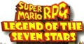
Used for the "LEGEND OF THE SEVEN STARS" text
Used for the "KING OF SWING" text

Used for the PHOTOS WITH text
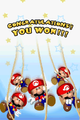
"YOU WON!!!" in Mario vs. Donkey Kong 2: March of the Minis


Skip[edit]

Skip (スキップ Sukippu) is a humanist sans-serif typeface designed by Shigenobu Fujita for Fontworks, first released in 2003. An updated version with multiple weights called Skip Pro was released in 2019.[90] It is used for the interface in the following games:
- WarioWare: Get It Together!
- WarioWare: Move It!.
It is also used for text in Shutter and the Japanese logo for Ski in Game & Wario.
SM Time Machine[edit]
SM Time Machine ("SM타임머신", SM Taimmeosin) is a sans-serif typeface for Korean released by Jikisoft. It is used for the interface in the Korean version of WarioWare: Smooth Moves.
Snell Roundhand[edit]

Snell Roundhand is a script typeface designed by Matthew Carter for Linotype, first released in 1966.[91] It is used in Super Mario Odyssey in the Bubblaine sticker.
Snyder Speed Brush[edit]

Snyder Speed Brush is a script typeface designed by Pat Snyder, first released in 1992.[92] It is used for the interface in Mario Kart 64.
Sofachrome[edit]
Sofachrome is a geometric sans-serif typeface designed by Ray Larabie for Typodermic.[93] A modified version is used for the logo for Retro Studios.
Sol[edit]

Sol is a geometric sans-serif typeface designed by C.B. Smith and Marty Goldstein for VGC, first released in 1973.[94] A modified version is used for the logo for the Satellaview.
Souvenir[edit]
- Possible alternatives include: ITC Souvenir and Souvenir Graphic.
Souvenir is a serif typeface designed by Morris Fuller Benton for ATF, first released in 1920.[95] It is used in Mario Kart 8, Mario Kart Tour and Mario Kart 8 Deluxe on the logo of Toad City Sightseeing.
Steadfast[edit]
Steadfast is a geometric sans-serif typeface designed by Todd Masui for T-26, first released in 1998.[96] It is used on the North American logo for Donkey Kong: Barrel Blast, albeit with a modified "A" glyph.
Stencil[edit]


Stencil is a serif display typeface designed by Gerry Powell for American Type Founders, first released in 1937.[97]
It is seen in the Japanese boxart for Super Mario All-Stars (also used globally for its limited edition), and also in Super Mario Odyssey, where it is used on the sticker for the Steam Gardens, albeit with a modified "R" glyph. It is also used for a promotional wallpaper for the Game Boy Advance version of Donkey Kong Country 3.
Stick[edit]

Stick (ステッキ Sutekki) is a typeface from Fontworks, first released in 2009.[98] It is used for text in Shutter in Game & Wario. A bolder, modified version is used for text in Dribble & Spitz's stage and the numbers in the Variety Towers in WarioWare: Move It!.
Stop[edit]

Stop is a sans-serif typeface designed by Aldo Novarese and first released by Nebiolo in 1970 or 1971.[99] It is used for the logo for the NES Power Pad. It is also seen in Mario Kart Tour and Mario Kart 8 Deluxe on the logo of Green Fuel.
Stymie[edit]
Stymie is a slab-serif typeface designed by Morris Fuller Benton for the American Type Founders, first released in 1931.[100] Stymie BT Extra Bold is used in the international logo for NES Open Tournament Golf.
Sui Generis[edit]
Sui Generis is a geometric sans-serif typeface designed by Ray Larabie for Larabie Fonts, first released in 2000.[101] It is used for car text in The Super Mario Bros. Movie.
Superstar[edit]
Superstar is a geometric slab-serif typeface designed by Colin Brignall for Letraset, first released in 1970.[102] A modified version is used for the logo for Mario Party: The Top 100.
Surface Rough[edit]
Surface Rough is a display typeface used for the logo of Super Smash Bros.
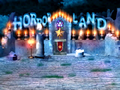
Suske & Wiske[edit]
Suske & Wiske is a rounded sans-serif typeface used on the Horror Land logo and text within the board in Mario Party 2, as well as general board text in Mario Party 3.

Horror Land Logo
Introduction's background

Item Shop
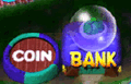
Koopa Bank


Sweet Sans[edit]

Sweet Sans is a geometric sans-serif typeface designed by Mark van Bronkhorst for MVB Fonts, first released in 2013.[103] It is used for the logo of amiibo tap: Nintendo's Greatest Bits.
Taberna Serif[edit]

Taberna Serif is a serif typeface designed by Jorge Cisterna and Rodrigo Fuenzalida for Latinotype, first released in 2016.[104] Its Black variant is used for the "Brothership" subtitle of the Mario & Luigi: Brothership logo.
Tarzan[edit]
Tarzan is an uneven typeface from FontBank, first released in 1993. It is used on the international logo for Mario Kart: Super Circuit.
Teknik[edit]
Teknik is a geometric slab-serif typeface designed by David Quay for ITC, first released in 1990.[105] It is used for the logo and text for the Nintendo Digital Event in 2014 and 2015.
Tekton[edit]
Tekton is a handwriting-style typeface designed by David Siegel and first released in 1989. It is used in Hotel Mario for some interface text, Yoshi's Story for Trial Mode, and interface text in Donkey Kong 64. Its bold condensed variation also replaces Kyo Geki in the European localizations of Mario Party 8, being used for selectable panels and player tags.
Telop Mincho[edit]

Telop Mincho (テロップ明朝 Teroppu Minchō) is a serif typeface designed by Shigenobu Fujita for Fontworks, first released in 2015.[106] It is used for text in the Fishy Felines and Fire Emblem: Three Houses microgames, and the dialogue for The Supreme Developer in WarioWare: Get It Together!.
Fishy Felines
Fire Emblem: Three Houses


Tempo[edit]

Tempo is a geometric sans-serif typeface designed by Robert Hunter Middleton for Ludlow, first released in 1930.[107] A modified version of Tempo Heavy Condensed is used for the logo for Baseball.
That's All Folks[edit]

That's All Folks is an uneven typeface designed by John Roshell for Comicraft, first released in 2002.[108] That's All Folks Bold is used for the logo for Diddy Kong Racing DS.
The Bold Font[edit]
The Bold Font is a geometric sans-serif typeface designed by Sven Pels, first released in 2015.[109] It is used in The Super Mario Bros. Movie for the logo for Super Mario Bros. Plumbing and location names in the Super Mario Bros. Plumbing commercial.
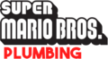
Used for "PLUMBING" on the Super Mario Bros. Plumbing logo
The Super Mario Bros. Movie
The Super Mario Bros. Movie


TheSans[edit]

TheSans is a sans-serif typeface designed by Lucas de Groot for LucasFonts, first released in 1994.[110] A version of this typeface, TheSans Rio 2016, is used for the interface in the Wii U version of Mario & Sonic at the Rio 2016 Olympic Games for Western languages.
Thrills[edit]
Thrills is an uneven sans-serif typeface designed by John Roshell for Comicraft, first released in 2005.[111] A modified version of Thrills Regular is used for the pre-release logo for New Super Mario Bros.
Times New Roman[edit]
Times New Roman is a serif typeface designed by Stanley Morison and Victor Lardent for Monotype, first released in 1937.[112]
It is used for the logo for Mario & Luigi: Partners in Time. It is also used for the "?" icon in the Item Box in Mario Kart 64, the room numbers in the Excess Express in Paper Mario: The Thousand-Year Door and its Nintendo Switch remake, and text in The Super Mario Bros. Movie. It is also used for the former logo for the Super Mario Club. It is also used for text in some artwork for Super Mario Advance.
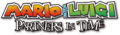
Mario & Luigi: Partners in Time ("PARTNERS IN TIME")
Trade Gothic[edit]

Trade Gothic is a sans-serif typeface designed by Jackson Burke for Linotype, first released in 1948.[113] It is used for the "STAGE CLEAR!" text in The Subspace Emissary in Super Smash Bros. Brawl. A modified version is used on the logo for Alleyway.
TS Hoboken[edit]

Hoboken is a serif typeface designed by Morris Fuller Benton for TypeShop Collection.[114] It is used in Mario Kart 8, Mario Kart Tour and Mario Kart 8 Deluxe on the logo of Bob-omb Plugs.
Tsukushi A Maru Gothic[edit]

Tsukushi A Maru Gothic (筑紫A丸ゴシック Chikushi A Maru Goshikku) is a rounded sans-serif typeface designed by Shigenobu Fujita for Fontworks, first released in 2008.[115] It is used for the HUD in the Nintendo 3DS remake of Luigi's Mansion.
Tsukushi A Old Mincho[edit]
Tsukushi A Old Mincho (筑紫Aオールド明朝 Chikushi A Ōrudo Minchō) is a serif typeface designed by Shigenobu Fujita for Fontworks, first released in 2012.[116] It is used for text in the Clog It and Write On, Dude microgames and Autograph! in WarioWare Gold.
WarioWare Gold

Tsukushi C Midashi Mincho[edit]
Tsukushi C Midashi Mincho (筑紫C見出ミン Chikushi C Midashi Min) is a serif typeface designed by Shigenobu Fujita for Fontworks, first released in 2016.[117] It is used for the "PERFECT TEATIME" text in the Fire Emblem: Three Houses microgame in WarioWare: Get It Together!.
Tsukushi Mincho[edit]
Tsukushi Mincho (筑紫明朝 Chikushi Minchō) is a serif typeface designed by Shigenobu Fujita for Fontworks, first released in 2004.[118] It is used for text on the Newspaper and Trophy things in Paper Mario: Sticker Star, and text in the Head Count microgame in WarioWare Gold.
Tsukushi Old Mincho[edit]
Tsukushi Old Mincho (筑紫オールド明朝 Chikushi Ōrudo Minchō) is a serif typeface designed by Shigenobu Fujita for Fontworks, first released in 2008.[119] It is used for text on the Pocket Watch thing in Paper Mario: Sticker Star.
UD Kakugo[edit]

UD Kakugo (UD角ゴ UD Kakugo) is a Universal Design sans-serif typeface from Fontworks, first released in 2015.[120] Its Latin characters are classified as humanist. It is used for the interface in Super Mario Maker 2, Tetris 99, Princess Peach: Showtime!, and Yoshi and the Mysterious Book for Western languages. It is also used for the sticker text in Mario Party Superstars for Western languages, advertisements in Rainbow Galleria and the Milk shop in Western Land in Super Mario Party Jamboree and its Switch 2 Edition, and the logo for The "Who's in Control?" Show in WarioWare: Move It!. It is also used for text in the One Hit Wonder microgame in WarioWare Gold.
Super Mario Maker 2

UD Marugo[edit]

UD Marugo (UD丸ゴ UD Marugo) is a Universal Design rounded sans-serif typeface from Fontworks, first released in 2015.[121] It is used for the interface in Super Mario Party for Western languages and for text in the Flag Waver microgame in WarioWare Gold and text in Pyoro W in WarioWare: Move It!.
UD Mincho[edit]

UD Mincho (UD明朝 UD Minchō) is a Universal Design serif typeface from Fontworks, first released in 2015.[122] It is used for the logo for Gotta Bounce in WarioWare: Get It Together!.
UD Shin Go[edit]

UD Shin Go (UD新ゴ UD Shingo) is a Universal Design sans-serif typeface from Morisawa. Its Latin characters and numerals come from ClearTone SG, a humanist sans serif typeface also from Morisawa, with slight modifications, particularly in the letter "J". In UD Shin Go, "J" sits on the baseline; while in ClearTone SG, "J" descends below the baseline. UD Shin Go has full character sets for hiragana, katakana, kanji, hanzi, hangul, and Cyrillic characters. UD Shin Go modified with a single story "g" from Latin small letter script g is the system font on Nintendo Switch and Nintendo Switch 2, and is used as the typeface for Super Smash Bros. Ultimate, Super Mario 3D All-Stars, Mario Golf: Super Rush, Nintendo World Championships: NES Edition, Nintendo Switch 2 Welcome Tour, some prompts in Mario Kart 8 Deluxe, the language menu for Super Mario Odyssey, achievement notification text in Super Mario Party Jamboree and its Switch 2 Edition, the classic game applications for Nintendo Switch Online, the player names on many Mario games on the console, the Chinese and Korean versions of Tetris 99 and Super Mario Bros. 35, and the Simplified Chinese and Korean version of the Nintendo Switch remake of Mario vs. Donkey Kong. It is also used for the word "Play" in the title screen of Super Mario RUN since the Fall 2017 update. The unmodified UD Shin Go with a double story "g" is used for the interface in Mario & Sonic at the Olympic Games Tokyo 2020.
Uni Neue[edit]
Uni Neue is a sans-serif typeface designed by Plamen Motev and Svetoslav Simov for Fontfabric, first released in 2017.[123] It is used for the logo and text for the Nintendo Sportlight in 2017.
Univers[edit]
Univers is a large sans-serif typeface designed by Adrian Frutiger, first released in 1957.[124]
It is used for the number "2" in various scenery in Frantic Factory in Donkey Kong 64, including the blocks and the button and floor puzzles.
It is used for the Canadian, French, Dutch, Italian, and Australasian logos of certain NES games:
- Golf (Univers Black)
- Wrecking Crew (Univers Bold Condensed)
- Super Mario Bros. (Univers Bold Condensed)
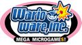
It is used for the logo of WarioWare, Inc.: Mega Microgame$! and the Game Boy Pocket (albeit slightly modified). It is also used for the "ABS" label on the back of the Nintendo 64.
Its bold condensed variant is used for the logo for Super Mario Bros. 2 and the Australasian logos for Game & Watch Gallery, Game & Watch Gallery 2, and Game & Watch Gallery 3. It is also used for the logo for Dr. Mario 64 and the console and controller labels on the SNES and N64. Modified versions are also used for the numbers in the logos for Donkey Kong Country 2 and Donkey Kong Country 3 in western languages. It is also used for the large exclamation points in a cutscene in Mario vs. Donkey Kong and its Nintendo Switch remake. It is also used for body text in the classic NES E-Reader cards. It was also used for the "ENTERTAINMENT SYSTEM" text in the logo for the Super Nintendo Entertainment System until 1993. It is also used for the credits for The Adventures of Super Mario Bros. 3 and the copyright text in the Simplified Chinese versions of Super Mario 64 and Yoshi's Story.
Univers Extra Black is used for the logo for the Nintendo 64, including the "DD" in the 64DD logo.
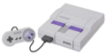
Modified versions of Univers Condensed are used for the logos for the Super Nintendo Entertainment System and its branding, the Super NES Classic Edition, the Super Scope, the Virtual Boy, and the Nintendo 64 under its original name, the Ultra 64.
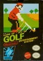
Golf
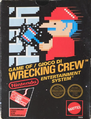
Wrecking Crew
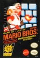
Super Mario Bros.
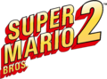
Super Mario Bros. 2

Super Nintendo Entertainment System ("SUPER NINTENDO")
Super Nintendo Entertainment System ("POWER", "RESET", "EJECT", "ON", "OFF") and its controller ("A", "B", "X", "Y", "L", "R", "START", "SELECT")
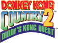
Donkey Kong Country 2 ("2")
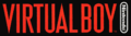
Virtual Boy

Nintendo 64 ("NINTENDO")
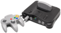
Nintendo 64 ("POWER", "RESET", "MEMORY EXPANSION", "ON", "OFF") and its controller ("A", "B", "C", "START")
Donkey Kong Country 3 ("3")

Game & Watch Gallery ("GAME BOY GALLERY")
Game & Watch Gallery 2 ("GAME BOY GALLERY")
Game & Watch Gallery 3 ("GAME BOY GALLERY")

Dr. Mario 64 ("64")
WarioWare, Inc.: Mega Microgame$! ("MEGA MICROGAME$!")

Super NES Classic Edition ("CLASSIC EDITION" along with "SUPER NINTENDO")


VAG Rounded[edit]

VAG Rounded is a widely used rounded sans-serif typeface designed by Gerry Barney for Volkswagen, first released between 1978 and 1979.[125] It is used for the interface in the following games:
- Mario vs. Donkey Kong: Minis March Again!
- Mario vs. Donkey Kong: Mini-Land Mayhem!
- Donkey Kong Country: Tropical Freeze
In Super Mario Odyssey, it is used on the Honeylune Ridge sticker. In Mario Pinball Land, it is used for the ? Block and the Question mark. It is also used for the logo for Tetris & Dr. Mario. It is also used for the logo for Lemmy's High-ate Regency Hotel in Hotel Mario.
Van Dijk[edit]
Van Dijk is a handwritten-style typeface designed by Peter O'Donnel and Jan van Dijk, published by ITC in 1986.[126] Its bold variation is used in the localized logo for Mario Golf: Advance Tour.
Venus Extended[edit]
Venus Extended is a sans-serif typeface from Bauer.[127] It is used for the "BLOCK" text for the blocks used by R.O.B..
Verdana[edit]
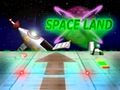
Verdana is a humanist sans-serif typeface designed by Matthew Carter for Microsoft, first released in 1996.[128] It is used on the Eternal Star logo in Mario Party, the Space Land logo and text within the board in Mario Party 2, the "EXIT" image in the bonus screen in the Game Boy Advance version of Donkey Kong Country, and the "Donkey Kong" text in a jumbotron screen in Mario Strikers Charged.
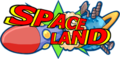
Space Land Logo
Introduction's background
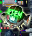
Item Shop
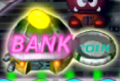
Koopa Bank


Vero Antiqua[edit]

Vero Antiqua is a humanist sans-serif typeface from VGC, first released in 1973.[129] It is used for the logo for the NES Max.
Vipnagorgialla[edit]

Vipnagorgialla is a geometric sans-serif typeface designed by Ray Larabie for Typodermic.[130] A modified version is used for the English logo of Mario Hoops 3-on-3.
Virginia[edit]
Virginia is a geometric sans-serif typeface designed by Russell Bean for Lettergraphics, first released in 1970.[131] It is used for cutscene text in Mario vs. Donkey Kong.
WBX Komik[edit]

WBX Komik is an uneven sans-serif typeface designed by WolfBainX for the Vigilante Typeface Corporation. It is used for the "THANKS FOR PLAYING" text in the credits picture in Mario vs. Donkey Kong.
Xcelsion[edit]
Xcelsion is a geometric sans-serif typeface designed by Daniel Zadorozny for Typodermic, first released in 2003. It is used for the logo for Retro Studios.
Yuruka[edit]
Yuruka (ユールカ Yūruka) is a Point of Purchase typeface from Fontworks, first released in 2012.[132] It is used for the interface in the following games:
- NES Remix games (except Ultimate NES Remix)
- Dr. Mario: Miracle Cure
- Yoshi's Woolly World
- Poochy & Yoshi's Woolly World (with modified "I" for Poochy missions)
- WarioWare Gold
- Luigi's Mansion (Nintendo 3DS)
- Yoshi's Crafted World
- WarioWare: Get It Together!
- WarioWare: Move It!
- Super Mario Party Jamboree (reaction text)
- Mario & Luigi: Brothership
- Super Mario Party Jamboree – Nintendo Switch 2 Edition + Jamboree TV (reaction text)
Notably, it is used for the "13" on 13-Amp's hat. It is also used for the logo for Dr. Mario World and the Japanese logo for WarioWare: Get It Together!. It is also used for text for the Yarn Yoshi and Poochy iMessage stickers. Additionally, it is used on signage at the Yoshi's Adventure attraction at Super Nintendo World.
NES Remix 2
Yoshi's Crafted World

WarioWare: Get It Together! (Japanese)
Mario & Luigi: Brothership


Zolar[edit]

Zolar is a geometric sans-serif typeface from Summitsoft. It is used for the interface in Tetris 99.
References[edit]
- ^ Adobe Fonts. VDL-LineG. https://fonts.adobe.com/fonts/vdl-lineg. Retrieved July 11, 2024.
- ^ Wikipedia. (2024). Lithos. https://en.wikipedia.org/wiki/Lithos. Retrieved June 19, 2024.
- ^ Adobe Fonts. VDL-LogoG. https://fonts.adobe.com/fonts/vdl-logog. Retrieved July 11, 2024.
- ^ Adobe Fonts. VDL-LogoG. https://fonts.adobe.com/fonts/vdl-logojr. Retrieved June 9, 2026.
- ^ Adobe Fonts. VDL-Logona. https://fonts.adobe.com/fonts/vdl-logona. Retrieved July 11, 2024.
- ^ Fonts In Use. Lucida Blackletter in use. https://fontsinuse.com/typefaces/1025/lucida-blackletter. Retrieved August 3, 2025.
- ^ Wikipedia. (2024). Lucida Grande. https://en.wikipedia.org/wiki/Lucida_Grande. Retrieved July 18, 2024.
- ^ Fonts In Use. Maiandra in use. https://fontsinuse.com/typefaces/1034/maiandra. Retrieved July 20, 2024.
- ^ Fonts In Use. Manito LP in use. https://fontsinuse.com/typefaces/10282/manito-lp. Retrieved September 8, 2024.
- ^ Fonts In Use. Mason Serif in use. https://fontsinuse.com/typefaces/2033/mason-serif. Retrieved May 25, 2025.
- ^ Fontworks. マティス Pro. https://lets.fontworks.co.jp/fonts/72. Retrieved June 19, 2024.
- ^ Fontworks. マティスえれがんと Pro. https://lets.fontworks.co.jp/fonts/244. Retrieved July 26, 2024.
- ^ Fontworks. マティスV Pro. https://lets.fontworks.co.jp/fonts/252. Retrieved July 26, 2024.
- ^ Fontworks. ミステリ Std. https://lets.fontworks.co.jp/fonts/192. Retrieved June 19, 2024.
- ^ Fontworks. コミックミステリ Std. https://lets.fontworks.co.jp/fonts/176. Retrieved July 13, 2024.
- ^ Fonts In Use. (2025). Mayberry in use. https://fontsinuse.com/typefaces/8110/mayberry. Retrieved April 16, 2025.
- ^ Fonts In Use. Memphis in use. https://fontsinuse.com/typefaces/4273/memphis. Retrieved December 14, 2025.
- ^ Wikipedia. (2024). Méridien (typeface). https://en.wikipedia.org/wiki/Méridien_(typeface). Retrieved November 5, 2024.
- ^ Wikipedia. (2025). Microgramma (typeface). https://en.wikipedia.org/wiki/Microgramma_(typeface). Retrieved February 8, 2025.
- ^ Wikipedia. (2024). Eurostile. https://en.wikipedia.org/wiki/Eurostile. Retrieved July 22, 2024.
- ^ Fonts In Use. Mingo Gothic SG in use. https://fontsinuse.com/typefaces/23862/mingo-gothic-sg. Retrieved September 15, 2024.
- ^ Identifont. Mister Earl. http://www.identifont.com/show?25B Retrieved February 20, 2026.
- ^ Fontworks. モード明朝A Std. https://lets.fontworks.co.jp/fonts/129. Retrieved October 26, 2024.
- ^ Fonts In Use. Modula Serif in use. https://fontsinuse.com/typefaces/8938/modula-serif. Retrieved July 18, 2024.
- ^ Wikipedia. (2024). Monaco (typeface). https://en.wikipedia.org/wiki/Monaco_(typeface). Retrieved November 10, 2024.
- ^ Fonts In Use. Moore Computer in use. https://fontsinuse.com/typefaces/7324/moore-computer. Retrieved September 14, 2024.
- ^ Fonts In Use. MS Gothic in use. https://fontsinuse.com/typefaces/141612/ms-gothic. Retrieved July 13, 2024.
- ^ Wikipedia. (2024). Myriad (typeface). https://en.wikipedia.org/wiki/Myriad_(typeface). Retrieved July 19, 2024.
- ^ Fonts In Use. Nadianne in use. https://fontsinuse.com/typefaces/5033/nadianne. Retrieved July 17, 2024.
- ^ Fonts In Use. Naru in use. https://fontsinuse.com/typefaces/235644/naru. Retrieved April 27, 2025.
- ^ Wikipedia. (2024). Neo Sans. https://en.wikipedia.org/wiki/Neo_Sans. Retrieved June 19, 2024.
- ^ Wikipedia. (2024). Neuland. https://en.wikipedia.org/wiki/Neuland. Retrieved June 19, 2024.
- ^ Fontworks. ニューシネマA Std. https://lets.fontworks.co.jp/fonts/305. Retrieved July 13, 2024.
- ^ Fontworks. ニューロダン Pro. https://lets.fontworks.co.jp/fonts/78. Retrieved June 20, 2024.
- ^ Wikipedia. (2024). News Gothic. https://en.wikipedia.org/wiki/News_Gothic. Retrieved June 19, 2024.
- ^ Wikipedia. (2026). Noto fonts. https://en.wikipedia.org/wiki/Noto_fonts. Retrieved January 9, 2026.
- ^ MyFonts. (2024). Noyh. https://www.myfonts.com/collections/noyh-font-typesketchbook. Retrieved June 20, 2024.
- ^ MyFonts. (2024). OL Butterfly. https://www.myfonts.com/collections/olbutterfly-font-dennis-ortiz-lopez. Retrieved July 15, 2024.
- ^ Fonts In Use. Othello in use. https://fontsinuse.com/typefaces/37537/othello. Retrieved April 27, 2025.
- ^ Wikipedia. (2024). Optima. https://en.wikipedia.org/wiki/Optima. Retrieved June 19, 2024.
- ^ Fonts In Use. Orbit-B in use. https://fontsinuse.com/typefaces/12054/orbit-b. Retrieved November 10, 2024.
- ^ Fonts In Use. Oz Handicraft in use. https://fontsinuse.com/typefaces/12056/oz-handicraft. Retrieved June 28, 2024.
- ^ Fontworks. パルラムネ Std. https://lets.fontworks.co.jp/fonts/154. Retrieved June 19, 2024.
- ^ Fontworks. パルレトロン Std. https://lets.fontworks.co.jp/fonts/156. Retrieved June 19, 2024.
- ^ Fonts In Use. Park Avenue in use. https://fontsinuse.com/typefaces/12057/park-avenue. Retrieved July 13, 2024.
- ^ Fonts In Use. (2024). Peachy Keen JF. https://fontsinuse.com/typefaces/40071/peachy-keen-jf. Retrieved June 20, 2024.
- ^ Fonts In Use. Pepita in use. https://fontsinuse.com/typefaces/8083/pepita. Retrieved March 20, 2025.
- ^ Fonts In Use. (2024). Phosphate. https://fontsinuse.com/typefaces/5969/phosphate. Retrieved July 15, 2024.
- ^ Fonts In Use. (2024). PiePie. https://fontsinuse.com/typefaces/38671/piepie. Retrieved June 20, 2024.
- ^ Fontworks. Popフューリ Std. https://lets.fontworks.co.jp/fonts/206. Retrieved June 19, 2024.
- ^ Fontworks. Popハッピネス Std. https://lets.fontworks.co.jp/fonts/208. Retrieved June 19, 2024.
- ^ Fontworks. Popジョイ Std. https://lets.fontworks.co.jp/fonts/204. Retrieved June 19, 2024.
- ^ Fonts In Use. Poplar in use. https://fontsinuse.com/typefaces/7212/poplar. Retrieved April 12, 2025.
- ^ Fonts In Use. Present in use. https://fontsinuse.com/typefaces/3484/present. Retrieved September 8, 2024.
- ^ Fonts In Use. Princetown in use. https://fontsinuse.com/typefaces/3948/princetown. Retrieved July 18, 2024.
- ^ Fonts In Use. Pritchard in use. https://fontsinuse.com/typefaces/3496/pritchard. Retrieved July 13, 2024.
- ^ Bold Monday. (2024). PuffinDisplaySoft. https://www.boldmonday.com/typeface/puffin/. Retrieved June 20, 2024.
- ^ Fonts In Use. (2024). Pump. https://fontsinuse.com/typefaces/1886/pump. Retrieved June 20, 2024.
- ^ Fonts In Use. Quagmire in use. https://fontsinuse.com/typefaces/1403/quagmire. Retrieved July 13, 2024.
- ^ Fonts In Use. (2025). Quartz in use. https://fontsinuse.com/typefaces/3879/quartz. Retrieved March 24, 2025.
- ^ Fonts In Use. Rat Fink Gothic in use. https://fontsinuse.com/typefaces/40982/rat-fink-gothic. Retrieved July 22, 2024.
- ^ Fonts In Use. Rat Fink Heavy in use. https://fontsinuse.com/typefaces/129923/rat-fink-heavy. Retrieved July 16, 2024.
- ^ Fonts In Use. Remedy in use. https://fontsinuse.com/typefaces/2080/remedy. Retrieved May 25, 2025.
- ^ Wikipedia. (2023). Stephenson Blake. https://en.wikipedia.org/wiki/Stephenson_Blake. Retrieved June 29, 2024.
- ^ Fontspring. Riffic. https://www.fontspring.com/fonts/inky-type/riffic. Retrieved July 26, 2024.
- ^ Wikipedia. (2024). Rockwell (typeface). https://en.wikipedia.org/wiki/Rockwell_(typeface). Retrieved June 19, 2024.
- ^ Fontworks. ロダン Pro. https://lets.fontworks.co.jp/fonts/75. Retrieved July 10, 2024.
- ^ Fontworks. ロダンカトレア Pro. https://lets.fontworks.co.jp/fonts/232. Retrieved July 15, 2024.
- ^ Fontworks. ロダンハッピ Pro. https://lets.fontworks.co.jp/fonts/230. Retrieved July 15, 2024.
- ^ Fontworks. ロダンマリア Pro. https://lets.fontworks.co.jp/fonts/222. Retrieved June 19, 2024.
- ^ Fontworks. ロダンNTLG Pro. https://lets.fontworks.co.jp/fonts/236. Retrieved June 19, 2024.
- ^ Nintendo 公式チャンネル (June 18, 2025). ドンキーコング バナンザ Direct 2025.6.18. YouTube. Retrieved June 24, 2025.
- ^ Fontworks. ロダンローズ Pro. https://lets.fontworks.co.jp/fonts/224. Retrieved June 19, 2024.
- ^ Fontworks. ロダンわんぱく Pro. https://lets.fontworks.co.jp/fonts/238. Retrieved July 16, 2024.
- ^ Fontworks. ラグラン Std. https://lets.fontworks.co.jp/fonts/214. Retrieved June 19, 2024.
- ^ Fontworks. ラグランパンチ Std. https://lets.fontworks.co.jp/fonts/216. Retrieved November 3, 2024.
- ^ Fontworks. レイルウェイ Std. https://lets.fontworks.co.jp/fonts/200. Retrieved July 13, 2024.
- ^ Fontworks. レゲエ Std. https://lets.fontworks.co.jp/fonts/194. Retrieved June 21, 2024.
- ^ Fontworks. コミックレゲエ Std. https://lets.fontworks.co.jp/fonts/174. Retrieved July 15, 2024.
- ^ Fontworks. ロックンロール Std. https://lets.fontworks.co.jp/fonts/188. Retrieved June 19, 2024.
- ^ Fontworks. ロウディ Std. https://lets.fontworks.co.jp/fonts/212. Retrieved June 19, 2024.
- ^ Fonts In Use. Monotype Script Bold in use. https://fontsinuse.com/typefaces/7358/monotype-script-bold. Retrieved July 22, 2024.
- ^ Fonts In Use. (2024). Seagull in use. https://fontsinuse.com/typefaces/317/seagull. Retrieved June 29, 2024.
- ^ Fonts In Use. Serpentine in use. https://fontsinuse.com/typefaces/1220/serpentine. Retrieved July 13, 2024.
- ^ Fontworks. スーラ Pro. https://lets.fontworks.co.jp/fonts/87. Retrieved June 19, 2024.
- ^ Fontworks. スーラキャピ Pro. https://lets.fontworks.co.jp/fonts/242. Retrieved June 19, 2024.
- ^ Fontworks. スランプ Std. https://lets.fontworks.co.jp/fonts/190. Retrieved June 19, 2024.
- ^ Fonts In Use. Shimbun Tokubuto Gothic-tai in use. https://fontsinuse.com/typefaces/121640/shimbun-tokubuto-gothic-tai. Retrieved April 27, 2025.
- ^ TypeNetwork. (2024). Showcard Gothic. https://store.typenetwork.com/foundry/designerstudio/fonts/showcard-gothic. Retrieved July 4, 2024.
- ^ Fontworks. スキップ Pro. https://lets.fontworks.co.jp/fonts/144. Retrieved June 19, 2024.
- ^ Fonts In Use. (2024). Snell Roundhand. https://fontsinuse.com/typefaces/58/snell-roundhand. Retrieved June 20, 2024.
- ^ Fontspace. Snyder Speed Brush. https://www.fontspace.com/snyder-speed-brush-font-f9518. Retrieved July 13, 2024.
- ^ Fonts In Use. Sofachrome in use. https://fontsinuse.com/typefaces/28321/sofachrome. Retrieved September 14, 2024.
- ^ Fonts In Use. Sol in use. https://fontsinuse.com/typefaces/522/sol. Retrieved April 27, 2025.
- ^ Fonts In Use. Souvenir in use. https://fontsinuse.com/typefaces/31473/souvenir. Retrieved June 29, 2024.
- ^ Fonts In Use. Steadfast in use. https://fontsinuse.com/typefaces/28679/steadfast. Retrieved July 26, 2024.
- ^ Wikipedia. (2024). Stencil (typeface). https://en.wikipedia.org/wiki/Stencil_(typeface). Retrieved June 19, 2024.
- ^ Fontworks. ステッキ Std. https://lets.fontworks.co.jp/fonts/164. Retrieved June 19, 2024.
- ^ Fonts In Use. (2024). Stop in use. https://fontsinuse.com/typefaces/6943/stop. Retrieved June 29, 2024.
- ^ Fonts In Use. Stymie in use. https://fontsinuse.com/typefaces/4509/stymie. Retrieved July 18, 2024.
- ^ Fonts In Use. Sui Generis in use. https://fontsinuse.com/typefaces/28950/sui-generis. Retrieved July 24, 2024.
- ^ Fonts In Use. Superstar in use. https://fontsinuse.com/typefaces/1923/superstar. Retrieved July 17, 2024.
- ^ Fonts In Use. Sweet Sans in use. https://fontsinuse.com/typefaces/6396/sweet-sans. Retrieved July 13, 2024.
- ^ MyFonts. (2024). Taberna. https://www.myfonts.com/collections/taberna-font-latinotype. Retrieved June 20, 2024.
- ^ Fonts In Use. Teknik in use. https://fontsinuse.com/typefaces/3982/teknik. Retrieved April 17, 2025.
- ^ Fontworks. テロップ明朝 Pro. https://lets.fontworks.co.jp/fonts/137. Retrieved July 28, 2024.
- ^ Fonts In Use. (2024). Tempo in use. https://fontsinuse.com/typefaces/4539/tempo. Retrieved July 19, 2024.
- ^ Fonts In Use. (2025). That's All Folks in use. https://fontsinuse.com/typefaces/29453/that-s-all-folks. Retrieved April 16, 2025.
- ^ Fonts In Use. (2024). The Bold Font. https://fontsinuse.com/typefaces/48054/the-bold-font. Retrieved June 20, 2024.
- ^ Fonts In Use. (2024). TheSans. https://fontsinuse.com/typefaces/4715/thesans. Retrieved June 20, 2024.
- ^ MyFonts. (2024). Thrills. https://www.myfonts.com/collections/thrills-font-comicraft. Retrieved July 24, 2024.
- ^ Wikipedia. (2024). Times New Roman. https://en.wikipedia.org/wiki/Times_New_Roman. Retrieved June 19, 2024.
- ^ Wikipedia. (2024). Trade Gothic. https://en.wikipedia.org/wiki/Trade_Gothic. Retrieved July 23, 2024.
- ^ Fonts In Use. TS Hoboken in use. https://fontsinuse.com/typefaces/21038/ts-hoboken. Retrieved June 29, 2024.
- ^ Fontworks. 筑紫A丸ゴシック Std. https://lets.fontworks.co.jp/fonts/56. Retrieved July 15, 2024.
- ^ Fontworks. 筑紫Aオールド明朝 Pr6. https://lets.fontworks.co.jp/fonts/31. Retrieved July 15, 2024.
- ^ Fontworks. 筑紫C見出ミン Std. https://lets.fontworks.co.jp/fonts/44. Retrieved July 28, 2024.
- ^ Fontworks. 筑紫明朝 Pro. https://lets.fontworks.co.jp/fonts/8. Retrieved February 8, 2025.
- ^ Fontworks. 筑紫オールド明朝 Pro. https://lets.fontworks.co.jp/fonts/29. Retrieved February 8, 2025.
- ^ Fontworks. UD角ゴ_ラージ Pro. https://lets.fontworks.co.jp/fonts/107. Retrieved June 19, 2024.
- ^ Fontworks. UD丸ゴ_ラージ Pro. https://lets.fontworks.co.jp/fonts/120. Retrieved June 19, 2024.
- ^ Fontworks. UD明朝 Pro. https://lets.fontworks.co.jp/fonts/103. Retrieved June 19, 2024.
- ^ Fonts In Use. Uni Neue in use. https://fontsinuse.com/typefaces/45356/uni-neue. Retrieved April 17, 2025.
- ^ Wikipedia. (2024). Univers. https://en.wikipedia.org/wiki/Univers. Retrieved July 15, 2024.
- ^ Wikipedia. (2024). VAG Rounded. https://en.wikipedia.org/wiki/VAG_Rounded. Retrieved June 19, 2024.
- ^ MyFonts. Van Dijk. https://www.myfonts.com/collections/van-dijk-font-itc#aboutThisFont. Retrieved July 10, 2024.
- ^ Fonts In Use. Venus Extended in use. https://fontsinuse.com/typefaces/95593/venus-extended. Retrieved May 26, 2025.
- ^ Wikipedia. (2024). Verdana. https://en.wikipedia.org/wiki/Verdana. Retrieved July 24, 2024.
- ^ Fonts In Use. Vero Antiqua in use. https://fontsinuse.com/typefaces/167790/vero-antiqua. Retrieved April 27, 2025.
- ^ Fonts In Use. Vipnagorgialla in use. https://fontsinuse.com/typefaces/30469/vipnagorgialla. Retrieved August 3, 2025.
- ^ Fonts In Use. Virginia in use. https://fontsinuse.com/typefaces/30471/virginia. Retrieved July 20, 2024.
- ^ Fontworks. ユールカ Std. https://lets.fontworks.co.jp/fonts/218. Retrieved June 19, 2024.