List of licensed fonts (F–K)
It has been requested that more images be uploaded for this article. Remove this notice only after the additional images have been added. Specifics: Illustrate all fonts listed
- Main article: List of fonts
This is a list of licensed typefaces and fonts (F–K) used in games and related media within the Super Mario franchise.
FF Blur[edit]
FF Blur is a rounded sans-serif display typeface designed by Neville Brody for FontFont, first released in 1992.[1] It is used for the logos for Roy's HardBrick Hotel and Lemmy's High-ate Regency Hotel in Hotel Mario.
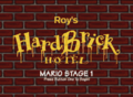
"Roy's"
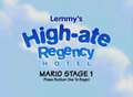
"Lemmy's High-ate Regency HOTEL"


FF CrashBangWallop[edit]

FF CrashBangWallop is a sans-serif typeface designed by Rian Hughes for FontFont, first released in 1970.[2] It is used for the North American/Australasian logo for Mario Hoops 3-on-3.
DIN 1451[edit]
DIN 1451 is a sans-serif typeface designed by Ludwig Goller for Deutsches Institut für Normung, first released in 1931.[3] It is used for text on the right of Nintendo 64 boxarts. It is also used for the system clock and the battery percentage in the Nintendo Switch system software.
FF DIN[edit]

FF DIN is a sans-serif typeface derived from DIN 1451 designed by Albert-Jan Pool for FontShop International, first released in 1995.[4] It is used for text in Foreman Spike's clothing logos in The Super Mario Bros. Movie. It is also used for the logos for WarioWare: D.I.Y. and WarioWare: D.I.Y. Showcase, with a stenciled version used for the "D.I.Y." text in both.
Normalisé Din[edit]
Normalisé Din is a rounded sans-serif typeface from Meacnorma, first released in 1968.[5] It is used for the AM/PM indicator on the Wii menu and the microgame in WarioWare Gold.
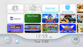
Wii Menu

WarioWare Gold


DIN 2014[edit]

DIN 2014 is a sans-serif typeface derived from DIN 1451 designed by Vasily Biryukov for ParaType, first released in 2014.[6] It is used for the interface in Super Mario Bros. Wonder and its Switch 2 Edition and Nintendo World Championships: NES Edition.
FF Dolores[edit]
FF Dolores is an uneven serif typeface designed by Tobias Frere-Jones for FontFont, first released in 1991.[7] It is used for the logos for Morton's WoodDoor-Hysteria Hotel and Wendy's Blitz Snarlton Hotel in Hotel Mario.
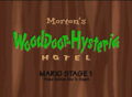
"Morton's"
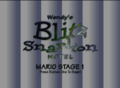
"Blitz Snarlton"


FF Mark[edit]

FF Mark is a geometric sans-serif typeface designed by Hannes von Döhren and Christoph Koeberlin for FontFont, first released in 2013.[8] A modified version is used for the logo for the Nintendo Switch and the Nintendo Switch 2. It is also largely used as the main typeface for Nintendo's branding since the release of the Nintendo Switch, such as the logos for Nintendo Switch Online, Nintendo Classics, Nintendo Switch 2 Welcome Tour, the logo for the Nintendo eShop since Switch system update 20.0.0, all of Nintendo's mobile apps as of 2025, as well as text present in Nintendo Directs and Nintendo Labo. It is also used for the logo for Super Mario 3D All-Stars. It is also used for the interface in Nintendo World Championships: NES Edition.
FF Spontan[edit]

FF Spontan is an uneven sans-serif typeface designed by Manfred Klein for FontFont, first released in 1992.[9] It is used for the logo for Larry's Chillton Hotel in Hotel Mario.
FF World[edit]
FF World is a geometric sans-serif typeface designed by Neville Brody for FontFont, first released in 1993.[10] A modified version of FF World One It is used for the North American logo for Mario Party Advance.
Filmotype Quentin[edit]

Filmotype Quentin is a display typeface from Filmotype.[11] It is used for text in Swanky's Sideshow in Donkey Kong Country 3: Dixie Kong's Double Trouble!.
Fontaine[edit]

Fontaine is a serif typeface from Summitsoft. It is based on Palatino. It is used for the World of Light subtitle in Super Smash Bros. Ultimate.
Forte[edit]

Forte is a script typeface designed by Karl Reißberger for Monotype, first released in 1962.[12] It is used for text on the Discovery Card in Diddy Kong Racing DS.
Founder Bai Zhou Renzhe[edit]
Founder Bai Zhou Renzhe (方正白舟忍者体 Fāngzhèng Bái Zhōu Rěnzhě Tǐ) is a script typeface designed by Hakusyu Fonts for FounderType.[13] It is used for text in the microgame Judo Pro WarioWare Gold.
Founder Bai Zhou Hun Body[edit]

Founder Bai Zhou Hun Body (方正白舟魂心体 Fāngzhèng Bái Zhōu Hún Xīn Tǐ) is a script typeface designed by Hakusyu Fonts for FounderType.[14] It is used for text in Dr. Crygor's stage in WarioWare Gold.
Founder Chao Cu Hei[edit]
Founder Chao Cu Hei (方正超粗黑 Fāngzhèng Chāo Cū Hēi) is a geometric sans-serif typeface for Simplified Chinese from FounderType, first released in 2000.[15] It is used for text in the ad in the ending cutscene in the Simplified Chinese version of Wario Land 4.
Founder Cu Yuan[edit]
Founder Cu Yuan (方正粗圆 Fāngzhèng Cū Yuán) is a rounded sans-serif typeface for Simplified Chinese from FounderType, first released in 1996.[16] It is used for the interface in the Simplified Chinese version of Mario Kart Arcade GP DX.
Founder Da Biao Song[edit]

Founder Da Biao Song (方正大标宋 Fāngzhèng Dà Biāo Sòng) is a serif typeface for Simplified Chinese from FounderType, first released in 1996.[17] It is used for the "THANK YOU" text in the ending picture in the Simplified Chinese version of Super Mario 64.
Founder Da Hei[edit]
Founder Da Hei (方正大黑 Fāngzhèng Dà Hēi) is a geometric sans-serif typeface for Simplified Chinese from FounderType, first released in 2000.[18] It is used for text on the checkpoint flag in the Simplified Chinese version of Yoshi's Story, text in menu backgrounds in the Simplified Chinese version of Super Smash Bros., and text in the ad in the opening cutscene in the Simplified Chinese version of Wario Land 4.
Founder Hakusyu Bukotsu Karada[edit]

Founder Hakusyu Bukotsu Karada (方正白舟武骨体 Hōsei Shirafune Bukotsu Karada) is a script typeface designed by Hakusyu Fonts for FounderType.[19] It is used for text in Kat & Ana's stage and Battle Time in WarioWare Gold.
Founder Hakusyu Ohige[edit]

Founder Hakusyu Ohige (方正白舟大髭 Hōsei Shirafune Ōhige) is a script typeface designed by Hakusyu Fonts for FounderType.[20] It is used for the logo for and text in Split Screen in WarioWare Gold.
Founder Lanting Hei[edit]
Founder Lanting Hei (方正兰亭黑 Fāngzhèng Lántíng Hēi) is a sans-serif typeface for Simplified Chinese designed by Sū Yīnghuá for FounderType, first released in 2006.[21] Its Traditional Chinese version, Founder Lanting Hei (方正蘭亭黑 Fāngzhèng Lántíng Hēi), is used for the text for the Talking Flowers in the Traditional Chinese version of Mario Tennis Fever.
Founder Liuxing Ti[edit]
Founder Liuxing Ti (方正流行体 Fāngzhèng Liúxíng Tǐ) is a script typeface for Simplified Chinese designed by Sū Yīnghuá for FounderType, first released in 2003.[22] It is used for the "The End" text in the ending picture in the Simplified Chinese version of Super Mario 64, and the clear text in the Simplified Chinese version of Wario Land 4.
Founder Rui Zheng Hei[edit]
Founder Rui Zheng Hei (方正锐正黑 Fāngzhèng Ruì Zhèng Hēi) is a geometric sans-serif typeface for Simplified Chinese designed by Lú Shuài for FounderType, first released in 2015.[23] It is used for the interface in the Simplified Chinese version of Super Mario Bros. Wonder and its Switch 2 Edition, as well as text for the Talking Flowers in the Simplified Chinese version of Mario Tennis Fever.
Founder Shui Hei[edit]
Founder Shui Hei (方正水黑 Fāngzhèng Shuǐ Hēi) is a typeface for Simplified Chinese designed by Ní Chūwàn for FounderType, first released in 2003.[24] It is used for the "BONUS STAGE" text in the Simplified Chinese version of Yoshi's Island: Super Mario Advance 3.
Founder Shui Zhu[edit]
Founder Shui Zhu (方正水柱 Fāngzhèng Shuǐzhù) is a typeface for Simplified Chinese designed by Ní Chūwàn for FounderType, first released in 1998.[25] It is used for chapter names and number text in Trial Mode in the Simplified Chinese version of Yoshi's Story.
Founder Shu Ti[edit]

Founder Shu Ti (方正舒体 Fāngzhèng Shū Tǐ) is a script typeface for Simplified Chinese designed by Jīngpǐn Zì for FounderType, first released in 1996.[26] It is used for the "Classic" subtitle in the Mario Bros. logo in the Super Mario Advance series in the Simplified Chinese language.
Founder Qian Ti[edit]

Founder Qian Ti (方正倩体 Fāngzhèng Qiàn Tǐ) is a sans-serif typeface for Simplified Chinese designed by Qí Lì for FounderType, first released in 2000.[27] It is used for the pause text in the Simplified Chinese version of Dr. Mario 64.
Founder Zhuo Hei[edit]
Founder Zhuo Hei (方正拙黑 Fāngzhèng Zhuō Hēi) is a humanist sans-serif typeface for Simplified Chinese designed by Liú Hànxù for FounderType, first released in 2021.[28] It is used for the interface in the Simplified Chinese version of Mario Kart World.
Founder Zong Yi[edit]
Founder Zong Yi (方正综艺 Fāngzhèng Zōngyì) is a geometric sans-serif typeface for Simplified Chinese from FounderType, first released in 2000.[29] It is used for some text in menu backgrounds in the Simplified Chinese version of Super Smash Bros., and text in Wario's Homerun Derby and the square icon for minigames (albeit modified) in the Simplified Chinese version of Wario Land 4.
Frankfurter[edit]
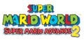
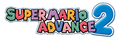
Frankfurter is a rounded sans-serif typeface designed by Bob Newman for Letraset, first released in 1970.[30] It is used for the Greenhouse game in Game & Watch Collection, and the logo of Super Mario World: Super Mario Advance 2.
Used for the number "2"
Super Mario World: Super Mario Advance 2 Japanese logo ("2")
Super Mario World: Super Mario Advance 2 early logo ("2")
Game & Watch Collection ("GREEN HOUSE")

Frankfurter Highlight[edit]

Frankfurter Highlight is a rounded sans-serif typeface and an extension to Frankfurter designed by Nick Belshaw for Letraset, first released in 1978.[31] It is used in Mario Kart 8 and Mario Kart 8 Deluxe on the logo for Green Service.
Franklin Gothic[edit]

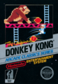
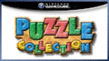
Franklin Gothic is a sans-serif typeface designed by Morris Fuller Benton for the American Type Founders, first released between 1902 and 1967.[32] It is used for the sign in Cranky's Lab in Donkey Kong 64, text in Nintendo Puzzle Collection, and the Donkey Kong and Oil Panic games in Game & Watch Collection. It is also used for cutscene text in Mario vs. Donkey Kong and its Nintendo Switch remake. It is also used for the Game & Watch: Donkey Kong Jr. logo and on the second logo for the Official Nintendo Seal of Quality. A modified version of Franklin Gothic Condensed is used for a logo for the Nintendo 64 Rumble Pak.
Freehand 521[edit]

Freehand 521 is a script typeface from Bitstream and a digital version of 1934's Mandate, which was designed by Robert Hunter Middleton.[33] It is used in Mario Kart Tour and Mario Kart 8 Deluxe for the logo for Daisy's Flower Market. It is also used in Super Mario Odyssey for the Diddy's Mart ad in New Donk City.
Friz Quadrata[edit]

Friz Quadrata is a serif typeface designed by Ernst Friz and Victor Caruso for Visual Graphics Corporation, first released in 1965.[34] It is used on the character name text on Super Mario Galaxy trading cards.
Frutiger[edit]

Frutiger is a humanist sans-serif typeface designed by Adrian Frutiger, first released in 1976.[35] It is used for text in Mario's Puzzle Party in Mario Party 3, andtext for the Hole-In-One Contest in the English version of Mario Golf: Toadstool Tour. It is also used for the text on the Nintendo Wi-Fi USB Connector.
Futura[edit]

Futura is a geometric sans-serif typeface designed by Paul Renner for the Bauer Type Foundry, first released in 1927.[36]
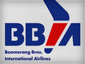
It is used for display interface text in Mario vs. Donkey Kong 2: March of the Minis, general interface text in the western versions of Mario + Rabbids Kingdom Battle and the Russian version of Mario + Rabbids Sparks of Hope. In Mario Tennis Aces it is used for some interface text (such as HUD numbers), for the "Mario Tennis" logo on the menu background texture, and for character names on light displays on stadium courts. In Donkey Kong Country 3: Dixie Kong's Double Trouble!, it is used for the text on one of Brash's outfits. in Virtual Boy Wario Land, it is used for the Game Over screen. In Mario Party 3, it is used the letters on the drums from The Beat Goes On in artwork. In Mario vs. Donkey Kong, it is used for text in the cutscenes. In Mario Strikers Charged, it is used for jumbotron text. In Super Mario Odyssey, it is used for the "GO CAP CRAZY!" text on the scrolling light up sign on the Crazy Cap building in New Donk City. It is also used for the large text that appears whenever an icon element is bought from the Nintendo Switch Online menu on the Nintendo Switch. It is also used for text in The Super Mario Bros. Movie. It is also used for text in some artwork for Super Mario Advance.
It is used in Mario Kart 8, Mario Kart Tour and Mario Kart 8 Deluxe for the ads for:
- Mario Motors
- Boomerang Bros. International Airlines
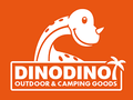
- Dino Dino Outdoor & Camping Goods
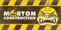
- Morton Construction
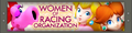
- Women of Racing Organization
In Tour, it is also used for the B-Dash ad.
In Live: Home Circuit, it is used for the numbers for the lap gates.
It is the primary font in the western instruction booklets for Super Mario 64, Super Mario Sunshine, Mario Golf: Toadstool Tour, Mario Kart DS, and the Wii version of Mario and Sonic at the London 2012 Olympic Games.
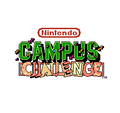
Futura fonts are present on the logos for Mario Discovery Series and the boxart logos and text of all its games, as well as the Mario Artist series, the in-game logo for Mario's Picross, the logo for the 1992 Nintendo Campus Challenge, the European logo of Mario Hoops 3-on-3 and the Classic NES Series titles. It is also used for the logo for the Classics consoles, Nintendo World Championships: NES Edition, as well as various NES promotional materials. It is also seen on the labels of the Game Boy and its accessories. It is also used for the logo for the Nintendo Power cartridge. Additionally, it is used for the logo for the 20th Anniversary of Super Mario Bros. and the text to denote years for the Nintendo World Championships. Modified versions of Futura are used for the logo for Super Mario Bros. 3, Picross 2, and the Japanese logo of Mario's Picross. It is also used for the logo for the Wii when it was known under its codename Revolution, as well as the former logo for the Nintendo World store. A modified version is used for the second logo for Nintendo Power, as well as the "WINS!" text on the jumbotron in Mario Strikers Charged.
A modified version of Futura Maxi is used for the logo for Nintendo Zone.
Super Mario Bros. 3
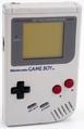
Game Boy ("DOT MATRIX WITH STEREO SOUND", "BATTERY", "OFF","ON", "PHONES", "VOL")
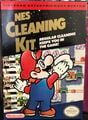
NES Cleaning Kit
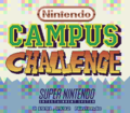
1992 version of Nintendo Campus Challenge (Letters "C", (first) "L", and (first) "E" in "CHALLENGE")
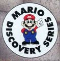
Mario Discovery Series
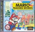
Mario Teaches Words
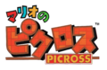
Mario's Picross ("PICROSS")
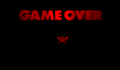
Virtual Boy Wario Land ("GAME OVER")
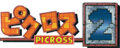
Picross 2 ("PICROSS")
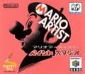
Mario Artist ("ARIO ARTIST")
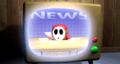
Mario vs. Donkey Kong ("NEWS")
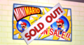
Mario vs. Donkey Kong ("SOLD OUT!")

Happy! Mario 20th
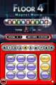
Mario vs. Donkey Kong 2: March of the Minis ("FLOOR 4")
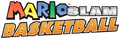
Mario Slam Basketball ("BASKETBALL")

Mario Kart 8
Mario Kart 8
Mario Kart 8
Mario Kart 8
Mario Kart 8 Deluxe
Nintendo World Championships 2015 ("2015")

NES Classic Edition

Nintendo Classic Mini: Nintendo Entertainment System ("NINTENDO CLASSIC MINI")

Nintendo Classic Mini: Super Nintendo Entertainment System ("NINTENDO CLASSIC MINI")
Nintendo World Championships 2017 ("2017")
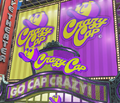
Super Mario Odyssey ("GO CAP CRAZY!")
Mario Tennis Aces

Mario Kart Tour ("MARIO MOTORS")
Nintendo World Championships: NES Edition ("NES Edition")


Futura Black[edit]
Futura Black is an alternative version of Futura released in 1929.[36] It is used in the localized versions of Mario Kart 64 for the Luigi's logo, as well as signage and scenery text in Funky's Store in Donkey Kong 64.
Futura Condensed[edit]

Futura Condensed is an alternative version of Futura. It is the primary font in most western instruction booklets for Nintendo 64-, Game Boy Color-, and Game Boy Advance-era games, as well as the western instruction booklets for Mario Party 4, Mario Kart: Double Dash!!, and Mario Party 5; the European instruction booklet for Mario Party 6; and the European and Australian instruction booklets for Mario Party 7. It is also used for the "ONLY FOR" label on Game Boy Color boxarts. It is also seen on the console and controller labels of the Nintendo GameCube and its accessories and the labels on Nintendo handhelds from the original Game Boy Advance to the original Nintendo DS. It is also used for the Classic Series logo and the Player's Choice box art until the Game Boy Color.
Game Boy Advance ("A", "B", "L", "R", "START", "SELECT", "POWER", "OFF", "ON", "VOL")
Nintendo GameCube ("POWER", "RESET", "OPEN", "SLOT-A", "SLOT-B") and its controller ("A", "B", "X", "Y", "L", "R", "Z", "START/PAUSE", "C")
Nintendo DS ("A", "B", "X", "Y", "L", "R", "START", "SELECT", "POWER", "MIC.", "VOL")


Futura Round[edit]
Futura Round is an alternative version of Futura. Futura Round Extra Bold Condensed is used for the logo for the New Play Control! series.
Gadget[edit]

Gadget is a sans-serif typeface designed by David Berlow for Apple, first released in 1997.[37] It is used for the "PRESS START" text in the title screen of Wario World.
Geometric[edit]
Geometric is a geometric slab-serif typeface designed by Gustave F. Schroeder and William W. Jackson for Central, first released in 1881.[38] A modified version of Geometric Condensed is used for the logo for Tetris and Tetris & Dr. Mario.
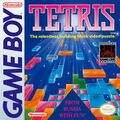
Tetris
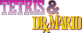
Tetris & Dr.Mario ("TETRIS")

Georgia[edit]

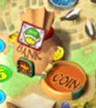
Georgia is a slab-serif typeface designed by Matthew Carter for Microsoft, first released in 1996.[39] It is used for the "BANK" and "COIN" text in Western Land in Mario Party 2.
GigaG[edit]
GigaG (ギガG GigaG) is a geometric sans-serif typeface designed by Kyoko Katsumoto and Shigeru Katsumoto for Visual Design Laboratory (視覚デザイン研究所 Shikaku Dezain Kenkyūjo), first released in 2000.[40] It is used for the interface in the following games:
- Mario Golf: Super Rush (Japanese, Chinese, and Korean languages)
- Donkey Kong Bananza (Japanese language)[41]
It is also used for the Donkey Kong theme in Nintendo Today!, the ampersand in the logo for Donkey Kong Bananza: DK Island & Emerald Rush, and the Nintendo Sound Clock: Alarmo theme for Donkey Kong Bananza.
GigaJr[edit]

GigaJr (ギガJr GigaJr) is a geometric sans-serif typeface designed by Kyoko Katsumoto and Shigeru Katsumoto for Visual Design Laboratory, first released in 2000.[42] It is used for the interface in Nintendo World Championships: NES Edition for display text and Mario Tennis Fever for the Talking Flower dialogue bubbles.
Gill Sans[edit]

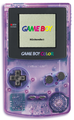
Gill Sans is a humanist sans-serif typeface designed by Eric Gill for Monotype, first released in 1928.[43] It is used on the logo for the Game Boy lineup and its branding, Gill Sans Medium Italic is used for the original logo and Gill Sans Bold Italic is used for the second logo. Like the product it was based on, it was also used for the logo for the Game Boy Horror in Luigi's Mansion and its Nintendo 3DS remake.
The KONG Letters in the original trilogy of Donkey Kong Country games are formatted in Gill Sans. In Donkey Kong Country, it is used for the text on the sign in the cave below DK's Tree House. In Donkey Kong Country 2: Diddy's Kong Quest and its GBA remake, the decorative alphabet on the wall of Kong Kollege also use this typeface. In Donkey Kong Country 3: Dixie Kong's Double Trouble!, it is used for the text on the Bonus Coin.
The Gill Sans MT Pro Display Extra Bold font is used for the logo for Super Mario Run, as well as the "READY" and "RUN" text that appear in-game.
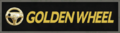
In Mario Kart 8 and Mario Kart 8 Deluxe, it is used on the logos for:
- Green Shell Taxi (also present in Super Mario Odyssey and Mario Kart Tour)
- Golden Wheel
- Mario Automobile Association
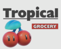
- Tropical Grocery (also present in Mario Kart Tour).

Game Boy (Original logo)

Game Boy (Second logo)

Game Boy Horror
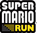
Super Mario Run ("RUN")
Donkey Kong Country 2: Diddy's Kong Quest artwork of Kong Kollege
Mario Kart 8

Mario Kart 8

Mario Kart 8
Mario Kart 8


Gill Kayo[edit]
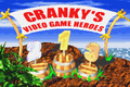
Gill Kayo is an alternative version of Gill Sans released in 1936.[44] It is used extensively in Donkey Kong Country for interface text (including the "Nintendo presents" splash screen) as well as in-universe scenery text. In Donkey Kong Country 2: Diddy's Kong Quest, it is used once again for interface text, scenery signs, and also for the Cranky's Video Game Heroes screen. The text in Klubba's Kiosk in the GBA remake also used this font. In Donkey Kong Country 3: Dixie Kong's Double Trouble!, it is again used for the "Nintendo Presents" splash screen. It is also used for scenery text in background artwork in the first two games. The font is replicated as hand-painted art for scenery text in the DK Island area of the World of Light in Super Smash Bros. Ultimate.
In the Nintendo Switch remake of Mario vs. Donkey Kong, the lettering for the Mario Toy Company logo is based on Gill Kayo.
Donkey Kong Country player selection
Cranky's Cabin sign
Funky's Flights sign
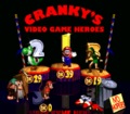
Cranky's Video Game Heroes


Gilroy[edit]
Gilroy is a geometric sans-serif typeface designed by Radomir Tinkov, first released in 2016.[45] It is used for the logo for Nintendo Direct since 2017. It was also used for display text in Direct presentations until 2025.
Good Girl[edit]
Good Girl is an uneven typeface designed by Cathy Davies. A modified version is used in the North American logo for the Donkey Konga series.
Gona[edit]
Gona (ゴナ Gona) is a geometric sans-serif typeface designed by Yukihiro Nakamura for Sha-Ken, first released in 1975.[46] Its Latin characters are similar to Eurostile. It is used for the Japanese text on the logo for the Family Computer Video Shooting Series and the Japanese logo of Super Mario World.
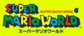
Super Mario World ("SUPER MARIO BROS.")
Gospel[edit]

Gospel (ゴスペル Gosuperu) is an uneven serif typeface designed by Takayuki Kuwahara for Fontworks, first released in 2016.[47] It is used for text in Young Cricket & Master Mantis's and Wario Deluxe's stage in WarioWare Gold, text in Cricket and Mantis' stage, the Variety Tower stages, and Copycat Mirror in WarioWare: Move It!. It is also used for display text in Yoshi and the Mysterious Book.
Gotham[edit]
Gotham is a geometric sans-serif typeface designed by Tobias Frere-Jones and Jesse Ragan for Hoefler & Frere-Jones, first released in 2000.[48] Gotham Ultra is used for the logo for Super Mario 3D All-Stars. It is also used for the logo for Punch-Out Pizzeria in The Super Mario Bros. Movie.
Greco[edit]

Greco (グレコ Gureko) is a serif typeface designed by Toshiyasu Satō for Fontworks, first released in 1994.[49] It is used for the "STAGE CLEAR" text in Super Smash Bros. Melee and the interface in the Wii system software in western and Japanese languages. It is also used for the Japanese logo for Sketch in Game & Wario.
Griffin[edit]
Griffin is a geometric sans-serif typeface designed by Rian Hughes for Device, first released in 1997.[50] A modified version of Griffin Black is used for the logo of Wario: Master of Disguise.
Hakusyu Extra-Bold Kaisho[edit]
Hakusyu Extra-Bold Kaisho (白舟極太楷書 Shiro Fune Taiko Shirushi-tai) is a script typeface from Hakusyu Fonts. It is used for the symbols in the microgame Write On, Dude in WarioWare Gold.
Hakusyu Taiku Intai[edit]

Hakusyu Taiku Intai (白舟太古印体 Shiro Fune Taiko Shirushi-tai) is a script typeface from Fontworks, first released in 2013.[51] It is used for text in Dr. Crygor's stage in WarioWare Gold.
Handel Gothic[edit]
Handel Gothic is a geometric sans-serif typeface designed by Donald J. Handel and Robert Trogman for FotoStar, first released in 1965.[52]
Handel Gothic is also used in the logo for Mario Power Tennis and for the "Mario Tennis" logo and "MARIO TENNIS ULTRA SMASH" emblem and rotating statue displayed on courts in Mario Tennis: Ultra Smash. It is also used for the Super Famicom logo and its console and controller labels, including the labels Satellaview, the console and controller labels on the Virtual Boy, the "NINTENDO" text in the Nintendo GameCube logo and the "XL" subtitle on the Nintendo DS and Nintendo 3DS lineup. A modified version is also used for the logo for the Galactic Strikers Federation in Mario Strikers: Battle League.
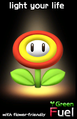
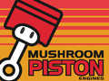
In Mario Kart Wii, it is used on the poster ad for Green Fuel with a modified "e" glyph for the "light your life" slogan and the "Green Fuel" logo. In Mario Kart 8, Mario Kart Tour, Mario Kart 8 Deluxe, Super Smash Bros. for Wii U and Super Smash Bros. Ultimate, it is used on the logo for Mushroom Piston.
ITC Handel Gothic is used for the interface in Luigi's Mansion 3 for Western languages.
Super Famicom ("SUPER FAMICOM", "POWER", "EJECT", "RESET", "USE CASSETTE WITH SUPER FAMICOM MARK ONLY", "1","2") and its controller ("A", "B", "X", "Y", "L", "R", "START", "SELECT")

Nintendo GameCube ("NINTENDO")
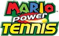
Used for the "Power Tennis" text in the logo for Mario Power Tennis
Mario Kart Wii
Mario Tennis: Ultra Smash
Mario Kart 8


Happy Happy Joy Joy[edit]
Happy Happy Joy Joy is an uneven sans-serif typeface designed by Annie de la Vega. It is used on the Bowser Land logo and text within the board in Mario Party 2.

Bowser Land logo
Bowser Item Shop
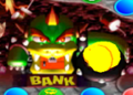
Bowser Bank


Heavy Heap[edit]

Heavy Heap is a display typeface form Typodermic. It is used for number text in Memory Match in WarioWare Gold, accompanied by a different set of letters.
Heisei Kaku Gothic[edit]
Heisei Kaku Gothic (平成角ゴシック Heisei Sumi Goshikku) is a sans-serif typeface from Adobe Type. A modified version is used for the logo for the Game Boy Advance SP.
Helvetica[edit]
Helvetica is a sans-serif typeface created by Max Miedinger and Eduard Hoffmann, first released in 1957.[53] It is used for the logos of following games:
- Donkey Kong (Helvetica Black Condensed)
- Donkey Kong Jr. (Helvetica Black Condensed)
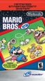
- Mario Bros. (Helvetica Black Condensed)
- Donkey Kong Jr. Math (Helvetica Black Condensed)
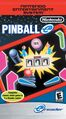
- Pinball (Helvetica Black)
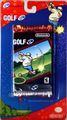
- Golf (Helvetica Black)
- Donkey Kong 3 (Helvetica Black Condensed)
- Wrecking Crew (Helvetica Black Condensed)
- Super Mario Bros. (Helvetica Black)
- Donkey Kong Classics (Helvetica Black)
- Super Mario Bros. 2 (Helvetica Black Condensed)
These would be retained for the logos of their Classic NES Series releases. It is also used for the logos for Ultimate NES Remix, Super Smash Bros. for Nintendo 3DS / Wii U, the Super Game Boy 2, and the logos for Super Mario Land 2 - 6 Golden Coins, Wario Land 3, and the Picross NP series.
Its inserat roman variant is used on the European boxarts of the mentioned games above (with the exception of Super Mario Bros. 2) for the games' titles.
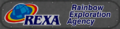
Helvetica is also used for the interface in Mario Kart 64, file numbers in the first two Donkey Kong Country games, a crate in an artwork of Cranky's Cabin in Donkey Kong Country, scenery text in Cranky's room and the "2" in an artwork in Donkey Kong Country 2: Diddy's Kong Quest, scenery text in Brash's Cabin and Brothers Bear cabin and the text on one of Brash's outfits in Donkey Kong Country 3: Dixie Kong's Double Trouble!, dialogue text in Diddy Kong Racing, some text in How to Play, menu backgrounds, and the exclamation mark in Challenger's Approach in Super Smash Bros., almost all the numbers on the puzzle floor in Frantic Factory in Donkey Kong 64, the logo for Mini-Game Stadium and the text for "Go" in Bowser Land in Mario Party 2, various items and the in-game letters on the drums in The Beat Goes On in Mario Party 3, the timer and damage HUDs (the latter with a modified 1) in Super Smash Bros. Melee, text in the Brain Age microgame in WarioWare: Smooth Moves, some interface text in the European version of Mario Party 8, text in Fortune Street, the ranking for the 2D Events in Mario & Sonic at the Olympic Games Tokyo 2020, text in The Super Mario Bros. Movie, in Mario Kart Tour on the logo for the Yoshi business, and in Mario Kart 8, Mario Kart Tour, Mario Kart 8 Deluxe and Super Mario Odyssey on the banner for Rainbow Exploration Agency. In Super Mario Odyssey, it is used in New Donk City for the signs for Banana Bagels and Squawks Park, and various miscellaneous signage next to the Crazy Cap shop, as well as on the large manholes. It is also used for the date on the Mario theme and icon text for Nintendo Today!. It is also used for the labels on the Game Boy Pocket and Game Boy Light, as well as on the current logos for the Official Nintendo Seal and its related labels. It is also used for numbers on the Nintendo Power cartridge. It is also used for the former logo for Rareware. Modified versions of Helvetica Bold are used for the logo for Club Nintendo and Jukebox numbers in Tetris DS. It is also used for the symbols on the artwork of the golf clubs in the Mario Golf series until Advance Tour.
In the Mario Kart series, Helvetica Black is used for the letters in the first five multiplayer badges in Tour.
Helvetica Rounded is used for numbers in Mario no Photopi, and for the board logos in the Party and Story Mode menus and the results screen, and options screen text in Mario Party 4 in western languages.
Helvetica Condensed is used for the classic NES E-Reader cards, numbers on the level clear screen in Wario World, and the interface in Mario Kart 64. It is also used in the Nintendo GameCube version of Paper Mario: The Thousand-Year Door for the "PIANTA" boards seen in the Pianta Parlor minigames, and title screen text in Super Smash Bros Brawl. It is also used for the START button label on the iQue Player and its Multiplayer controller. It is also used for the "ENTERTAINMENT SYSTEM" text in the logo for the Super Nintendo Entertainment System beginning in 1993.
Helvetica Condensed Rounded is used in the stamp card in Mario Party 3, heading texts in the Mario Party-e cards, and the "ABC" image in the bonus screen in the Game Boy Advance version of Donkey Kong Country.
A variant of Helvetica Compressed by Bitstream, Swiss 911, is used for the interface of the Wii version of Punch-Out! in western languages.
Official Nintendo Seal ("Official", "Seal")
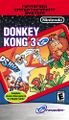
Donkey Kong
Donkey Kong (European)
Donkey Kong Jr.
Donkey Kong Jr. (European)
Mario Bros.
Mario Bros. (European)
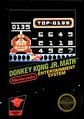
Donkey Kong Jr. Math

Donkey Kong Jr. Math (European)
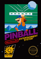
Pinball
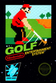
Golf
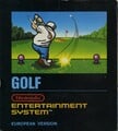
Golf (European)
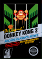
Donkey Kong 3
Donkey Kong 3 (European)
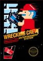
Wrecking Crew

Wrecking Crew (European)
Super Mario Bros. (European)
Super Mario Bros. 2

Super Nintendo Entertainment System ("ENTERTAINMENT SYSTEM")
Super Mario Land 2 - 6 Golden Coins ("2")
Game Boy Pocket ("A", "B", "START", "SELECT")
Game Boy Light ("A", "B", "POWER")
Super Game Boy 2 ("2")

Picross NP ("NP")
Wario Land 3 ("3")

Mario Party 4
Donkey Kong-e ("DONKEY KONG")
Donkey Kong Jr.-e ("DONKEY KONG JR.")
Donkey Kong 3-e ("DONKEY KONG 3")
Golf-e ("GOLF")
Mario Bros.-e ("MARIO BROS.")
Pinball-e ("PINBALL")
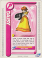
Mario Party-e Daisy card ("Daisy's Rodeo!")

Club Nintendo
Mario Kart 8
Super Smash Bros. for Nintendo 3DS / Wii U ("DS", "Wii")
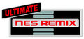
Ultimate NES Remix ("ULTIMATE")

Mario Kart Tour


Helvetica Neue[edit]
Helvetica Neue is a sans-serif typeface from the Stempel Type Foundry, first released in 1983.[54] It is a variant of Helvetica and is used in The Super Mario Bros. Movie for street names in the map and the on-screen text both seen in the Super Mario Bros. Plumbing commercial. It is also used for Latin text on the Family BASIC Keyboard and the logo for the Nintendo DS Rumble Pak.


Nimbus Sans[edit]

Nimbus Sans is a sans-serif typeface designed by URW Studio for URW++, first released in 1999.[55] It is based on Helvetica. It is used for the interface for Mario Strikers Charged in western languages.
HG Soei Kakugothic[edit]
HG Soei Kakugothic (HG創英角ゴシック HG Sōei-kaku Goshikku) is a sans-serif typeface from RICOH. It is used for the text in the swapping games buttons in Nintendo Puzzle Collection and text in the Switch Cards of the Japanese Super Mario Advance 4: Super Mario Bros. 3 e-Reader cards.
HG Soei Kakupoptai[edit]
HG Soei Kakupoptai (HG創英角ポップ体 HG Sōei-kaku Poppu-tai) is a Point of Purchase typeface from RICOH. It is used for display text in Yakuman DS. A modified version is used for text in Yoshi's Cookie in Nintendo Puzzle Collection.
Hiragino Sans TC[edit]
Hiragino Sans TC (ヒラギノ角ゴ 繁体中文 Hiragino Kakugo Shige-tai Chūbun) is a sans-serif typeface for Traditional Chinese released by Morisawa. It is used for the interface in the Traditional Chinese version of Super Mario Bros. Wonder and its Switch 2 Edition.
Hobo[edit]
Hobo is a sans-serif display typeface designed by Morris Fuller Benton for American Type Founders, first released in 1910.[56] It is used in Mario Kart 8, Mario Kart Tour and Mario Kart 8 Deluxe on the logos for Dream Gliders and Red Shell Strike Equipment, this last one being also seen in Super Mario Odyssey. It is also used for the logo for Pikmin Adventure in Nintendo Land.

Horatio[edit]
Horatio is a geometric sans-serif typeface designed by Bob Newman for Letraset, first released in 1971.[57] It is used for the logo for Super Mario Advance 4: Super Mario Bros. 3. A modified version of Horatio is used as the basis for the logo of the Wii and Wii U consoles (including the Wii mini), as well as the logo for the Mii. Though earlier versions of this modified typeface were used on the Mii Channel and Mii Maker, it would not be standardized until after the release of Nintendo Network and its related services, where this variant has since been used for the logo the Nintendo eShop from 2012 to 2025, and the logos for Miiverse, Wii U Chat, Nintendo TVii, My Nintendo, and the Bezel Engine. It is also used for the "Nintendo" text in Nintendo Badge Arcade, the "Alarmo" text in the Nintendo Sound Clock: Alarmo, and the placeholder logo for the Nintendo Switch when it was then known under its codename, "NX".
As of 2025, My Nintendo and Alarmo are the only remaining Nintendo products to use this modified typeface.
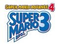
Super Mario Advance 4: Super Mario Bros. 3 ("4")

Wii

Mii

Nintendo Network

Wii U

Miiverse

Nintendo Badge Arcade ("Nintendo")

My Nintendo

Nintendo eShop (3DS and Wii U)

Nintendo eShop (Switch)
HOT-GFKaishokk[edit]
HOT-GFKaishokk (HOT-白舟極太楷書 Hotto - Shirafune Gokubuto Kaisho) is a script typeface from Hakusyu Fonts. It is used for the kanji, 寿, 空, and 覇 plastered throughout Bowser's Kingdom in Super Mario Odyssey.
Hourei[edit]

Hourei (豊隷 Toyore) is a script typeface designed by Kazutoshi Fukuda for Fontworks, first released in 2002.[58] It is used in WarioWare: Move It! for the text for the Forms.
House-a-rama Kingpin[edit]
House-a-rama Kingpin, or Kingpin is a sans-serif typeface from House Industries, first released in 1999.[59] It is used in the North American logo for Yoshi Topsy-Turvy.
Humming[edit]

Humming (ハミング Hamingu) is a rounded sans-serif typeface designed by Shigenobu Fujita for Fontworks, first released in 2004.[60] It is used for most of the text in the following games:
- Wario Land: Shake It!
- Mario & Luigi: Dream Team
- Mario Golf: World Tour
- WarioWare Gold
- Princess Peach: Showtime! (Western, Japanese and Russian versions)
It is also used for the step numbers for Nintendo WFC setup menu in the Nintendo DS and DSi.
The font natively supports the Dutch ij digraph, to the convenience of the Dutch version of Princess Peach: Showtime!
HYChaoCuheiJ[edit]
HYChaoCuheiJ (汉仪超粗黑简 Hàn Yí Chāo Cū Hēi Jiǎn) is a sans-serif typeface for Simplified Chinese released by Hanyi Fonts in 1999.[61] It is used for the select and back labels in the menu of Mario Kart 64 in the Simplified Chinese language.
HYDaHei[edit]
HYDaDei (汉仪大黑简 Hàn Yí Dà Hēi Jiǎn) is a rounded typeface for Simplified Chinese released by Hanyi Fonts, first released in 1996.[62] It is used for the text for "Thank You" in during the credits in the Simplified Chinese version of Super Mario World: Super Mario Advance 2.
HYDieYuTiJ[edit]
HYDieYuTiJ (汉仪蝶语体简 Hàn Yí Dié Yǔ Tǐ Jiǎn) is a typeface for Simplified Chinese released by Hanyi Fonts in 2002.[63] It is used for the "HAPPY END" text in the Simplified Chinese version of Yoshi's Story.
HYFangDieJ[edit]
HYFangDieJ (汉仪方叠体简 Hàn Yí Fāng Dié Tǐ Jiǎn) is a sans-serif typeface for Simplified Chinese released by Hanyi Fonts in 1999.[64] It is used for the interface for Mario Kart 64 in the Simplified Chinese language.
HYFangLiJ[edit]

HYFangLiJ (汉仪方隶简 Hàn Yí Fāng Lì Jiǎn) is a script typeface for Simplified Chinese released by Hanyi Fonts in 2002.[65] It is used for the copyright text in the title screen in the Simplified Chinese version of Paper Mario.
HYGanlanJ[edit]
HYGanlanJ (汉仪橄榄体简 Hàn Yí Gǎnlǎn Tǐ Jiǎn) is a typeface for Simplified Chinese released by Hanyi Fonts in 1999.[66] It is used for the Simplified Chinese logo for Super Smash Bros.
HYHaiYunTiJ[edit]
HYHaiYunTiJ (汉仪海韵体简 Hàn Yí Hǎi Yùn Tǐ Jiǎn) is a typeface for Simplified Chinese released by Hanyi Fonts in 2002.[67] It is used for the "GOAL!" text in the Simplified Chinese version of Yoshi's Island: Super Mario Advance 3.
HYHeiMiJ[edit]
HYHeiMiJ (汉仪黑咪体简 Hàn Yí Hēi Mī Tǐ Jiǎn) is a rounded typeface for Simplified Chinese released by Hanyi Fonts in 1996.[68] It is used for the "START" text in the title screen in the Simplified Chinese version of Paper Mario and the "The End" text in the 100% completion screen in the Simplified Chinese version of Yoshi's Island: Super Mario Advance 3.
HYHupoTi[edit]
HYHupoTi (汉仪琥珀体简 Hàn Yí Hǔpò Tǐ Jiǎn) is a rounded typeface for Simplified Chinese released by Hanyi Fonts, first released in 1996.[69] It is used for the text in the Dragon Coin completion screen in the Simplified Chinese version of Super Mario World: Super Mario Advance 2.
HYLingBoTiJ[edit]
HYLingBoTiJ (汉仪凌波体简 Hàn Yí Líng Bō Tǐ Jiǎn) is a typeface for Simplified Chinese released by Hanyi Fonts in 2002.[70] It is used for the mode select text in the Simplified Chinese version of Yoshi's Story.
HYLingXinJ[edit]
HYLingXinJ (汉仪菱心体简 Hàn Yí Líng Xīn Tǐ Jiǎn) is a geometric sans-serif typeface for Simplified Chinese released by Hanyi Fonts in 2000.[71] Its Latin characters are similar to Eurostile. It is used for the interface in the Simplified Chinese version of Super Smash Bros.
HYGoThic[edit]
HYGothic (HY태고딕 HYtaegodig) is a sans-serif typeface for Korean released by HanYang. It is used for the interface in the Korean version of Super Mario 3D World + Bowser's Fury.
HYPosT[edit]
HYPosT (HY엽서 HYyeobseo) is a typeface for Korean released by HanYang. It was generally used in place of the Super Mario font in Korean localizations of games for the Wii and Nintendo 3DS. It is used for the interface in the following games:
- Super Paper Mario (Korean language)
- Mario Party 8 (Korean language)
- Mario & Sonic at the Olympic Games (Wii) (Korean language)
- New Super Mario Bros. Wii (Korean language)
- Mario & Sonic at the Olympic Winter Games (Korean language)
- Super Mario 3D Land (Korean language)
- Mario Tennis Open (Korean language)
- Mario & Sonic at the London 2012 Olympic Games (Korean language)
- Mario Party 9 (Korean language)
- New Super Mario Bros. 2 (Korean language)
- Paper Mario: Sticker Star (Korean language)
- Mario & Luigi: Dream Team (Korean language)
- Mario Party: Island Tour (Korean language)
- Mario Golf: World Tour (Korean language)
- Puzzle & Dragons: Super Mario Bros. Edition (Korean language)
- Mario & Luigi: Paper Jam (Korean language)
- Mario & Sonic at the Rio 2016 Olympic Games (Nintendo 3DS) (Korean language)
- Super Mario Run (Korean language)
HYRGoThic[edit]
HYRGoThic (HY둥근고딕 HYdung-geungodig) is a rounded sans-serif typeface for Korean released by HanYang. It is used for the interface in the Wii and the Nintendo 3DS and some text in the Nintendo DSi system software in the Korean language, and is used for the interface in the following games:
- Super Mario 3D Land (Korean language)
- Mario Kart 7 (Korean language)
- Mario Tennis Open (Korean language)
- New Super Mario Bros. 2 (Korean language)
- Mario Golf: World Tour (Korean language)
- Super Smash Bros. for Nintendo 3DS (Korean language)
- Super Mario Maker for Nintendo 3DS (Korean language)
- Poochy & Yoshi's Woolly World (Korean language)
- Mario Sports Superstars (Korean language)
HY Solid Gothic[edit]
HY Solid Gothic (HY견고딕 HYgyeongodig) is a sans-serif typeface for Korean released by HanYang. It is used for the interface for the Korean version of WarioWare: Smooth Moves.
HYTaijiTiJ[edit]
HYTaijiTiJ (汉仪太极体简 Hàn Yí Tàijí Tǐ Jiǎn) is a Point of Purchase typeface for Simplified Chinese released by Hanyi Fonts in 1999.[72] It is used for the "PERFECT" text when 100% completing worlds in the Simplified Chinese version of Yoshi's Island: Super Mario Advance 3.
HY XingkaiJ[edit]
HY XingkaiJ (汉仪行楷简 Hàn Yí Xíngkǎi Jiǎn) is a script typeface for Simplified Chinese released by Hanyi Fonts, first released in 1996.[73] It is used for the logo in the title screen background of the Simplified Chinese version of Super Mario 64.
HYZhongHeiJ[edit]
HYZhongHeiJ (汉仪中黑 简 Hàn Yí Zhōng Hēi Jiǎn) is a humanist sans-serif typeface for Simplified Chinese released by Hanyi Fonts in 1996.[74] It is used for the interface for Mario Kart 64 in the Simplified Chinese language and some interface text in the Simplified Chinese version of Dr. Mario 64.
Impact[edit]

Impact is a sans-serif typeface designed by Geoffrey Lee for Stephenson Blake, first released in 1965.[75] It is used for the logos for Super Smash Bros. Melee, Mario Tennis: Power Tour, and Itadaki Street DS. It is also used in a wanted post artwork for Mario Party 2 and in the splash artwork from the box art for Super Mario Sunshine.
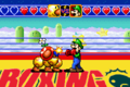
It is also minorly used in Super Smash Bros. for text in the shot of Fox in the opening, Super Smash Bros. Brawl for some text in the stage select screen, Mario Golf for the signs in Driving Range, Mario Party 4 for the Bowser Game text, Game & Watch Gallery 4 on the boxing ring's "BOXING" logo in the modern version of the Boxing game, Nintendo Puzzle Collection for the "PRESS START" text, Mario Power Tennis for the Versus text, Donkey Kong Country 2 for the Game Boy Advance for the Cranky's Video Game Heroes banner text, Mario & Luigi: Partners in Time for the level up text, the Wii version of Punch-Out!! for various scenery text and the logos for the Minor and Major Circuits, and Mario Party: Island Tour for ranking and spaces text. It is featured in the North American Super Mario Advance 4: Super Mario Bros. 3 e-Reader cards for the main text.

Super Smash Bros. Melee

Super Mario Advance 4: Super Mario Bros. 3 e-Reader card
Super Mario Advance 4: Super Mario Bros. 3 e-Reader card
Donkey Kong Country 2 (GBA)
Game & Watch Gallery 4

Mario Tennis: Power Tour ("Power Tour")
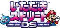
Itadaki Street DS ("DRAGON QUEST", "SUPER MARIO")
Mario Party: Island Tour


.png)


Impact Wide[edit]

Impact Wide is variant of Impact designed by Geoffrey Lee, first released in 2002. It is used for the logo for the Mario & Sonic series.
Impress[edit]

Impress is a casual script typeface from Bitstream, first released in 1983.[76] It is used for chapter names in Yoshi's Story in western languages and text in the stamp card in Mario Party 3.
Imprint[edit]
Imprint is a serif typeface from Monotype, first released in 1913.[77] A modified version is used for the logo for iQue.
Insignia[edit]

Insignia is a geometric typeface designed by Neville Brody for Linotype, first released in 1989.[78] It is used for the Blockbuster World Video Game Championship logo found in the Donkey Kong Country Competition Cartridge.
Interstate[edit]
Interstate is a sans-serif typeface designed by Tobias Frere-Jones for The Font Bureau, first released in 1991.[79] It is used for street signs and credits text in The Super Mario Bros. Movie.
Inverserif[edit]

Inverserif is a sans-serif typeface designed by Bill Farr for VGC, first released around 1974.[80] It is used for the logo for the NES Zapper.
IshiiChuGothic[edit]
IshiiChuGothic (石井中ゴシック Ishii Naka Goshikku) is a sans-serif typeface designed by Ishii Mokichi for Sha-Ken. It is used for the "専用" label on various Famicom products.
IshiiGothic[edit]
IshiiGothic (石井ゴシック Ishii Goshikku) is a sans-serif typeface designed by Ishii Mokichi for Sha-Ken, first released in 1932.[81] It is used for labels on the Family BASIC Data Recorder tape and the Japanese text on the keys on the Keyboard.
IshiiMincho[edit]
IshiiMincho (石井明朝 Ishii Minchō) is a serif typeface designed by Ishii Mokichi for Sha-Ken, first released in 1932.[82] It is used for the number identifiers on the Family Computer controllers.
ITC Avant Garde[edit]
ITC Avant Garde, ITC Avant Garde Gothic or simply Avant Garde is a geometric sans-serif typeface designed by Herb Lubalin and Tom Carnas for ITC, first released between 1970 and 1977.[83] It is used for the logos of the Game & Watch and the Family Computer, including the Family Computer Disk System and other accessories, as well as games that reference these logos:
- Golf: Japan Course
- Famicom Grand Prix: F1 Race
- Famicom Grand Prix II: 3D Hot Rally
- Game & Watch Gallery
- Game & Watch Gallery 2
- Game & Watch Gallery 3
- Game & Watch Gallery 4 (Game & Watch Gallery Advance)
- Game & Watch Collection
- Game & Wario
- Famicom Remix
- Famicom Remix 2
- Famicom Remix 1+2
- Famicom Remix: Best Choice
The Game & Watch logo uses the font's right-leaning variants of "A", "M", and "W"; the Family Computer logo uses the right-leaning variant of "A", but not "M". This is reflected in the logos that reference them. The Game & Watch Gallery Advance logo also uses the right-leaning variant of "V".
Other uses include:
- Game Boy Color (labels)
- Donkey Kong Country 3 (Game Boy Advance) (artwork for numbered KONG Letters)
- Art Style: PiCTOBiTS (interface text, with right-leaning "A")
- Game & Watch DSiWare games (display text)
- Nintendo Direct (logo; 2011-2017)
- Nintendo Selects (Japan)
- Nintendo Land (Octopus Dance)
- Mario Kart 8 (Galaxy Air logo)
- Game & Watch: Super Mario Bros. (box art)
- Mario Strikers: Battle League (logo; modified)
- Nintendo Sound Clock: Alarmo (logo)
- Nintendo Music (playlists)
- Nintendo Today! (Mario calendar)
- Mario Kart World (Mario Circuit and Mario Motors logos, in reference to Famicom Grand Prix II: 3D Hot Rally)
- Logos for Super Mario Bros. anniversaries (25th Anniversary, The Year of Luigi, 35th Anniversary)
- Logos for Nintendo's internal divisions such as Nintendo Software Technology
- Logos for official Nintendo stores such as Nintendo New York
- Nintendo Museum
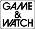
Game & Watch
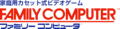
Family Computer
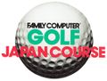
Golf: Japan Course
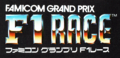
Famicom Grand Prix: F1 Race
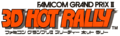
Famicom Grand Prix II: 3D Hot Rally
Game Boy Color ("A", "B"", "START", "SELECT", "POWER", "COMM.", "VOL", "EXT.", "PHONES", "DC 3V IN")
Game & Watch Gallery

Game & Watch Gallery 2
Game & Watch Gallery 3

Game & Watch Gallery 4

Game & Watch Gallery Advance

Game & Watch Collection
Art Style: PiCTOBiTS

Super Mario Bros. 25th Anniversary

The Year of Luigi
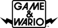
Game & Wario (US logo)
Game & Wario (Europe and Australia logo)
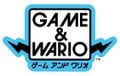
Game & Wario (Japanese logo)
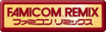
Famicom Remix
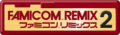
Famicom Remix 2
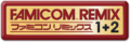
Famicom Remix 1+2
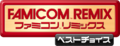
Famicom Remix: Best Choice
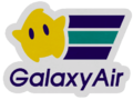
Galaxy Air in Mario Kart 8
Super Mario Bros. 35th Anniversary
Game & Watch: Super Mario Bros.
Mario Strikers Battle League
Mario Strikers Battle League (European and Australasian logo)
Nintendo Software Technology

Nintendo New York ("NEW YORK")


ITC Benguiat[edit]
ITC Benguiat is a decorative serif typeface designed by Ed Benguiat for ITC, first released in 1977.[84] It is used in Mario Kart 8, Mario Kart Tour and Mario Kart 8 Deluxe on the logos for Rainbow Exploration Agency and Roy Smooth Sounds.


ITC Bolt[edit]

ITC Bolt is a geometric sans-serif designed by Ronné Bonder and Tom Carnase for ITC, first released in 1970.[85] It is used on the logo for DK: Jungle Climber, albeit with a modified "G".
ITC Galliard[edit]
ITC Galliard is a serif typeface designed by Robert Granjon and Matthew Carter for Linotype, first released in 1978.[86] ITC Galliard Ultra is used in the logo for Super Smash Bros. Melee.
ITC Kabel[edit]

ITC Kabel is a geometric sans-serif typeface designed by Victor Caruso for ITC, first released in 1975.[87] It is a variant of Kabel and is used in Game & Wario in its Ultra variant for display as well as body text. In WarioWare Gold, it is used once again for microgame commands, like in Game & Wario's Gamer. It is also used for scenery text in Frantic Factory and bonus stages in Donkey Kong 64, and the "OPEN" sign in the Excess Express shop in the Nintendo Switch remake of Paper Mario: The Thousand-Year Door.
ITC Kabel is also used prominently in Super Smash Bros., albeit with circular punctuation dots instead of diamond-shaped, also present on the game's logo. It is also present on the logos for Mario Kart 64 (Medium), Mario Golf: Toadstool Tour (Ultra), Mario vs. Donkey Kong games (Bold) and Mario & Sonic at the Rio 2016 Olympic Games Arcade Edition (Bold). Additionally, it is used in the western instruction booklets for Super Mario 64 and Mario Party.
The Japanese logos for the Game & Watch Gallery games uses the font (Bold) for the English subtitle.
In Mario Kart 8 and Mario Kart 8 Deluxe, it is seen in the logo for Waluigi Sea Bed.
ITC Kabel Bold was used for an earlier version of the logo for Super Mario World 2: Yoshi's Island and ITC Kabel Ultra was used for the logo for the unreleased English version of Nintendo Puzzle Collection.
Mario Kart 64 ("64")

Super Smash Bros. ("SMASH")
Super Smash Bros.

Mario Golf: Toadstool Tour ("Toadstool Tour")
Mario vs. Donkey Kong ("VS.")

Game & Watch Gallery Japanese logo
Game & Watch Gallery 2 Japanese logo
Game & Watch Gallery 3 Japanese logo
Mario Kart 8
Mario & Sonic at the Rio 2016 Olympic Games Arcade Edition ("ARCADE EDITION")
Super Mario World 2: Yoshi's Island preliminary logo ("SUPER MARIO WORLD 2")
Nintendo Puzzle Collection unused English version logo


ITC Grizzly[edit]

ITC Grizzly is an alternative version of ITC Kabel.[88] It is used for the interface in the following games:
- Donkey Kong Country: Tropical Freeze
- Mario Strikers: Battle League
ITC Honda[edit]

ITC Honda is a display designed by Ronné Bonder and Tom Carnase for ITC, first released in 1970.[89] It is used for text in the game select screen in Wrecking Crew '98.
ITC Lubalin Graph[edit]
ITC Lubalin Graph is a geometric slab-serif typeface designed by Herb Lubalin, Joe Sundwall, and Tony Di Spigna for ITC, first released in 1974.[90] It is used for the "MOO MOO FARM" sign in Mario Kart 64, and text in the shot of Fox in the opening of Super Smash Bros.
ITC Machine[edit]
ITC Machine is a sans-serif typeface designed by Ronné Bonder and Tom Carnasse for ITC, first released in 1970.[91] It is used in the localized versions of Mario Kart 64 for interface text, as well as the Mario Star business logo.
ITC Machine is also used on the logo for the Super Mario Bros. film and much of the material related to it. A squished version is also used for the European logo of Mario Hoops 3-on-3. It is also used for the logo for the 1991 Nintendo Campus Challenge, and the Blockbuster World Video Game Championship logo found in the Donkey Kong Country Competition Cartridge, albeit with a Roman numeral-styled "2".
1991 version of Nintendo Campus Challenge ("CAMPUS")
Super Mario Bros. film logo
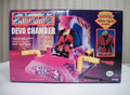
Super Mario Bros. Devo Chamber box
Super Mario Bros. trading card
Donkey Kong Country Competition Cartridge ("BLOCKBUSTER", "GAME CHAMPIONSHIP II")
Mario Hoops 3-on-3 [European] ("SLAM")


ITC Serif Gothic[edit]
ITC Serif Gothic is a geometric serif typeface designed by Herb Lubalin and Tony Di Spigna for ITC, first released in 1972.[92] It is used for the "HD" text for the logo for Luigi's Mansion 2 HD.
ITC Stone Sans[edit]
ITC Stone Sans is a humanist sans-serif typeface designed by Summer Stone for ITC, first released in 1988.[93] It is used for the credits text of Super Mario Bros.
ITC Tiepolo[edit]
ITC Tiepolo is a serif typeface designed by Arthur Baker and Cynthia Hollandsworth for ITC, first released in 1987.[94] It is used for license plate text in The Super Mario Bros. Movie, like the real-life New York license plates.
Jeepney[edit]
Jeepney is a serif typeface designed by Annie de la Vega, first released in 1998.[95] It is used on the Pirate Land logo and text within the board in Mario Party 2.
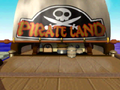
"PIRATE LAND"
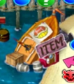
"ITEM"
"BANK", "COIN"


JTC Namiki POP[edit]
JTC Namiki POP (JTCナミキPOP JTC Namiki Poppu) is a Point of Purchase typeface for the interface for Diddy Kong Racing in the Japanese language (as well as placement rankings in the Nintendo DS remake), and the interface for Super Smash Bros. in the Japanese language, though it is also used for the "SCORE" text in the bonus results screen in western languages. It is also used for artwork of the Dice Blocks in Mario Party.
JTC Win[edit]
JTC Win (JTCウイン JTC Uin) is a sans-serif typeface, with its rounded R variant used for the interface for Mario Kart 64 in the Japanese language, though it is also used for the prompts by Lakitu and driving onomatopoeia in western languages, as well as an artwork for a Yoshi Egg in the iQue manual for Yoshi's Story, and its S variant used for the mode select in the same game in the Japanese language, and chapter names in Yoshi's Story in the Japanese language.
Juniper[edit]
Juniper is a serif typeface designed by Joy Redick for Adobe, first released in 1990 as a digital version of the woodtype Painters Roman by Nick Curtis, released by William H. Page & Company and Vanderburgh Wells & Company in 1878.[96] It is used in Mario Kart 64 for the Yoshi business sponsor and the "BOING!" onomatopoeia generated when a kart hops. It is also used in Super Mario Odyssey for the Expresso Espresso logo and signage on an ad near the Crazy Cap shop.
Kafu Pen[edit]
Kafu Pen (花風ペン Hanafū Pen) is a script-serif typeface designed by Arphic for Fontworks, first released in 2012.[97] It is used for the logo for Autograph! in WarioWare Gold.
Kafu Techno[edit]

Kafu Techno (花風テクノ Hanafū Tekuno) is a geometric sans-serif typeface designed by Arphic for Fontworks, first released in 2012.[98] It is used in the interface in Puzzle & Dragons: Super Mario Bros. Edition, WarioWare Gold in Dribble & Spitz and 18-Volt's stages, the HUD in the Nintendo 3DS remake of Luigi's Mansion, WarioWare: Get It Together! for Dr. Crygor's stage, and WarioWare: Move It! for text in the Volcano Wario stage, Megagame Muscles, and the logo for Dirty Job. It is also used for the logo for Crazy Galaxy in Nintendo Badge Arcade.
Kaufmann[edit]

Kaufmann is a brush script display typeface designed by Max R. Kaufmann for American Type Founders, first released in 1936.[99] It is used for the "The End" text in the ending picture in Super Mario 64.
Kiev[edit]

Kiev is a script typeface from Bay Animation, first released in 1994. It is based on Kaufmann. It is used in Super Mario Odyssey for the text in the Lake Lamode sticker.
Kokin Hige[edit]

Kokin Hige (古今髭 Kokon Hige) is a script typeface designed by KOKIN (Tetsushi Kogane) for Fontworks, first released in 1997.[100] It is used for text in Kat & Ana's stage in WarioWare Gold.
Koloss[edit]
Koloss is a sans-serif display typeface designed by Jakob Erbar for Ludwig & Mayer, first released in 1923.[101] It is used for the logo for R.O.B..
KoreanAH[edit]
KoreanAH (sometimes referred to as "아시아헤드 4종", Asian Heads) is a gothic typeface released by Asiafont in 2017.[102] It is used for the interface in the following games:
- Mario + Rabbids Kingdom Battle (Korean language)
- Mario + Rabbids Sparks of Hope (Korean language)
KoreanAISK[edit]
KoreanAISK (sometimes referred to as "아이스께끼 1종", Ice Cream) is an uneven typeface released by Asiafont in 2010.[103] It is used for the interface in the Korean version of Paper Mario: Sticker Star.
KoreanAMERI[edit]

KoreanAMERI (sometimes referred to as "아메리카노 3종", Americano) is a gothic typeface released by Asiafont in 2013.[104] Its "B" variant is used for almost all text in the Korean version of Princess Peach: Showtime!.
KoreanAT[edit]
KoreanAT (sometimes referred to as "아띠 1종", Atti) is a rounded typeface released by Asiafont in 2013.[105] It is used for text in the Pool Party Panic stage in the Korean version of WarioWare: Move It!.
KoreanBB[edit]
KoreanBB (sometimes referred to as "별빛 3종", Starlight) is an uneven typeface released by Asiafont in 1996.[106] It is used for the interface in the Korean version of Luigi's Mansion: Dark Moon and its Nintendo Switch remaster.
KoreanBIG[edit]
KoreanBIG (sometimes referred to as "빅체 2종", Big Sieves) is a gothic typeface released by Asiafont in 1996.[107] It is used for the interface in the Korean version of Super Smash Bros. for Nintendo 3DS. Its round version is used for the clear text in the Korean version of WarioWare: Snapped!.
KoreanBLACK[edit]
KoreanBLACK (sometimes referred to as "블랙 2종", Black) is a gothic typeface released by Asiafont in 2014.[108] It is used for the interface in the Korean version of Mario Strikers: Battle League.
KoreanCHD[edit]
KoreanCHD (sometimes referred to as "정헤드 3종", Jeonghead) is a typeface released by Asiafont in 1996.[109] It is used for text in the Wario Cup in WarioWare: Get It Together!. A modified version is also used for the logo for Friendless Battle in the Korean version of said game.
KoreanCOMA[edit]
KoreanCOMA (sometimes referred to as "컴퓨터 3종", Computers) is a display typeface released by Asiafont in 1999.[110] It is used for the interface in the Korean version of Super Mario Maker 2.
KoreanCM[edit]
KoreanCM (sometimes referred to as "자막체 1종", Subtitle) is an uneven typeface released by Asiafont in 2008.[111] It is used for the interface in the following games:
- Donkey Kong Country Returns 3D (Korean language)
- Donkey Kong Country Returns HD (Korean language)
KoreanDBIY[edit]
KoreanDBIY (sometimes referred to as "대박이야 1종", Page) is an uneven display typeface released by Asiafont in 2010.[112] It is used for text in Mona's stage in the Korean version of WarioWare: Move It!.
KoreanDGH[edit]
KoreanDGH (sometimes referred to as "둥근헤드 1종", Round Head) is a display typeface released by Asiafont in 1996.[113] It is used for text in Crygor, Penny, and Mike's stage, Switching Gears, and the logos for Listen to the Doctor! and The "Who's in Control?" Show in the Korean version of WarioWare: Move It!.
KoreanDH[edit]
KoreanDH (sometimes referred to as "동화 3종", Fairy Tales) is a script typeface released by Asiafont in 1996.[114] It is used for the logo and text in Snifit or Whifit in the Korean version of Paper Mario: Sticker Star.
KoreanDKB[edit]
KoreanDKB (sometimes referred to as "도깨비 1종", Goblin) is a display typeface released by Asiafont in 2017.[115] It is used for the logo for Balloon Bang in the Korean version of WarioWare: Get It Together!.
KoreanDNR[edit]

KoreanDNR (sometimes referred to as "디나루 3종", Dinaroo) is a rounded gothic typeface released by Asiafont in 1996.[116] It is used for the interface in the following games:
- Super Paper Mario (Korean language)
- Mario Party 8 (Korean language)
- Mario & Sonic at the Olympic Games (Korean language)
- New Super Mario Bros. Wii (Korean language)
- Mario & Sonic at the Olympic Winter Games (Korean language)
- Mario & Sonic at the London 2012 Olympic Games (Nintendo 3DS) (Korean language)
- Mario Party 9 (Korean language)
- Super Mario Run (Korean language)
- Paper Mario: The Origami King (Korean language)
- WarioWare: Get It Together! (Korean language)
- WarioWare: Move It! (Korean language)
KoreanDRDS[edit]
KoreanDRDS (sometimes referred to as "두리둥실 1종", Duridungsil) is an uneven typeface released by Asiafont in 2010.[117] It is used for the interface in the Korean version of Mario Tennis Open.
KoreanDREAM[edit]
KoreanDREAM (sometimes referred to as "드림고딕 7종", Dream Gothic) is a gothic typeface released by Asiafont in 2013.[118] It is used for the interface in the following games:
- Mario & Sonic at the Rio 2016 Olympic Games (Nintendo 3DS) (Korean language)
- Super Mario Party (Korean language)
- Mario Kart Tour (Korean language)
- Mario Kart Live: Home Circuit (Korean language)
- WarioWare: Get It Together! (Korean language; including "1" for multiplayer rankings in Simplified and Traditional Chinese languages)
- Princess Peach: Showtime! (Korean language)
- Paper Mario: The Thousand-Year Door (Nintendo Switch) (Korean language)
- Nintendo World Championships: NES Edition (Korean language)
- Super Mario Party Jamboree (Korean language)
- Super Mario Party Jamboree – Nintendo Switch 2 Edition + Jamboree TV (Korean language)
- Mario Tennis Fever (Korean language)
KoreanERCC[edit]
KoreanERCC (sometimes referred to as "으라차차 1종", Eurachacha) is a pixelated typeface released by Asiafont in 2010.[119] It is used for text in 9-Volt's stage in the Korean version of WarioWare: Get It Together!.
KoreanERIN[edit]
KoreanERIN (sometimes referred to as "어린이날 3종", Children's Day) is an uneven typeface released by Asiafont in 2014.[120] It is used for text in the Variety Towers and Penny's stages in the Korean version of WarioWare: Get It Together! and text in Ashley and Cricket and Mantis' stages and Copycat Mirror in the Korean verison of WarioWare: Move It!.
KoreanERWJ[edit]
KoreanERWJ (sometimes referred to as "어린왕자 3종", Little Prince) is a display typeface released by Asiafont in 2017.[121] It is used for text in Mona's stage in the Korean version of WarioWare: Get It Together! and for reaction text in the Korean version of Super Mario Party Jamboree and its Nintendo Switch 2 Edition.
KoreanEXP[edit]
KoreanEXP (sometimes referred to as "엑스포 3종, Expo) is a geometric typeface released by Asiafont in 1996.[122] It is used It is used for the text of Multi-Man Brawl in the Korean version of Super Smash Bros. Brawl.
KoreanGD[edit]
KoreanGD (sometimes referred to as "본문고딕 6종", Text Gothic) is a gothic typeface released by Asiafont in 1996.[123] It is used for the interface in the following games:
- Yoshi's Island DS (Korean language)
- Mario Party 9 (Korean language)
- Puzzle & Dragons: Super Mario Bros. Edition (Korean language)
- Super Mario Run (Korean player names)
- Mario Kart 8 Deluxe (Korean language)
- New Super Mario Bros. U Deluxe (Korean language)
- WarioWare: Get It Together! (Korean language)
- WarioWare: Move It! (Korean language)
It is also used for the interface in the Wii system software as well as the interface for the Nintendo DS Nintendo WFC setup menu in the Korean language.
KoreanGD1[edit]
KoreanGD1 (sometimes referred to as "고딕1 시리즈 10종", Gothic 1) is a gothic typeface released by Asiafont in 2015.[124] It is used for the interface in the following games:
- Mario Tennis Aces (Korean language)
- Yoshi's Crafted World (Korean language)
- Super Mario Maker 2 (Korean language)
- Dr. Mario World (Korean language)
- Mario Kart Tour (Korean language)
- Mario Party Superstars (Korean language)
- Nintendo World Championships: NES Edition (Korean language)
KoreanGID[edit]
KoreanGID (sometimes referred to as "고인돌 1종", Dolmen) is a display typeface released by Asiafont in 2015.[125] It is used for the interface in the Korean version of Mario Party: Star Rush and the logo for High Five in the Korean version of WarioWare: Get It Together!.
KoreanGESP[edit]
KoreanGESP (sometimes referred to as "가을소풍 2종", Fall Picnics) is a display typeface released by Asiafont in 2014.[126] It is used for the interface in the following games:
- Mario Sports Superstars (Korean language)
- Super Smash Bros. Ultimate (Korean language)
- WarioWare: Get It Together! (Korean language)
- WarioWare: Move It! (Korean language)
KoreanGEUDH[edit]
KoreanGEUDH (sometimes referred to as "가을운동회 2종", Fall Sports Events) is a display typeface released by Asiafont in 2014.[127] It is used for text in Dr. Crygor's stage in the Korean version of WarioWare: Get It Together!.
KoreanGRHD[edit]
KoreanGRHD (sometimes referred to as "굴림헤드 3종", Rolling Heads) is a gothic typeface released by Asiafont in 1996.[128] It is used for the interface in the following games:
- Mario Strikers Charged (Korean language)
- Mario Party DS (Korean language)
- Mario & Sonic at the Olympic Games (Korean language)
- Mario & Sonic at the London 2012 Olympic Games (Wii) (Korean Language)
- Club Nintendo Picross (Korean Language)
It is also used for the header of the Wii's Wii Shop Channel and the Photo Channel in the Korean language.
KoreanGRP[edit]
KoreanGRP (sometimes referred to as "그래픽 2종", Graphics) is a humanist typeface released by Asiafont in 1996.[129] It is used for the interface in the following games:
- Tetris DS (Korean language)
- Mario Party 8 (Korean language)
- Wario Land: Shake It! (Korean language)
KoreanGST[edit]
KoreanGST (sometimes referred to as "각설탕 1종", Sugar Cubes) is an uneven typeface released by Asiafont in 2014.[130] It is used for text in the Variety Towers in the Korean version of WarioWare: Move It!.
KoreanGWS[edit]
KoreanGWS (sometimes referred to as "가위손 3종", Scissor Hands) is a serif typeface released by Asiafont in 2011.[131] It is used for the World of Light subtitle in the Korean version of Super Smash Bros. Ultimate.
KoreanHAN[edit]
KoreanHAN (sometimes referred to as "한글사랑 3종, Korean Language Love) is a gothic typeface released by Asiafont in 2001.[132] It is used for the interface in the Korean version of Super Smash Bros. Brawl.
KoreanHDRI[edit]
KoreanHDRI (sometimes referred to as "헤드라인 3종", Headlines) is a typeface released by Asiafont in 2011.[133] It is used for text in Wario and Dribble & Spitz's stages and the Play-o-Pedia in the Korean version of WarioWare: Get It Together!.
KoreanHH[edit]
KoreanHH (sometimes referred to as "환희 3종", Joy) is a serif typeface released by Asiafont in 1996.[134] It is used for the interface in the following games:
- Super Smash Bros. Brawl (Korean language)
- Super Smash Bros. for Nintendo 3DS (Korean language)
KoreanHSE[edit]

KoreanHSE (sometimes referred to as "한글세상 3종", Hangul World) is a serif typeface released by Asiafont in 2003.[135] It is used for text in the Korean version of Mario Party 8. and text in Rising Star in the Korean version of WarioWare: Get It Together!.
KoreanHSO[edit]
KoreanHSO (sometimes referred to as "향수 3종", Perfume) is a display typeface released by Asiafont in 1999.[136] It is used for text in 9-Volt's stage in the Korean version of WarioWare: Move It!.
KoreanHYGR[edit]
KoreanHYGR (sometimes referred to as "하얀구름 1종", White Cloud) is a display typeface released by Asiafont in 2016.[137] It is used for the interface in the following games:
- Yoshi's Crafted World (Korean language)
- Mario Kart World (Korean language)
- Mario Tennis Fever (Korean language)
It is also used for text in Showdown and the logo for Frenemy Frenzy in the Korean version of WarioWare: Get It Together!, and the Korean logo of the Nintendo Switch remake of Mario vs. Donkey Kong.
KoreanIS[edit]
KoreanIS (sometimes referred to as "인사동 1종", Insadong) is a script typeface released by Asiafont in 1999.[138] It is used for the interface in the Korean version of the Nintendo 3DS remake of Luigi's Mansion.
KoreanJHMJ[edit]
KoreanDGH (sometimes referred to as "조합명조 3종", Combined Ming) is a serif typeface released by Asiafont in 1998.[139] It is used for text in the Korean version of WarioWare: Move It!.
KoreanKRSM[edit]
KoreanKRSM (sometimes referred to as "카리스마 3종", Charisma) is a display typeface released by Asiafont in 2015.[140] It is used for the interface in the following games:
- WarioWare: Get It Together! (Korean language)
- WarioWare: Move It! (Korean language)
KoreanKSB[edit]
KoreanKSB (sometimes referred to as "꽃선비 2종", Flower Scholar) is a script typeface released by Asiafont in 2014.[141] It is used for text in Cricket and Mantis' stage in the Korean version of WarioWare: Move It!.
KoreanMB[edit]
KoreanMB (sometimes referred to as "물레방아 3종", Watermills) is a serif typeface released by Asiafont in 1999.[142] It is used for the interface in the Korean version of Mario Party: Island Tour.
KoreanMJ[edit]
KoreanMJ (sometimes referred to as "본문명조 6종", Main Text) is a serif typeface released by Asiafont in 1996.[143] It is used for text in the Fire Emblem: Three Houses microgame and the dialogue for The Supreme Developer in the Korean version of WarioWare: Get It Together!.
KoreanMMMJ[edit]
KoreanMMMJ (sometimes referred to as "먹물명조 3종", Ink and Inkstone) is a serif typeface released by Asiafont in 1998.[144] It is used for text in Duelius Maximus in the Korean version of WarioWare: Get It Together! and text for the forms in the Korean version of WarioWare: Move It!.
KoreanMST[edit]
KoreanMST (sometimes referred to as "몬스터 1종", Monster) is a display typeface released by Asiafont in 2017.[145] It is used for text in the Remix stages in the Korean version of WarioWare: Get It Together!.
KoreanNGD[edit]
KoreanNGD (sometimes referred to as "뉴고딕 4종", New Gothic) is a gothic typeface released by Asiafont in 2011.[146] It is used for the interface in the Korean version of Mario Party: Star Rush.
KoreanNGL[edit]
KoreanNGL (sometimes referred to as "뉴굴림 4종", New Rolls) is a graphical typeface released by Asiafont in 2016.[147] It is used for the interface in the following games:
- Super Mario Odyssey (Korean language)
- Luigi's Mansion 3 (Korean language)
- Super Mario Galaxy + Super Mario Galaxy 2 (Korean language)
KoreanPB[edit]
KoreanPB (sometimes referred to as "편봉체 1종", Flattened Body) is an script typeface released by Asiafont in 1998.[148] It is used for the character title cards in the Korean version of WarioWare: Smooth Moves.
KoreanPKS[edit]
KoreanPKS (sometimes referred to as "피카소 1종", Picasso) is a graphical typeface released by Asiafont in 2018.[149] It is used for the interface in the following games:
- WarioWare: Get It Together! (Korean language)
- WarioWare: Move It! (Korean language)
- Mario & Luigi: Brothership (Korean language)
- Donkey Kong Bananza (Korean language)
It is also used for the Korean logo for WarioWare: Get It Together!.
KoreanPONM[edit]
KoreanPONM (sometimes referred to as "피오피네모 2종", P.O.Pinemo) is an uneven typeface released by Asiafont in 2013.[150] It is generally used in place of the Super Mario font in Korean localizations of games since the release of the Nintendo Switch. It is used for the interface in the following games:
- New Super Mario Bros. U Deluxe (Korean language)
- Dr. Mario World (Korean language)
- Paper Mario: The Origami King (Korean language)
- Super Mario 3D World + Bowser's Fury (Korean language)
- WarioWare: Get It Together! (Korean language)
- Mario vs. Donkey Kong (Nintendo Switch) (Korean language)
- Paper Mario: The Thousand-Year Door (Nintendo Switch) (Korean language)
KoreanPST[edit]
KoreanPST (sometimes referred to as "포스터 2종", Posters) is a gothic typeface released by Asiafont in 2018.[151] It is used for text in the Volcano Wario stage and the logos for Dirty Job and Galactic Conquest in the Korean version of WarioWare: Move It! and the Korean logo for Nintendo World Championships: NES Edition.
KoreanRKT[edit]
KoreanRKT (sometimes referred to as "로케트 1종", Rocket) is a display typeface released by Asiafont in 2017.[152] It is used for text in Dribble and Spitz's stage in the Korean version of WarioWare: Move It!.
KoreanRO[edit]
KoreanRO (sometimes referred to as "로미오 3종", Romeo) is a gothic typeface released by Asiafont in 2000.[153] It is used for the interface in the Korean version of Wario Land: Shake It!.
KoreanSDNR[edit]
KoreanSDNR (sometimes referred to as "신디나루 2종", Sindinaru) is a rounded gothic typeface released by Asiafont in 2002.[154] It is used for the interface in the following games:
- Super Mario Galaxy (Korean language)
- Super Smash Bros. Brawl (Home-Run Contest icon and difficulty slider; Korean language)
- Mario Kart Wii (Korean language; including the Mario Kart Channel)
- Super Mario Galaxy 2 (Korean language)
- Mario & Luigi: Dream Team (Korean Language)
- Mario & Luigi: Paper Jam (Korean Language)
- Mario & Luigi: Brothership (Korean language)
It is also used for the interface for Alarmo in the Korean language.
KoreanSGCK[edit]
KoreanSGCK (sometimes referred to as "뉴고딕 4종", Small Friend) is an uneven typeface released by Asiafont in 2008.[155] It is used for the interface in the Korean version of Yoshi's New Island.
KoreanSHD[edit]
KoreanSHD (sometimes referred to as "신헤드 1종", New Head) is a typeface released by Asiafont in 1998.[156] It is used for sticker text in the Korean version of Mario Party Superstars.
KoreanSJ[edit]
KoreanSJ (sometimes referred to as "수정 3종", Modifications) is a serif typeface released by Asiafont in 1996.[157] It is used for the logo and text in The Subspace Emissary in the Korean version of Super Smash Bros. Brawl.
KoreanSJSR[edit]
KoreanSJSR (sometimes referred to as "세종실록 2종", Sejong Sillok) is a rounded typeface released by Asiafont in 2017.[158] It is used for text in the Wario Bug stage in the Korean version of WarioWare: Get It Together!.
KoreanSMI[edit]
KoreanSMI (sometimes referred to as "스마일 3종", Smiles) is a gothic typeface released by Asiafont in 2014.[159] It is used for the interface in the Korean version of the Nintendo 3DS remake of Luigi's Mansion.
KoreanSMJ[edit]
KoreanSMJ (sometimes referred to as "순명조 1종", Pure Water) is a serif typeface released by Asiafont in 1996.[160] It is used for the logo for Gotta Bounce in the Korean version of WarioWare: Get It Together!.
KoreanSNM[edit]
KoreanSNM (sometimes referred to as "소나무 3종", Pine Trees) is a gothic typeface released by Asiafont in 2019.[161] It is used for the interface in the Korean version of the Nintendo Switch Remake of Super Mario RPG, as well as the Bonus Game text in the Korean version of WarioWare: Get It Together!.
KoreanSWGI[edit]
KoreanSWGI (sometimes referred to as "시월구일 4종", October 9th) is a gothic typeface released by Asiafont in 2021.[162] It is used for the interface in the Korean version of Super Mario Bros. Wonder and its Switch 2 Edition, and text for the Talking Flowers in the Korean version of Mario Tennis Fever.
KoreanTBSM[edit]
KoreanTBSM (sometimes referred to as "태백산맥 1종", Taebaek Mountain Range) is a script typeface released by Asiafont in 2012.[163] It is used for text in Kat & Ana's stage and Duelius Maximus in the Korean version of WarioWare: Get It Together!. A heavily modified version is also used for the logos for Duelius Maximus and Rising Star in the Korean version of said game. It is also used for text in Kat & Ana's stage and the logos for Showdown and Go the Distance in the Korean version of WarioWare: Move It!.
KoreanTITGD[edit]
KoreanTITGD (sometimes referred to as "타이틀고딕 5종", Title Gothic) is a gothic typeface released by Asiafont in 2017.[164] It is used for the interface in the following games:
- Mario + Rabbids Kingdom Battle (Korean language)
- Mario Golf: Super Rush (Korean language)
- WarioWare: Get It Together! (Korean language)
- Mario Strikers: Battle League (Korean language)
KoreanTYGD[edit]
KoreanTYGD (sometimes referred to as "소꼽친구 1종", Desertion Gothic) is a gothic typeface released by Asiafont in 2008.[165] It is used for the interface in the Korean version of Mario Golf: World Tour.
KoreanUJSN[edit]
KoreanUJSN (sometimes referred to as "우주소년 1종", Space Boy) is a display typeface released by Asiafont in 2016.[166] It is used for the interface in the Korean version of Luigi's Mansion 3.
KoreanYNMYT[edit]
KoreanYNMYT (sometimes referred to as "옛날목욕탕 3종", Old Bathhouses) is a typeface released by Asiafont in 2011.[167] It is used for the logo for Sly Angle in the Korean version of WarioWare: Get It Together!.
KoreanYNSJG[edit]
KoreanYNSJG (sometimes referred to as "옛날사진관 5종", Old Photo Studios) is a gothic typeface released by Asiafont in 2015.[168] It is used for the interface in the Korean version of the Nintendo Switch remake of Super Mario RPG.
KoreanYRGS[edit]
KoreanYRGS (sometimes referred to as "유리구슬 1종", Glass Marbles) is a display typeface released by Asiafont in 2014.[169] It is used for text in Jimmy T's stage and the logo for Medusa March in the Korean version of WarioWare: Move It!.
KoreanYS[edit]
KoreanYS (sometimes referred to as "예서체 2종", Caligraphy Font) is an uneven slab-serif typeface released by Asiafont in 1996.[170] It is used for the interface in the Korean version of WarioWare: Smooth Moves.
KS Basakoro[edit]

KS Basakoro (KSバサころ KS Basa Koro) is a script typeface from Koei Signworks. It is used for text in Kat & Ana's stage in WarioWare: Get It Together! and WarioWare: Move It! and the logo for Showdown in WarioWare: Move It!.
KS ByakkoSou[edit]

KS ByakkoSou (KS白虎爽書 KSO Báihǔ Shuǎng Shū) is a script typeface from Koei Signworks. It is used for text in Duelius Maximus in WarioWare: Get It Together!. A heavily modified version is also used for the logos for Duelius Maximus and Rising Star in said game.
KS Hiryu[edit]
KS Hiryu (KS飛龍 KS Hiryū) is a script typeface from Koei Signworks. It is used for numbers (and the round text in the Japanese version) of Cricket and Mantis' stage in WarioWare: Move It!.
KS Jinba[edit]
KS Jinba (KS迅馬 KS Jinba) is a script typeface from Koei Signworks. It is used for logo for Go the Distance in WarioWare: Move It!.
KS Jukaku[edit]
KS Jukaku (KS寿鶴 KS Jukaku) is a script typeface from Koei Signworks. It is used for the numbers in Switching Gears in WarioWare: Move It!.
KS Yuwa[edit]
KS Yuwa (KS遊和 KS Yū Kazu) is a script typeface from Koei Signworks. It is used for the round text of Cricket and Mantis' stage in the western version of WarioWare: Move It!.
Kurokane[edit]

Kurokane (くろかね Kurokane) is a geometric sans-serif typeface designed by Yoshiharu Ōsaki for Fontworks, first released in 2008.[171] It is used for the sticker text in Mario Party Superstars for the Japanese language. It is also widely used in WarioWare games starting from WarioWare Gold, as well as in Rhythm Heaven Megamix. It is also used in the Nintendo Switch remake of Paper Mario: The Thousand-Year Door for the "PIANTA" boards seen in the Pianta Parlor minigames, replacing Helvetica Condensed. It is also used for the text in the Racket Factory in Mario Tennis Fever.
KyoMadoka[edit]
KyoMadoka (京円 Kyō Madoka) is a script typeface from Hakusyu Fonts. It is used for text in the microgame Hanafuda in WarioWare Gold.
KyoMurasaki[edit]

KyoMurasaki (京紫 Kyō Murasaki) is a script typeface from Fontworks, first released in 2014.[172] It is used for text in Wario's stages in WarioWare Gold.
References[edit]
- ^ Fonts In Use. FF Blur in use. https://fontsinuse.com/typefaces/2404/ff-blur. Retrieved May 25, 2025.
- ^ Fonts In Use. (2024). FF CrashBangWallop. https://fontsinuse.com/typefaces/17039/ff-crashbangwallop. Retrieved July 10, 2024.
- ^ Wikipedia. (2025). DIN 1451. https://en.wikipedia.org/wiki/DIN_1451. Retrieved May 28, 2025.
- ^ Wikipedia. (2024). FF DIN. https://en.wikipedia.org/wiki/FF_DIN. Retrieved July 16, 2024.
- ^ Fonts In Use. Normalisé Din in use. https://fontsinuse.com/typefaces/24818/normalise-din. Retrieved June 3, 2025.
- ^ Wikipedia. (2024). DIN 2014. https://en.wikipedia.org/wiki/DIN_1451#Third-party_adaptations. Retrieved June 19, 2024.
- ^ Fonts In Use. FF Dolores in use. https://fontsinuse.com/typefaces/2548/ff-dolores. Retrieved May 25, 2025.
- ^ HvD Fonts. (2024). FF Mark. https://www.hvdfonts.com/fonts/ff-mark. Retrieved June 20, 2024.
- ^ Fonts In Use. FF Spontan in use. https://fontsinuse.com/typefaces/28523/ff-spontan. Retrieved May 25, 2025.
- ^ Fonts In Use. FF World in use. https://fontsinuse.com/typefaces/30943/ff-world. Retrieved October 19, 2024.
- ^ Fonts In Use. Filmotype Quentin in use. https://fontsinuse.com/typefaces/12101/filmotype-quentin. Retrieved May 25, 2025.
- ^ Fonts In Use. (2025). Forte in use. https://fontsinuse.com/typefaces/4120/forte. Retrieved April 16, 2025.
- ^ 方正字库 FounderType. 方正白舟忍者体. https://www.foundertype.com/index.php/FontInfo/index/id/5461. Retrieved May 23, 2026.
- ^ 方正字库 FounderType. 方正白舟魂心体. https://www.foundertype.com/index.php/FontInfo/index/id/5474. Retrieved September 20, 2024.
- ^ 方正字库 FounderType. 方正超粗黑. https://www.foundertype.com/index.php/FontInfo/index/id/122.html. Retrieved April 1, 2025.
- ^ 方正字库 FounderType. 方正粗圆. https://www.foundertype.com/index.php/FontInfo/index/id/179. Retrieved October 27, 2024.
- ^ 方正字库 FounderType. 方正大标宋. https://www.foundertype.com/index.php/FontInfo/index/id/126. Retrieved November 10, 2024.
- ^ 方正字库 FounderType. 方正大黑. https://www.foundertype.com/index.php/FontInfo/index/id/127. Retrieved November 10, 2024.
- ^ 方正字库 FounderType. 方正白舟武骨体. https://www.foundertype.com/index.php/FontInfo/index/id/5475. Retrieved September 16, 2024.
- ^ 方正字库 FounderType. 方正白舟大髭. https://www.foundertype.com/index.php/FontInfo/index/id/5473. Retrieved September 16, 2024.
- ^ 方正字库 FounderType. 方正兰亭黑. https://www.foundertype.com/index.php/FontInfo/index/id/216. Retrieved June 9, 2026.
- ^ 方正字库 FounderType. 方正流行体. https://www.foundertype.com/index.php/FontInfo/index/id/142. Retrieved October 26, 2024.
- ^ 方正字库 FounderType. 方正锐正黑家族. https://www.foundertype.com/index.php/FontInfo/index/id/239. Retrieved September 15, 2024.
- ^ 方正字库 FounderType. 方正水黑. https://www.foundertype.com/index.php/FontInfo/index/id/153. Retrieved April 13, 2025.
- ^ 方正字库 FounderType. 方正水柱. https://www.foundertype.com/index.php/FontInfo/index/id/154. Retrieved June 5, 2025.
- ^ 方正字库 FounderType. 方正舒体. https://www.foundertype.com/index.php/FontInfo/index/id/152.html. Retrieved March 25, 2025.
- ^ 方正字库 FounderType. 方正倩体家族. https://www.foundertype.com/index.php/FontInfo/index/id/181.html. Retrieved April 1, 2025.
- ^ 方正字库 FounderType. 方正拙黑. https://www.foundertype.com/index.php/FontInfo/index/id/5521. Retrieved June 30, 2025.
- ^ 方正字库 FounderType. 方正综艺. https://www.foundertype.com/index.php/FontInfo/index/id/178. Retrieved November 22, 2024.
- ^ Fonts In Use. Frankfurter in use. https://fontsinuse.com/typefaces/1762/frankfurter. Retrieved July 15, 2024.
- ^ Fonts In Use. Frankfurter Highlight in use. https://fontsinuse.com/typefaces/39486/frankfurter-highlight. Retrieved June 29, 2024.
- ^ Wikipedia. (2024). Franklin Gothic. https://en.wikipedia.org/wiki/Franklin_Gothic. Retrieved July 15, 2024.
- ^ Fonts In Use. Mandate in use. https://fontsinuse.com/typefaces/10135/mandate. Retrieved June 29, 2024.
- ^ Wikipedia. (2024). Friz Quadrata. https://en.wikipedia.org/wiki/Friz_Quadrata. Retrieved June 30, 2024.
- ^ Wikipedia. (2024). Frutiger (typeface). https://en.wikipedia.org/wiki/Frutiger_(typeface). Retrieved July 15, 2024.
- ^ a b Wikipedia. (2024). Futura (typeface). https://en.wikipedia.org/wiki/Futura_(typeface). Retrieved June 19, 2024.
- ^ Fonts In Use. (2024). Gadget in use. https://fontsinuse.com/typefaces/19734/gadget. Retrieved July 25, 2024.
- ^ Fonts In Use. Geometric in use. https://fontsinuse.com/typefaces/264/geometric. Retrieved July 18, 2024.
- ^ Wikipedia. (2025). Georgia (typeface). hhttps://en.wikipedia.org/wiki/Georgia_(typeface). Retrieved April 17, 2025.
- ^ Adobe Fonts. VDL-GigaG. https://fonts.adobe.com/fonts/vdl-gigag. Retrieved July 11, 2024.
- ^ Nintendo 公式チャンネル (June 18, 2025). ドンキーコング バナンザ Direct 2025.6.18. YouTube. Retrieved June 24, 2025.
- ^ Adobe Fonts. VDL-GigaJr. https://fonts.adobe.com/fonts/vdl-gigajr. Retrieved July 11, 2024.
- ^ Wikipedia. (2024). Gill Sans. https://en.wikipedia.org/wiki/Gill_Sans. Retrieved June 19, 2024.
- ^ Wikipedia. (2024). Gill Kayo. https://en.wikipedia.org/wiki/Gill_Sans#Gill_Kayo. Retrieved June 19, 2024.
- ^ Fonts In Use. Gilroy in use. https://fontsinuse.com/typefaces/42429/gilroy. Retrieved April 17, 2025.
- ^ Fonts In Use. Gona in use. https://fontsinuse.com/typefaces/79461/gona. Retrieved April 27, 2025.
- ^ Fontworks. ゴスペル Std. https://lets.fontworks.co.jp/fonts/315. Retrieved June 19, 2024.
- ^ Wikipedia. (2024). Gotham (typeface). https://en.wikipedia.org/wiki/Gotham_(typeface). Retrieved June 19, 2024.
- ^ Fontworks. グレコ Std. https://lets.fontworks.co.jp/fonts/92. Retrieved June 19, 2024.
- ^ Fonts In Use. Griffin in use. https://fontsinuse.com/typefaces/1363/griffin. Retrieved July 13, 2024.
- ^ FONTPLUS. 白舟太古印体. https://fontplus.jp/font-list/hakusyukointaibold. Retrieved September 20, 2024.
- ^ Wikipedia. (2024). Handel Gothic. https://en.wikipedia.org/wiki/Handel_Gothic. Retrieved June 19, 2024.
- ^ Wikipedia. (2024). Helvetica. https://en.wikipedia.org/wiki/Helvetica. Retrieved June 27, 2024.
- ^ Wikipedia. (2024). Helvetica Neue. https://en.wikipedia.org/wiki/Helvetica#Neue Helvetica. Retrieved June 19, 2024.
- ^ Wikipedia. (2024). Nimbus Sans. https://en.wikipedia.org/wiki/Nimbus_Sans. Retrieved July 11, 2024.
- ^ Wikipedia. (2024). Hobo (typeface). https://en.wikipedia.org/wiki/Hobo_(typeface). Retrieved June 28, 2024.
- ^ Fonts In Use. Horatio in use. https://fontsinuse.com/typefaces/1793/horatio. Retrieved July 19, 2024.
- ^ Fontworks. 豊隷 Std. https://lets.fontworks.co.jp/fonts/302. Retrieved June 19, 2024.
- ^ Fonts In Use. House-a-rama Kingpin in use. https://fontsinuse.com/typefaces/39638/house-a-rama-kingpin. Retrieved July 15, 2024.
- ^ Fontworks. ハミング. https://lets.fontworks.co.jp/fonts/142. Retrieved June 19, 2024.
- ^ Hanyi Fonts. 汉仪超粗黑简. https://www.hanyi.com.cn/productdetail.php?id=534&type=0. Retrieved November 10, 2024.
- ^ Hanyi Fonts. 汉仪大黑简. https://www.hanyi.com.cn/productdetail.php?id=468. Retrieved April 1, 2025.
- ^ Hanyi Fonts. 汉仪蝶语体简. https://www.hanyi.com.cn/productdetail.php?id=569&type=0. Retrieved April 27, 2025.
- ^ Hanyi Fonts. 汉仪方叠体简. https://www.hanyi.com.cn/productdetail.php?id=611&type=0. Retrieved September 15, 2024.
- ^ Hanyi Fonts. 汉仪方隶简. https://www.hanyi.com.cn/productdetail.php?id=440&type=0. Retrieved October 26, 2024.
- ^ Hanyi Fonts. 汉仪橄榄体简. https://www.hanyi.com.cn/productdetail.php?id=640&type=0. Retrieved July 19, 2024.
- ^ Hanyi Fonts. 汉仪海韵体简. https://www.hanyi.com.cn/productdetail.php?id=522&type=0. Retrieved April 13, 2025.
- ^ Hanyi Fonts. 汉仪黑咪体简. https://www.hanyi.com.cn/productdetail.php?id=613&type=0. Retrieved October 26, 2024.
- ^ Hanyi Fonts. 汉仪琥珀体简. https://www.hanyi.com.cn/productdetail.php?id=547&type=0. Retrieved April 1, 2025.
- ^ Hanyi Fonts. 汉仪凌波体简. https://www.hanyi.com.cn/productdetail.php?id=635&type=0. Retrieved April 27, 2025.
- ^ Hanyi Fonts. 汉仪菱心体简. https://www.hanyi.com.cn/productdetail.php?id=544&type=0. Retrieved October 19, 2024.
- ^ Hanyi Fonts. 汉仪太极体简. https://www.hanyi.com.cn/productdetail.php?id=541&type=0. Retrieved April 13, 2025.
- ^ Hanyi Fonts. 汉仪行楷简. https://www.hanyi.com.cn/productdetail.php?id=592&type=0. Retrieved April 1, 2025.
- ^ Hanyi Fonts. 汉仪中黑 简. https://www.hanyi.com.cn/productdetail.php?id=554&type=0. Retrieved November 10, 2024.
- ^ Wikipedia. (2024). Impact (typeface). https://en.wikipedia.org/wiki/Impact_(typeface). Retrieved June 19, 2024.
- ^ Fonts In Use. Impress (Bitstream) in use. https://fontsinuse.com/typefaces/12050/impress-bitstream. Retrieved July 18, 2024.
- ^ Wikipedia. (2024). Imprint (typeface). https://en.wikipedia.org/wiki/Imprint_(typeface). Retrieved September 8, 2024.
- ^ Fonts In Use. Insignia in use. https://fontsinuse.com/typefaces/1154/insignia. Retrieved July 18, 2024.
- ^ Fonts In Use. Interstate in use. https://fontsinuse.com/typefaces/2247/interstate. Retrieved May 25, 2025.
- ^ Fonts In Use. Inverserif in use. https://fontsinuse.com/typefaces/42882/inverserif. Retrieved April 27, 2025.
- ^ Fonts In Use. Ishii Gothic in use. https://fontsinuse.com/typefaces/121641/ishii-gothic. Retrieved April 27, 2025.
- ^ Fonts In Use. Ishii Mincho in use. https://fontsinuse.com/typefaces/235485/ishii-mincho. Retrieved April 27, 2025.
- ^ Wikipedia. (2024). ITC Avant Garde. https://en.wikipedia.org/wiki/ITC_Avant_Garde. Retrieved June 29, 2024.
- ^ Wikipedia. (2024). ITC Benguiat. https://en.wikipedia.org/wiki/ITC_Benguiat. Retrieved June 28, 2024.
- ^ Fonts In Use. ITC Bolt in use. https://fontsinuse.com/typefaces/12090/itc-bolt. Retrieved May 31, 2025.
- ^ Wikipedia. (2024). Galliard (typeface). https://en.wikipedia.org/wiki/Galliard_(typeface). Retrieved July 12, 2024.
- ^ Wikipedia. (2024). ITC Kabel. https://en.wikipedia.org/wiki/Kabel_(typeface)#ITC Kabel. Retrieved June 19, 2024.
- ^ Wikipedia. (2024). ITC Grizzly. https://en.wikipedia.org/wiki/Kabel_(typeface)#ITC Kabel. Retrieved June 19, 2024.
- ^ Fonts In Use. ITC Honda in use. https://fontsinuse.com/typefaces/7859/itc-honda. Retrieved Novemer 19, 2024.
- ^ Fonts In Use. ITC Lubalin Graph in use. https://fontsinuse.com/typefaces/68/itc-lubalin-graph. Retrieved July 19, 2024.
- ^ Fonts In Use. ITC Machine in use. https://fontsinuse.com/typefaces/1840/itc-machine. Retrieved June 28, 2024.
- ^ Fonts In Use. ITC Serif Gothic in use. https://fontsinuse.com/typefaces/1907/itc-serif-gothic. Retrieved May 25, 2025.
- ^ Fonts In Use. ITC Stone Sans in use. https://fontsinuse.com/typefaces/1919/itc-stone-sans. Retrieved March 20, 2025.
- ^ Fonts In Use. ITC Tiepolo in use. https://fontsinuse.com/typefaces/1937/itc-tiepolo. Retrieved July 24, 2024.
- ^ Fontspace. Jeepney. https://www.fontspace.com/jeepney-font-f289. Retrieved July 24, 2024.
- ^ Fonts In Use. Juniper in use. https://fontsinuse.com/typefaces/8055/juniper. Retrieved June 21, 2024.
- ^ Fontworks. 花風ペン Std. https://lets.fontworks.co.jp/fonts/273. Retrieved May 23, 2026.
- ^ Fontworks. 花風テクノ Std. https://lets.fontworks.co.jp/fonts/279. Retrieved June 19, 2024.
- ^ Wikipedia. (2024). Kafumann (typeface). https://en.wikipedia.org/wiki/Kaufmann_(typeface). Retrieved October 26, 2024.
- ^ Fontworks. 古今髭 Std. https://lets.fontworks.co.jp/fonts/289. Retrieved July 15, 2024.
- ^ Fonts In Use. Koloss in use. https://fontsinuse.com/typefaces/568/koloss. Retrieved April 27, 2025.
- ^ KoreanAH. Asiafont. Retrieved 21 July 2024.
- ^ KoreanAISK. Asiafont. Retrieved 15 July 2024.
- ^ KoreanAMERI. Asiafont. Retrieved 20 June 2024.
- ^ KoreanAT. Asiafont. Retrieved 23 May 2026.
- ^ KoreanBB. Asiafont. Retrieved 15 July 2024.
- ^ KoreanBIG. Asiafont. Retrieved 15 July 2024.
- ^ KoreanBLACK. Asiafont. Retrieved 24 July 2024.
- ^ KoreanCHD. Asiafont. Retrieved 5 September 2024.
- ^ KoreanCOMA. Asiafont. Retrieved 21 July 2024.
- ^ KoreanCM. Asiafont. Retrieved 15 July 2024.
- ^ KoreanDBIY. Asiafont. Retrieved 23 May 2026.
- ^ KoreanDGH. Asiafont. Retrieved 23 May 2026.
- ^ KoreanDH. Asiafont. Retrieved 3 November 2024.
- ^ KoreanDKB. Asiafont. Retrieved 4 September 2024.
- ^ KoreanDNR. Asiafont. Retrieved 13 July 2024.
- ^ KoreanDRDS. Asiafont. Retrieved 15 July 2024.
- ^ KoreanDREAM. Asiafont. Retrieved 15 July 2024.
- ^ KoreanERCC. Asiafont. Retrieved 28 July 2024.
- ^ KoreanERIN. Asiafont. Retrieved 4 September 2024.
- ^ KoreanERWJ. Asiafont. Retrieved 28 July 2024.
- ^ KoreanEXP. Asiafont. Retrieved 14 December 2025.
- ^ KoreanGD. Asiafont. Retrieved 13 July 2024.
- ^ KoreanGD. Asiafont. Retrieved 15 July 2024.
- ^ KoreanGID. Asiafont. Retrieved 15 July 2024.
- ^ KoreanGESP. Asiafont. Retrieved 15 July 2024.
- ^ KoreanGEUDH. Asiafont. Retrieved 28 July 2024.
- ^ KoreanGRHD. Asiafont. Retrieved 13 July 2024.
- ^ KoreanGRP. Asiafont. Retrieved 13 July 2024.
- ^ KoreanGST. Asiafont. Retrieved 23 May 2026.
- ^ KoreanGWS. Asiafont. Retrieved 23 November 2024.
- ^ KoreanHAN. Asiafont. Retrieved 15 July 2024.
- ^ KoreanHDRI. Asiafont. Retrieved 19 September 2024.
- ^ KoreanHH. Asiafont. Retrieved 3 November 2024.
- ^ KoreanHSE. Asiafont. Retrieved 20 June 2024.
- ^ KoreanHSO. Asiafont. Retrieved 23 May 2026.
- ^ KoreanHYGR. Asiafont. Retrieved 21 July 2024.
- ^ KoreanIS. Asiafont. Retrieved 23 July 2024.
- ^ KoreanJHMJ. Asiafont. Retrieved 23 May 2026.
- ^ KoreanKRSM. Asiafont. Retrieved 28 July 2024.
- ^ KoreanKSB. Asiafont. Retrieved 23 May 2026.
- ^ KoreanMB. Asiafont. Retrieved 15 July 2024.
- ^ KoreanMJ. Asiafont. Retrieved 28 July 2024.
- ^ KoreanMMMJ. Asiafont. Retrieved 4 September 2024.
- ^ KoreanMST. Asiafont. Retrieved 4 September 2024.
- ^ KoreanNGD. Asiafont. Retrieved 15 July 2024.
- ^ KoreanNGL. Asiafont. Retrieved 16 July 2024.
- ^ KoreanPB. Asiafont. Retrieved 3 August 2025.
- ^ KoreanPKS. Asiafont. Retrieved 11 July 2024.
- ^ KoreanPONM. Asiafont. Retrieved 15 July 2024.
- ^ KoreanPST. Asiafont. Retrieved 25 July 2024.
- ^ KoreanRKT. Asiafont. Retrieved 23 May 2026.
- ^ KoreanRO. Asiafont. Retrieved 13 July 2024.
- ^ KoreanSDNR. Asiafont. Retrieved 13 July 2024.
- ^ KoreanSGCD. Asiafont. Retrieved 15 July 2024.
- ^ KoreanSHD. Asiafont. Retrieved 14 September 2024.
- ^ KoreanSJ. Asiafont. Retrieved 3 November 2024.
- ^ KoreanSJSR. Asiafont. Retrieved 4 September 2024.
- ^ KoreanSMI. Asiafont. Retrieved 15 July 2024.
- ^ KoreanSMJ. Asiafont. Retrieved 4 September 2024.
- ^ KoreanSNM. Asiafont. Retrieved 24 July 2024.
- ^ KoreanSWGI. Asiafont. Retrieved 24 July 2024.
- ^ KoreanTBSM. Asiafont. Retrieved 28 July 2024.
- ^ KoreanTITGD. Asiafont. Retrieved 21 July 2024.
- ^ KoreanTYGD. Asiafont. Retrieved 15 July 2024.
- ^ KoreanUJSN. Asiafont. Retrieved 21 July 2024.
- ^ KoreanYNMYT. Asiafont. Retrieved 4 September 2024.
- ^ KoreanYNSJG. Asiafont. Retrieved 24 July 2024.
- ^ KoreanYRGS. Asiafont. Retrieved 23 May 2026.
- ^ KoreanYS. Asiafont. Retrieved 24 July 2024.
- ^ Fontworks. くろかね Std. https://lets.fontworks.co.jp/fonts/312. Retrieved June 19, 2024.
- ^ FONTPLUS. 京紫(SBTH-KyoMurasaki-E). https://fontplus.jp/font-list/kyomurasakistd-e. Retrieved September 20, 2024.