List of licensed fonts (A–E)
It has been requested that more images be uploaded for this article. Remove this notice only after the additional images have been added. Specifics: Illustrate all fonts listed
- Main article: List of fonts
This is a list of licensed typefaces and fonts (A–E) used in games and related media within the Super Mario franchise.
Aachen[edit]

Aachen is a slab-serif typeface designed by Colin Brignall for Letraset, first released in 1969.[1] It is used for the logos in the following games:
- Mario Bros. (European-exclusive Nintendo Classics re-release)
- Virtual Boy Wario Land (Japanese)
- Game & Watch Gallery (Australasian)
- Game & Watch Gallery 2 (Australasian)
- Game & Watch Gallery 3 (Australasian)
It is also used in Super Mario Odyssey on the Football Uniform, Donkey Kong Bananza on the logo for Enguarde Eatery and the "BANANA" text on the back of Pauline's Feast Apparels, and in Mario Kart 8, Mario Kart Tour and Mario Kart 8 Deluxe on the logo of the 1-Up Fuel and Mario Super Motor Team businesses.
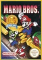 Mario Bros.
 Game & Watch Gallery Australasian logo ("2")
 Game & Watch Gallery 2 Australasian logo ("3")
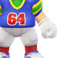 Super Mario Odyssey
 Mario Kart 8
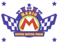 Mario Kart 8


Ad Lib[edit]

Ad Lib is an uneven sans-serif typeface designed by Freeman Craw for the American Type Founders, first released in 1961. It is used for the interface in the following games:
- Luigi's Mansion: Dark Moon
- Luigi's Mansion 3
- Luigi's Mansion 2 HD
- Donkey Kong Bananza (Western and Russian languages and digits in the Japanese version)
It is also used for the text in English versions of the artworks for Helmet and Vermin from Game & Watch Gallery 2, a poster in the Training Gym in Punch-Out!!, the balloon numbers in Cranky's Shop in Donkey Kong Country Returns and its 3DS and Switch ports, as well as the years in the copyright text for Donkey Kong Country: Tropical Freeze and its Switch port, and the Nintendo Sound Clock: Alarmo theme for Donkey Kong Bananza. Image Club's version of the font is used in the logo for WarioWare, Inc.: Mega Party Game$! as well as in the western instruction booklets for Mario Party 4 and 5.
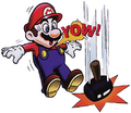 Game & Watch Gallery 2 (Helmet)
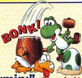 Game & Watch Gallery 2 (Vermin)
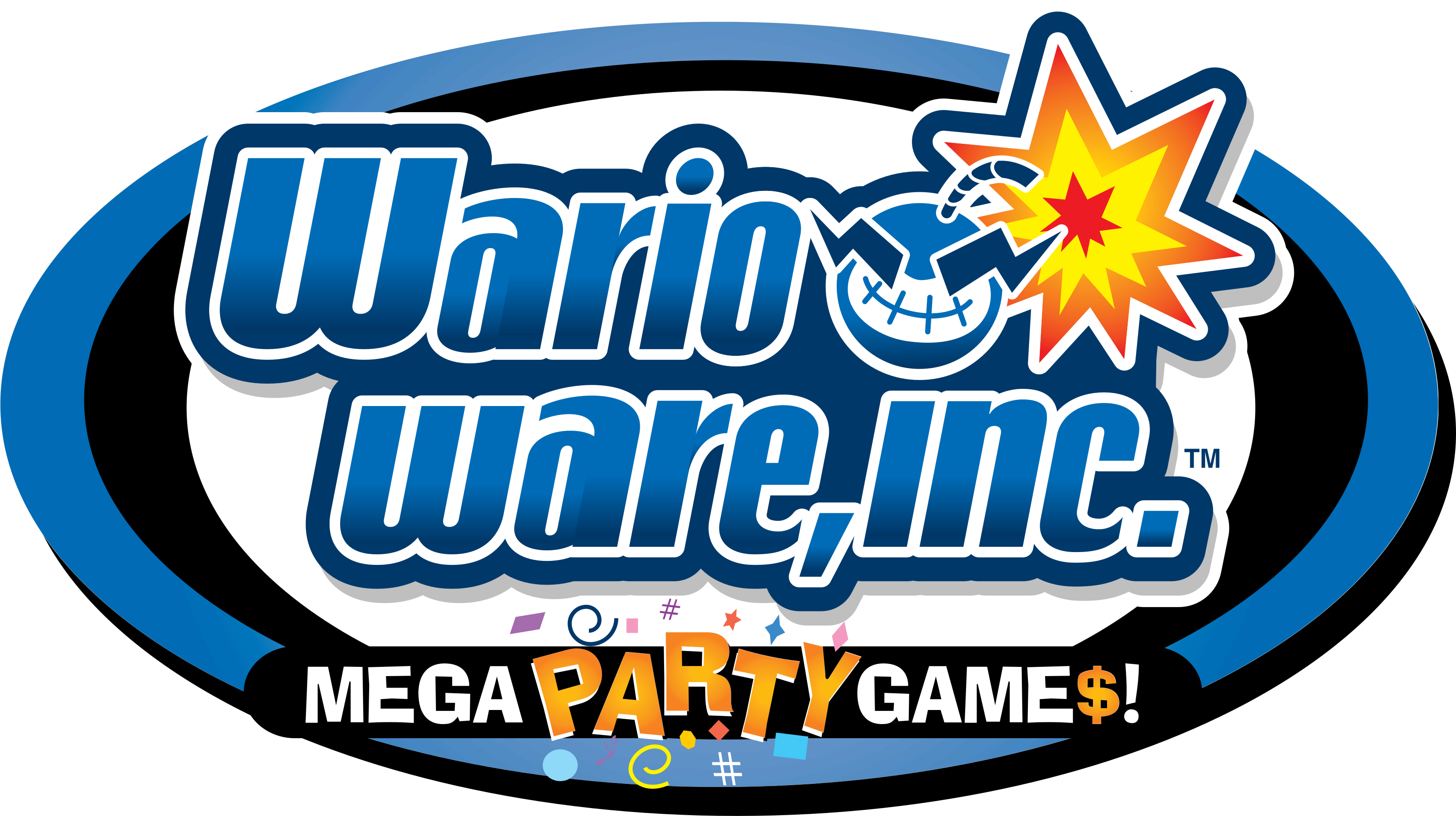 Used for the "MEGA PARTY GAME$!" text
 Used for the "DK Island" and "Emerald Rush" text


Adobe Fairfield LT[edit]

Adobe Fairfield LT is a serif typeface derived from Fairfield designed by Robert Slimbach for Adobe Type and Linotype. It is used for the international logo for Yoshi and the Mysterious Book.
Adobe Garamond[edit]
Adobe Garamond is a serif typeface derived from Garamond designed by Robert Slimbach for Adobe Type, first released in 1989.[2] It is used for the Japanese logo for Donkey Kong Country 2: Diddy's Kong Quest, the English in-game logo for Donkey Kong Country 3: Dixie Kong's Double Trouble!, the European logo for Donkey Kong Land 2, and the pre-release logo for Mario vs. Donkey Kong 2: March of the Minis. In Donkey Kong Country 3: Dixie Kong's Double Trouble!, it is also used for scenery text in Mekanos and Brash's Cabin (with modified numbers). In Donkey Kong Bananza, it is used for the "Donkey Kong Island" text on the Disc covers for the DK Island tracks.
 Donkey Kong Country 3: Dixie Kong's Double Trouble! ("DOUBLE TROUBLE")

ITC Garamond[edit]

ITC Garamond is a serif typeface derived from Garamond designed by Tony Stan for ITC, first released in 1975.[3] It is used for the amiibo cards for Mario Sports Superstars.
Monotype Garamond[edit]
Monotype Garamond is a serif typeface derived from Garamond from Monotype, first released in 1922.[4] It is used for the exclamation point and question mark icons in Wario World.


Adsans[edit]
Adsans is a sans-serif typeface designed by Walter Tracy for Bitstream, first released in 1959.[5] It is used for the interface in the following games:
- Dance Dance Revolution: Mario Mix (European languages; including a rounded version for the save file warning text in those regions)
- WarioWare: D.I.Y. Showcase (European languages)
- Donkey Kong Country Returns (European languages, including numbers in all regions)
- Donkey Kong Country Returns 3D (numbers)
- Donkey Kong Country Returns HD (European languages, including almost all numbers in all regions)
It is also used for copyright text, some button prompt text, the stage filter in the stage select screen, and the "NEWCOMER" text in The Subspace Emissary in Super Smash Bros. Brawl, in addition to various text in the European versions. In Super Mario Odyssey, it is used for street signs and road markings in New Donk City.
 Dance Dance Revolution: Mario Mix
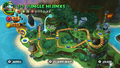 Donkey Kong Country Returns


Agency FB[edit]

Agency FB is a geometric sans-serif typeface designed by David Berlow for the Font Berau, first released between 1990 and 1995.[6] It is used for the logo for the Mario + Rabbids Kingdom Battle Season Pass.
Aki Lines[edit]

Aki Lines is a display typeface designed by Akihiko Seki for ITC, first released around 1973.[7] A modified version is used for the logo for WarioWare: Smooth Moves, with its unmodified variant used in a prerelease logo.
Albertus[edit]
Albertus is a serif typeface designed by Berthold Wolpe for Monotype, first released in 1932.[8] It is used for the logo for Funky's Flights in Donkey Kong Bananza.
Allegro[edit]

Allegro is a serif typeface designed by Hans Bohn for Ludwig & Meyer, first released in 1936. It is used in Mario Kart 8, Mario Kart Tour and Mario Kart 8 Deluxe on the logo for Fuzzy Battery. It is also used for the Banana Bagels sign in Super Mario Odyssey.
Alternate Gothic[edit]
Alternate Gothic is a sans-serif typeface designed by Morris Fuller Benton and Sol Hess for the American Type Founders, first released in 1903.[9] It is used for the North American and European/Australasian logos for Wario Land: Shake It!. It is also used for the A button icon in dialogues for the Adventure Mode in Diddy Kong Racing DS and the "PUSH" text in the Famicom Disk System Card Cleaner. It is also used for the logo for Cranky Records in Donkey Kong Bananza, as well as the text on the Taxi in Super Mario Odyssey and Donkey Kong Bananza.
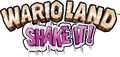 Wario Land: Shake It! ("SHAKE IT!")
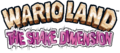 Wario Land: The Shake Dimension ("THE SHAKE DIMENSION")


Amelia[edit]

Amelia is a display typeface created by Stanley Davis circa 1964, later digitized and distributed by Linotype.[10] It is used for the "SECRET ENTRANCE" sign at The Great Tree in the GameCube version of Paper Mario: The Thousand-Year Door.
American Text[edit]

American Text is a blackletter typeface designed by Morris Fuller Benton for the American Type Founders, first released in 1932.[11] It is seen in Mario Kart 8, Mario Kart 8 Deluxe and Mario Kart Tour, where it is featured on the logotype for Tropical Bakery.
American Typewriter[edit]
American Typewriter is a slab-serif typeface designed by Joel Kaden and Tony Stan for ITC, first released in 1974.[12] It is used for the logos for the following games:
- Mario's Picross
- Dr. Mario: Miracle Cure (ITC American Typewriter Pro Bold)
It is also used in Super Mario Odyssey for the logo for Tiny's Proshkis.

 Used for the "Miracle Cure" text


Anito[edit]

Anito (アニト Anito) is a rounded sans-serif typeface designed by Yutaka Satō[13] for Type Labo, first released in 2001.[14] It is used for the interface in Super Mario Maker. The typeface was also used in the tentative logo for that game during E3 2014, then named Mario Maker.
 Tentative logo for Super Mario Maker

Antique Olive[edit]
Antique Olive is a humanist sans-serif typeface designed by Roger Excoffon for the Fonderie Olive, first released between 1962 and 1966.[15] It is used in the logo for Yoshi Touch & Go (albeit with a modified "G" glyph) and Mario Tennis: Ultra Smash. It is also used for description text in the North American Super Mario Advance 4: Super Mario Bros. 3 e-Reader cards.
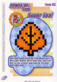 Super Mario Advance 4: Super Mario Bros. 3 e-Reader card
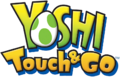 Yoshi Touch & Go logo ("Touch & Go")
 Mario Tennis: Ultra Smash ("ULTRA SMASH")


Aokane[edit]

Aokane (あおかね Aokane) is a rounded sans-serif typeface designed by Yoshiharu Ōsaki for Fontworks, first released in 2015.[16] It is used for the interface in Tetris 99, text in WarioWatch in WarioWare Gold, text in Mona and Penny's stages in WarioWare: Get It Together!, and text in the Pool-Party Panic stage in WarioWare: Move It!. It is also used in the Nintendo Switch remake of Paper Mario: The Thousand-Year Door for the "SECRET ENTRANCE" sign at The Great Tree, replacing Amelia. It was also used for the POW Block text in an early model seen in concept art.
A-OTF Folk Pro[edit]

A-OTF Folk Pro (A-OTF フォーク Pro A - OTF Fōku Pro) is a geometric sans-serif typeface from Morisawa. It is used for the interface in Super Smash Bros. Melee, Yakuman DS, Super Smash Bros. Brawl, and Super Smash Bros. for Nintendo 3DS/Wii U, including the Smash Controller. It is also used for the Capsule Blasters in Dr. Mario: Miracle Cure.
A-OTF Jun Pro[edit]

A-OTF Jun Pro (A-OTF じゅん Pro A - OTF Jun Pro) is a rounded sans-serif typeface from Morisawa. It is used for the difficulty slider in Super Smash Bros. Brawl.
A-OTF Maru Folk Pro[edit]

A-OTF Maru Folk Pro (A-OTF 丸フォーク Pro A - OTF Maru Fōku Pro) is a geometric sans-serif typeface from Morisawa. It is used for the units for the distance in Home-Run Contest in Super Smash Bros. Brawl, and a modified version is used for the "Wi-Fi" text in the Nintendo Wi-Fi Connection button in the game's menu.
A-OTF Shin Go Pro[edit]

A-OTF Shin Go Pro (A-OTF 新ゴ Pro A - OTF Shin Go Pro) is a geometric sans-serif typeface from Morisawa. Its Latin characters are similar to Eurostile. It is used for the interface in Super Smash Bros. Brawl.
A-OTF Shin Maru Go Pro[edit]

A-OTF Shin Maru Go Pro (A-OTF 新丸ゴ Pro A - OTF Shinmarugo Pro) is a rounded sans-serif typeface from Morisawa. It is used for the logo for Home-Run Contest in Super Smash Bros. Brawl.
AR DieYuan[edit]

AR DieYuan (文鼎疊圓體 Wén Dǐng Dié Yuán Tǐ) is a rounded display typeface from Arphic. It is used for display text in the Simplified Chinese version of Dr. Mario 64.
AR Hei[edit]

AR Hei (文鼎黑體 Wén Dǐng Hēitǐ) is a geometric sans-serif typeface for Chinese released by Arphic. It is used for the Random icon in the stage select screen in the Simplified Chinese version of Super Smash Bros. as well as character names in the opening cutscene in the Simplified Chivese version of WarioWare, Inc.: Mega Microgame$!.
AR NewHei[edit]

AR NewHei (文鼎新黑體 Wén Dǐng Hēitǐ) is a geometric sans-serif typeface for Chinese released by Arphic. It is used for course names and the copyright text in the Simplified Chinese version of Mario Kart 64.
AR POP-4[edit]
AR POP-4 (文鼎POP-4 Wén Dǐng POP-4) is a Point of Purchase display typeface from Arphic. It is used for various text in the iQue Player manual for Dr. Mario 64.
Arrus[edit]
Arrus is a serif typeface designed by Richard Lipton for Bitstream, first released in 1991.[17] It is used for the ? mark and text in Frantic Factory and Angry Aztec in Donkey Kong 64.
AR ShuiGuan[edit]
AR ShuiGuan (文鼎酷字集 Wén Dǐng Kù Zì Jí) is an uneven serif typeface for Chinese released by Arphic. It is used for the header in Trial Mode in the Simplified Chinese version of Yoshi's Story, and headers in the iQue Player manual for Mario Kart 64.
AR ShuLinSong[edit]

AR ShuLinSong (文鼎书林宋体 Wén Dǐng Shū Lín Sòngtǐ) is a serif typeface for Simplified Chinese released by Arphic. It is used for the no controller screen in the Simplified Chinese version of Super Smash Bros..
AR UDJingXiHei[edit]
AR UDJingXiHei (文鼎UD晶熙黑體 Wén Dǐng UD Jīng Xī Hēitǐ) is a Universal Design sans-serif typeface from Arphic. Its G30 variant is used for the interface in the Simplified Chinese version of Mario Tennis Aces. Its B5HK variant is used for the interface in the following games:
- Mario Kart 8 Deluxe (player names and some prompts, Traditional Chinese language)
- Mario Tennis Aces (Traditional Chinese language)
- Nintendo Entertainment System – Nintendo Classics (Traditional Chinese language)
- Super Mario Party (player names, Traditional Chinese language)
- Super Smash Bros. Ultimate (Traditional Chinese language)
- New Super Mario Bros. U Deluxe (Bonus Videos, Traditional Chinese language)
- Super Nintendo Entertainment System – Nintendo Classics (Traditional Chinese language)
- Super Mario 3D All-Stars (Traditional Chinese language)
- Nintendo 64 – Nintendo Classics (Traditional Chinese language)
- Mario Strikers: Battle League (player and team names, Traditional Chinese language)
- Game Boy – Nintendo Classics (Traditional Chinese language)
- Game Boy Advance – Nintendo Classics (Traditional Chinese language)
- Mario vs. Donkey Kong (Nintendo Switch) (Traditional Chinese language)
- Luigi's Mansion 2 HD (player names, Traditional Chinese language)
- Nintendo World Championships: NES Edition (Traditional Chinese language)
- Nintendo GameCube – Nintendo Classics (Traditional Chinese language)
- Virtual Boy – Nintendo Classics (Traditional Chinese language)
AR XingKai[edit]

AR XingKai (文鼎行楷 Wén Dǐng Xíngkǎi) is a script typeface from Arphic. It is used for text in the Screen Adjust menu in the Simplified Chinese version of Super Smash Bros.
AR XinYi[edit]
AR XinYi (文鼎新藝體 Wén Dǐngxīn Yì Tǐ) is a geometric sans-serif typeface from Arphic. It is used for the "START" text in the title screen of the Simplified Chinese version of Dr. Mario 64, interface text for modes in the Simplified Chinese version of Mario Kart 64, and display text in the Simplified Chinese version of Paper Mario. It is also used for the logo for Mario Bros. in the Simplified Chinese versions of the Super Mario Advance series, and text in the title screen and Jimmy's stages in the Simplified Chinese versions of WarioWare, Inc.: Mega Microgame$!.
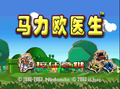 Dr. Mario 64

