MarioWiki:Featured images/Archive 1
| FI archive
|
|---|
Past archived Featured Images nominations.
April 16, 2009: Bosses from Super Mario Galaxy
29-0

Subject: Super Mario Galaxy
Nominated by: Twentytwofiftyseven (talk)
Support
- Twentytwofiftyseven (talk)
- Super Mario Bros. (talk)
- Corka Cola (talk)
- McQueenMario (talk)
- Supermario6449 (talk)
- Luigifreak (talk)
- Mario304 (talk)
- Lu-igi board (talk)
- Hardcore Gamer (talk)
- Elvira Maltina (talk) 06:44, 11 April 2009 (EDT)
- Frostyfireyoshi (talk)
- Paper Yoshi (talk)
- Castle Toad (talk)
- Lewa159 (talk)
- Leirin (talk) - Gorgeous, epic work of art.
- Sonic64 (talk) - Too epic to deny. Just...epic.
- Lightning09 (talk)
- Zafum (talk) - I geuss it's okay.
- Mrsdaisyluigi (talk) - Pure Epic.
- Purple Yoshi (talk)
- The Great Gonzales (talk) - As funny as the one where Bowser is frying Mario's butt is, this one just looks too cool to pass up.
- Stooben Rooben (talk) - The quality is great!
- Dark boo File:Dark Boo TTYD.PNG
- Dark Luigi (talk) - Yeah, the bosses look cool.
- Yoshi Boo 118 (talk) - The artwork is great!
- Guardianboy2 (talk) - I love it, it really shows what Galaxy is all about!
- SonicTheHedgehog (talk) Sweet! Excellent picture. You have my vote!
- Ultratim4 (talk) - Grand picture from a grand game. You have my vote too!
- kingbowser99 (talk) - I think it won...
Oppose
Comments
This picture is high qualtiy.This really desreves to be on the main page!Supermario6449 (talk)
Per Supermario6449Elvira Maltina (talk) 06:44, 11 April 2009 (EDT)
THIS PICTURE IS SO SUPERB, I REALLY WANT IT. IT IS AN INCREDIBLE MONTAGE OF EVERY SINGLE BOSS CHARACTER IN GALAXY, ALL HELD UP BY MARIO'S STAR SPIN. AWESOME,INCREDIBLE,AMAZING. IT DEFINITELY DESERVES TO BE A FEATURED IMAGE. Frostyfireyoshi (talk)
I love this one!!! wow! yes i like it so much because... mmm.... well....i can't even explain it!!! well that image speaks for itself!!! Castle Toad (talk)
This is great!
The preceding unsigned comment was added by Ukauka3 (talk).
April 23, 2009: Copy Mario Bros. from Mario & Luigi: Partners in Time
18-3

Subject: Copy Flower
Nominated by: Son of Suns (talk)
Support
- Son of Suns (talk)
- Ninja Yoshi (talk) I'm seeing double---I mean, multiple!Nice choice.
- luvluv321 (talk)
- Twentytwofiftyseven (talk)
- Super Mario Bros. (talk)
- RAP (talk)
- McQueenMario (talk)
- luigifreak (talk)
- Paper Yoshi (talk)
- Lu-igi board (talk)
- Leirin (talk) - A not often used image. Very cool!
- Webkinz Mania (talk) - Awesome picture.
- FluddFan (talk) Nice! I have to get this game.
- SonicTheHedgehog (talk) Woohoo! The copy flowers never get old!
- Nihaho13 (talk) cool
- Yoshario (talk)
- student (talk) Copy Flower, what will we do without you?
- Pikman01 (talk) Cool Picture. It's items like these I use against Princess Shroob.
Oppose
- Elvira Maltina (talk) 06:44, 11 April 2009 (EDT) - that's not very good, only lots of Marios in a blank background
- Supermario6449 (talk) I agree with Elvira.It's to boring.Just a bunch of Marios.
- Zafum (talk) - Not very interesting.
Comments
This piece of promotional artwork is fun, high-quality, and big! The multiple Mario Brothers make this image really fascinating. =) -- Son of Suns (talk)
- Indeed it is. x3 Tis a good thing I covered that image, by uploading a larger version. XD - RAP (talk)
As I said, that's just a lot of Marios in a blank background, too boring to be in the main space. Elvira Maltina (talk) 06:44, 11 April 2009 (EDT)
- There's more than just Mario, and almost every promotional artwork has a white background. - Nerdy Guy (talk)
April 30, 2009: All Colors Yoshis
10-0

Support
- Tucayo (talk) Great cartoon-like technique
- Castle Toad (talk)
- Lu-igi board 16:13, 16 April 2009 (EDT)
- Webkinz Mania (talk)
- Leirin (talk) - Has a great style. ;)
- Zafum (talk) - If I could only pick one pic out of all of these to support, it would be this one.
- Waluigimaster (talk) - One of my favourite Yoshi Pictures!
- Superstar Daisy (talk)"The next day, all the little Yoshis became a Featured Picture."
- Guy Tim (talk) I can almost sense all the happiness that the Yoshis are having! Very nice pic!
- Alan Warp Zone (talk) The way that Yoshi look is so cute and it give you calm when you see this image so this is an Artwork whorth to be in the main page.
Oppose
Comments
Alan Warp Zone (talk) I saw this first time in a magazine (full page) at mid of 90´s (And I was 3 or 4 them) and still having it, I also played the game (in Advance Generation) and it´s very cute and cheeful.
May 7, 2009: Super Mario Galaxy Rainbow Mario artwork
10-0

Subject: Rainbow Mario
Nominated by: Stooben Rooben (talk)
Support
- Stooben Rooben (talk) - It's a beautifully colored image that's high in quality. Definitely worthy of being on the Main Page!
- Tucayo (talk) - Per Stooby
- Paper Yoshi (talk) - Per St00by. SMG images are great!
- Z3r0 Tw0 (talk) - It's definitely a dazzling, colorful picture. It is more than worthy of being featured!
- Leirin (talk) - Ahh, this picture is marvelous! Beautiful! I love how it reflects so many colors, it's all eye candy.
- Zafum (talk) - Very unique.
- Superstar Daisy (talk) Per all. Cool pic, cool colors, cool everything.
- Ultratim4 (talk) - One of the best pictures from one of the best games.
- Supermario6449 (talk) - Per Stooby.
- Dark boo (talk)- The colors match perfectly against the black background.
Oppose
Comments
May 14, 2009: At the Star Carnival
11-0

- Subject: Mario and his Friends enjoying in the Star Carnival, in Mario Party 8.
- Nominated by: Coincollector (talk)
Support
- Birdoshi (talk) I agree ^__^
- Castle Toad (talk) me too!!!
- Stooben Rooben (talk) -- Amazing quality!
- McQueenMario (talk) Very colorful!
- Webkinz Mania (talk) Features a lot of the characters both new and old
- User:luvluv321
- Leirin (talk) - This is a very detailed picture, with lots of vibrant colors. You have my approval.
- Zafum (talk) - It has a nice feel to it.
- PT PRANA (talk) - Brilliant pic with the main mario cast and good quality... But where's Bullet Bill?
- Timmy Tim (talk) - Good quality, good picture, good colours, just plain good.
- Nihaho13 (talk) - Today I can tell that this is DEFINETLY the next featured image.
Oppose
Comments
This image has a great resolution and perfect size. Moreover it's so vivid, dynamic and it is worth for being nominated... sorry I can't say more, just look. Coincollector (talk)
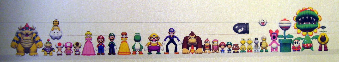
May 21, 2009: Size Chart
12-2

- Subject: Well, it's used in the article "Koopa"...
- Nominated by: Twentytwofiftyseven (talk)
Support
- Twentytwofiftyseven (talk)
- sonictoast (talk)
- Castle Toad (talk)
- wow I've always wanted to see something like that! Lu-igi board
- McQueenMario (talk) - Fully awesome!
- Webkinz Mania (talk) - I never seen anything like this@
- Grandy02 (talk) - A very interesting image, I can bear the tag.
- Thadeu (talk) - Very good.
- Superstar Daisy (talk) Words cannot describe this.
- Zafum (talk) - i'm changing my mind for the third time. I really think that this would be a cool pic to have on the main page.
- ForeverDaisy09 (talk) - Pretty cool. Looks like it's very useful.
- Yoshi Koshi Moshi (talk) - Per ForeverDaisy09. Very useful.
Oppose
- Bloc Partier (talk) - Though it is amazing and I did upload it, it is... um... stolen... from here. Of course, this site got it from an official source, but with the small tag on the bottom it is not very official to have it featured.
- PT PRANA (talk) - At first sight it looks oddly compelling, but it does get pretty boring once you've seen it a couple of times.
Comments
Well, I expect this to be shot down fairly quickly as "boring" or somesuch. Thing is, that isn't why I nominated it. I don't think it's exciting or beautiful, but I think it's informative. This is also sort of a hard image to find elsewhere on the internet. Twentytwofiftyseven (talk)
This is perfect. Though it is looking like the Mario Galaxy picture is gonna win, this is still perfect. This Wiki is about everything Mario, this picture represents the main cast in proportion to each other, giving us those little details no one else knew existed. Plus this picture is a rare find, thus showing the kind of mystical treasures this site has to offer. sonictoast (talk)
Woah!!! This is just PERFECT??? and i've no idea this could be possible to exist!!! it's the comparison of heights it's amazing Castle Toad (talk)
Would this be preferable? I don't see what's wrong with the tag, anyway. It's a caption, not a logo. Twentytwofiftyseven (talk)
It's a caption, yes. But it's a caption original to the image on that site, showing it's stolen. I still love the image though. :3 Bloc Partier (talk)
May 28, 2009: Mario Kart: Double Dash!! characters
10-3

- Subject: Mixed Mario Kart: Double Dash!! teams racing on Luigi Circuit.
- Nominated by: Mario304 (talk)
Support
- Mario304 (talk)
- great picture :) Lu-igi board 09:50, 16 April 2009 (EDT)
- Webkinz Mania (talk) Features a lot of the characters seen in Mario Kart: Double Dash.
- Leirin (talk) - This picture has great depth and nice character interaction.
- PT PRANA (talk) - You can't complain about anything to do with Mario Kart, can you? Great pic!
- Alan Warp Zone (talk) - This one is very great also it has some brillant colors and it makes me to have some memories about this game, also the way that the caracters use items here it makes see they cool!!!
- Nihaho13 (talk) - W00T!
- Timmy Tim (talk) - This picture has it all; colour, familiar characters, good quality, a good scene. Need I say more.
- Yoshi Koshi Moshi (talk) - This picture reminds me of the good old Gamecube times.
- ForeverDaisy09 (talk) Shows off characters really well.
Oppose
- Zafum (talk) - I have finally figured out why I don't like this pic. It just seems to have way to much action in it.
- Dark boo (talk) Really blurrey in the back.
- not that good Lu-igi board 13:10, 28 May 2009 (EDT)
Comments
June 4, 2009: Around the Shake Dimension in 40 levels
10-2

Subject: Wario at the Shake Dimension (with more Wario's exploring this dimension) in Wario Land: Shake It!
Nominated by: Arend (talk)
Support
- Arend (talk) Great style, many sights of the game and the world self.
- McQueenMario (talk)
- good pic Lu-igi board 11:48, 2 May 2009 (EDT)
- Grandy02 (talk) Full of detail and great style.
- Dark boo (talk) great qualitey.
- Nihaho13 (talk) It is AWSOME!!!
- Tucayo (talk) Great i like it, its interesting
- Yoshi Koshi Moshi (talk) Per Ninhalo13 and Dark Boo.
- Leirin (talk) - I really like the wispy clouds surrounding the busy world, a very interesting and imaginitive picture =)
- Timmy Tim (talk) - Good quality image with good settings.
Oppose
- Zafum (talk) - I just don't like this picture.
- sonictoast (talk) - This would be better for the Super Wario Wiki.
Comments
No offense, but is Zafum's vote valid? It's like unfeaturing King K. Rool because "some people" could be "startled" when seeing a Donkey Kong character as the featured article... --Grandy02 17:22, 7 May 2009 (EDT)
- Well, you're not forced to add a reason when voting, so it's valid. But I agree that Zafum's reason doesn't make much sense. Time Q (talk)
- Agree. Zafum said on the SSBB picture (who seems to be uploaded by me) that he saw it too much, while he didn't said newlings get startled because they see Link, Pit, pikachu, Pokémon Trainer, etc. on it. Glad he edited his vote. Arend (talk)
June 11, 2009: bowsers army
10-0

- Subject: Bowser and his Goomba army
- Nominated by: Lu-igi board (talk)
Support
- great picture :) Lu-igi board
- Tucayo (talk) Looks nice :)
- Castle Toad (talk) i like it!
- PT PRANA (talk) Finally! A good choice of pic, Lu-igi board. (love the goombas!)
- Alan Warp Zone (talk) good one I´m M&L RPG Fan so I undestand & Goombas Attack!!! (Yes I use 3 !!! cause this game)
- Timmy Tim (talk) per PT PRANA.
- babymario12 (talk) EVIL GOOMBA!!! RUN!!! (aka, i like it)
- iggykoopa (talk)Agree nice pic
- Nihaho13 (talk) - :D teh game wil be AWSOME!!!
- Zafum (talk) - Now that it's changed to normal, ill support.
Oppose
Comments
hold up, have I gone mad, or has someone changed the picture to a slightly different one? Lu-igi board 11:32, 9 June 2009 (EDT)
- Ill revert it Tucayo (talk)
- It is the same artwork, the difference is that it is higher resolution, it hasn't the background from the Japanese website and the flames are not cut. For the some reason, the colors of the smaller version are much paler than on the website. Grandy02 (talk)
June 18, 2009: Fire Mario
12-3

- Subject: Fire Mario
- Nominated by: Dark boo (talk)
Support
- Dark boo (talk)
- goes well with the black bakground Lu-igi board 11:57, 5 May 2009 (EDT)
- Castle Toad (talk)
- Alan Warp Zone (talk) Cool it´s a classic, same pose for the NSMB, but seen from front.
- Nihaho13 (talk) ...cool...
- Tucayo (talk) Looks nice and interesting
- Dark Bowser (talk) Very nice quality! I like it!
- babymario12 (talk) i just love the fire, and the feriocity of the way he's throwing the fireball. great capture of action in motion
- Timmy Tim (talk) Simply lovely
- Dry Luigi (talk) Best yet!
- Paper Yoshi (talk) Good image.
- Pixlfreak (talk) I love it so much!!! FIRE MARIO!!!
Oppose
- Zafum (talk) - Nice quality, but only a single Fire Mario is not very interesting.
- Waluigimaster (talk) - It looks very cool, but I see it alot and there is just one thing in the picture.
- SuperbowserX (talk) - My opinion matches both Waluigimaster's and Zafum. Single isn't interesting. Extra fact, it's kinda boring. No offense.
Comments
I could actually vote for this.......well, but there's no image!!! what's wrong? huh? Castle Toad (Talk)
could someone help me get the image up Dark boo (talk)
I think i got it Dark boo (talk)
June 25, 2009: Kingdoms Collide
11-0

- Subject: the main characters of Mario & Luigi
- Nominated by: Lu-igi board (talk)
Support
- great picture :) Lu-igi board
- Leirin - This is one of my favorite Mario artworks. It really has lots of feeling in it. The coloring style is really nice and looks watercolor-ish.
- Zafum (talk) - I have to admit that this pic looks quit good, and has an extremely nice quality.
- Time Q (talk): This is great.
- Alan Warp Zone (talk) Um... this game was cool and this artwork makes the sense of this game, like said before by Leirin the colors & tecnique does this looking better.
- Nihaho13 (talk) - :D teh game wuz AWZUME!!!
- babymario12 (talk) I like it, i really really like it
- Pixlfreak (talk) I love this game!!!
- Phoenix Rider (talk) Quite beautifully captures the major characters of the game and has a nice epic feel.
- Superstar Daisy (talk) Yay.
- YellowYoshi127 (talk) Yoshi! Love the watercolour.
Oppose
Comments
July 2, 2009: New Super Mario Bros. Group Picture
13-3

Support
- Mario304 (talk)
- I've always had a soft spot for this scene :PLu-igi board (talk)
- Timmy Tim (talk) I don't actually mind this, very generic and typicaly Mario.
- Catloverjohn (talk) I guess old meets new in this scene. =^..^=
- Yellowyoshi127 (talk) Yoshi! This is a nice image and very scenic
- I think this is one of the best images yet! And it,s of one of my favorite games.-Dry dry bones
- Karinmij (talk) Cool picture :)
- Paper Yoshi (talk) Although it's from NSMB, this image shows something from NSMBWii: Mario and Luigi going through a level together. BTW, this is a good picture.
- Baby Mario Bloops (talk) It is a great picture representing mario. I agree with this more than oppose. The only problem I have about this picture is too many things posing, but that is a minor problem, so I think it is great.
- Phoenix Rider (talk) Much better. A good shot, it illustrates concepts and looks very fun.
- Pixlfreak (talk) i luv it
- McQueenMario (talk) Such a fun scene!
- Super Mario Bros. (talk) Now that I look at it, it is better quality than what I originally saw in it. Also, per Paper Yoshi.
Oppose
- Zafum (talk) - It just has too much of a linear look to it.
- Luigifreak (talk) Am I the only one that thinks this pic has a bad quality? Too fuzzy, and this pic has to be really big to look good.
- Zero777 (talk) I am Zero! Poor quality, long-look to it, and too small, besides that I may reconsider. Zero signing out.
Comments
July 9, 2009: Shadow Mario Attack
11-0

- Subject: Mario and chums running from Shadow mario's attack in Super Mario Sunshine
- Nominated by: YellowYoshi127 (talk)
Support
- YellowYoshi127 (talk) Yoshi! I think this image is really nice to look at and has nice quality.
- Pixlfreak (talk) I am all for it! i think it's a great pic
- <HYPERVENTILATES> I've always wanted to see something like this!!!!Lu-igi board
- Timmy Tim (talk) I was going to upload this instead of my other SMS picture, good job.
- Super Mario Bros. (talk) Wonderful! It is good quality, good lighting, and it's not box-art!
- Zafum (talk) - I have nothing against it, but I really have nothing for it either. I'll support anyway.
- Zero777 (talk) I am Zero! Great quality, brilliant color scheme, and good designs, but I suggest to enlarge it slightly. Zero signing out.
- Castle Toad (talk) Look how scared is Toadsworth! hehe i like this one
- Platitudinous (talk) I am Platitudinous, the longest word in the worldiverse! I like Peach's hair. Ciao!
- Marioguy1 (talk) Characters are well-placed throughout the image though they are not easily seen,
- YourBuddyBill (talk)though it should be enlarged
Oppose
Comments
Yoshi! I think this picture looks better when enlarged. YellowYoshi127 (talk)
that's right Mario laugh in the face of danger....Lu-igi board 03:46, 4 July 2009 (EDT)
Yoshi! I would BuddyBill but it has to be thumbnails on this page. YellowYoshi127 (talk) (P.S clicking on it works just as well)
July 16, 2009: Gelato Beach
10-0

Support
- Timmy Tim (talk) This image has better quality than my M&S picture.
- Super Mario Bros. (talk) Good! This picture is nice.
- wow it's so colourful......Lu-igi board (talk) 11:12, 28 June 2009 (EDT) p.s, I'm sure this appears after the SMS credits, so is'nt really promo art...
- YellowYoshi127 (talk) Yoshi! Its nice to see Mario chillaxing for once..
- Pixlfreak (talk) I agree, Mario never gets to relax
- Zafum (talk) - Though it doesn't have the highest quality, it's still a good picture.
- Zero777 (talk) I am Zero! This picture will be a good idea to be in the main page, but make it bigger. Zero signing out
- BoygeyDude (talk)
- Platitudinous (talk) I am Platitudinous, the awesomest word in the worldiverse! A beautifully illustrated work of art. Ciao!
- Dry Luigi (talk) Shows a different side of Mario.
Oppose
Comments
Platitudinous (talk) I am Platitudinous, the awesomest word in the worldiverse! It's actually the pic you see at the end of the game. However, if you collect all 120 Shine Sprites, it shows... I'm not gonna tell. Ciao!
Platitudinous (talk) This would also be good for a postcard.
Marioguy1 (talk) FYI Platitudinous, the longest word on earth is Pneumonoultramicroscopicsilicovolcanoconiosis, look it up, anyhow, it is way too crowded for my liking, everybody is in one spot and I can only make out Mario.
YellowYoshi127 (talk) Yoshi! Erm... no he didn't Marioguy1, he commented like you, if you want to oppose then sign in the oppose box.
YourBuddyBill (talk)Although it is good, Marioguy1 is right, its pretty crowded.
Marioguy1 (talk) Yellowyoshi, I didn't want to vote because I can't decide, I will eventually...
Marioguy1 (talk) - Platitudinous, that's not fair, my word beat yours, you can't just change it :(
Platitudinous (talk) I made a mistake, okay? I like the word pneumonoultramicroscopicsilicovolcanoconiosis anyway. Did you notice Peach's hair is like this in MKDS?
Marioguy1 (talk) - I'm sorry, I didn't know I was making you angry :( And I did not notice that, good find!
Platitudinous (talk) I wasn't mad.
July 23, 2009: Yoshi and Co
14-1

Support
- Timmy Tim (talk) This image is similar to the boxart, but it's bigger and shows more.
- Time Q (talk): Very interesting image, especially if you only know the section used as the boxart. Nice quality also.
- YellowYoshi127 (talk) Yoshi! Despite this being extended box-art, i really like this pic
- Castle Toad (talk) per Time Q, Baby time! i think this is a good election, and quite funny... in a strange way... i think
- Zero777 (talk) I am Zero! Great picture, but enlarge it slightly. Zero signing out.
- Super Mario Bros. (talk) Good.
- Baby Mario Bloops (talk) I agree, it shows a lot about the games good side. You can't say no to babies....unless you cold hearted.
- Per all Marioguy1 (talk)
- Pixlfreak (talk) BABIES!!! (i luv em as much as pixls)
- YourBuddyBill (talk)per all
- Hrothgar (talk) A nice chaotic picture.
- McQueenMario (talk) Very cute! I love this game!
- Booman (talk) Very nice image,but it would be better if it was bigger.
- Yoshi Koshi Moshi Bright, colorful and CUTE;)!
Oppose
- just doesn't appeal to me.... Lu-igi board (talk) 03:49, 4 July 2009 (EDT)
Comments
Platitudinous (talk) I am Platitudinous, the awesomest word in the worldiverse! What would Baby Waluigi look like? Ciao!
- Like this. Super Mario Bros. (talk)
Hey Super Mario Bros., I was tempted to nominate that Baby Waluigi pic. Timmy Tim (talk)
- No joke nominations Marioguy1 (talk)
- Although I agree with Marioguy1, I think the nomination would have been hilarious and I would have voted for it. Super Mario Bros. (talk) 12:47, 10 July 2009 (EDT)
July 30, 2009: Luigi being attacked by ghosts
15-0

- Subject: Luigi being chased by Ghosts
- Nominated by: Lu-igi board (talk)
Support
- Lu-igi board (talk) this was nominated before but lost for being to small. I decided I would give the image a fair chance.
- Super Mario Bros. (talk) I uploaded a new version, and... Ta-da! The black bars are gone!
- Platitudinous (talk) I am Platitudinous, the awesomest word in the worldiverse! I agree with you, Super Mario Bros. This is a great image as well and it's funny to see Luigi get attacked by ghosts. Or Grodus. Or Goombas. You get the point, right? Ciao!
- Timmy Tim (talk) per all.
- Zero777 (talk) I am Zero! Alright, I will support, I can really see this picture in the main page. Zero signing out.
- YourBuddyBill (talk)per all
- Karinmij (talk) Nice pic. Makes me curious about this game (have never played it).
- yay! god (talk)
- Booman (talk) Awesome Game,Awesome Image, and Awesome Boos.
- Hrothgar (talk) Since those black bars are gone now, I'll support.
- Marioguy1 (talk) - I no longer see bars.
- McQueenMario (talk) - How could ANYONE oppose this!
- Baby Mario Bloops (talk) It shows the great, enjoyable, best sides of the game. The image is also very funny since Luigi's worst fears are ghost, so it makes it even more better.
- YellowYoshi127 (talk) Yoshi! Great and enjoyabale.
- Nihaho13 (talk)
Oppose
Comments
I am Zero! Well, if you can get a clearer image, then I'll support it. Zero signing out. Zero777 (talk)
- Hey Zero, when you enlarge this pic, it looks a whole lot clearer. You should support. Timmy Tim (talk)
I am Zero! Alright then, I'll support. Zero signing out. Zero777 (talk)
um... God? have you literally wrote in a number 8? I'll change it 4 u. Lu-igi board
um.... those black bars are still there... as far as I know they never left. Lu-igi board 03:13, 18 July 2009 (EDT)
- Try looking at it now. Super Mario Bros. (talk)
there we go! Lu-igi board 12:47, 21 July 2009 (EDT)
August 6, 2009: Strikers Charged Scene
18-2

- Subject: A scene from Mario Strikers Charged
- Nominated by: McQueenMario (talk)
Support
- McQueenMario (talk) - VERY epic scene!
- Time Q (talk): Looks great and has fantastic quality.
- Platitudinous (talk) THIS IS THE BEST IMAGE IN THE HISTORY OF MARIO!!!
- Zero777 (talk) I am Zero! Yes, very great, but this is a box-art in the european version, but this should still be allowed. Zero signing out.
- Baby Mario Bloops (talk) Platitudinous, I don't think awesome can sum it up. I don't think any word can. It shows the epic battle in that match, showing the tension on the characters. It's Absolutely Amazing!!!
- Marioguy1 (talk) - Now this is super mario strikers! I'm fighting with myself to change my vote in the other one now that I've seen what SMS can really be...
- Timmy Tim (talk) Per all.
- Karinmij (talk) Nice!!
- Super Mario Bros. (talk) Epic win.
- General bob-omb (talk)Awsome!
- Dark Lakitu 789 (talk) Per all
- Lu-igi board (talk) box-art! and yet great... :P
- Booman (talk) Per all.
- YellowYoshi127 (talk) Yoshi! I was going to upload this image but decided against it as I thought people wouldn't like it because its box-art. Glad to see they aren't as this picture is AMAZING!!!
- Nihaho13 (talk) ...wow...
- D.R.02 It's so action-packed! Now I'm sad that isn't box art for the US game.
- Dark boo (talk) Do I even have to say anything? P.S Pokemoneinstein if you like this image so much why are you stopping it from becoming a featured image?
- Paper Yoshi (talk) EPIC. JUST EPIC.
Oppose
- Pokémoneinstein (talk): No way. This picture is TOO good for the front page. Forget Featured, this deserves the title of "Godliest Mario Image, Ever, Ever."
- GalacticPetey (talk) GARGLE HARGLE BARGLE! translation- It is just strikers artwork!
Comments
McQueenMario (talk) - Before you oppose, remember that this is not the official boxart for everyone.
Yoshi Koshi Moshi (talk) I still don't know if should I support or oppose this picture. It's scary... (a bit)
Uhm, Pokémoneinstein, are you kidding? Your vote doesn't make sense at all. Time Q (talk)
- pokemoneintein's vote should be deleted. it is clearly a joke. Lu-igi board 12:09, 23 July 2009 (EDT)
- Is that allowed? You are not required to leave a comment in your vote, although this is a good candidate for deletion, we have allowed votes with terrible reasons in the past. Super Mario Bros. (talk)
- Marioguy1, thanks for the advice on my talk page, but I'm actually not joking at all. I really do think this picture deserves a better title than "Featured Image" Pokémoneinstein (talk)
- Pokémoneinstein, thanks for your comment above but your vote probably won't make much of a difference. I really think that Featured Image is the best title on the wiki! Marioguy1 (talk)
- Pokémoneinstein, come on, we simply don't have any "better" category than Featured Image. It's better to make it "only" a featured image than nothing, hm? Time Q (talk) (Actually, your vote does make a difference. Hadn't you opposed, the image would be featured this week.)
I guess I will make the amount of votes that it takes to remove a vote... Since it's not recognized in the rules right now, I will unofficially make it five votes. If nobody removes that section, then it will be five. Super Mario Bros. (talk) 21:10, 23 July 2009 (EDT)
August 13, 2009: Mario Party DS Group Picture
23-10

- Subject: Mario Party DS Characters Avoiding Bowser
- Nominated by: Castle Toad (talk)
Support
- Castle Toad (talk)
- Tucayo (talk) - Looks nice
- Ultratim4 (talk) - Lovely and colourful. You can see just how petrified Mario is of Bowser!
- PT PRANA (talk) - Fun pic. Nice choice, Castle Toad!
- Superstar Daisy (talk) You're awesome. And so is this pic.
- Yoshi Koshi Moshi (talk) Cheerful action. It MUST be featured.
- Baby Mario Bloops (talk) No doubt it should be featured. Yoshi is very funny also.
- babymario12 (talk) it is a prefect way to through the elements of a game together, havent seen better work in some time now
- Pixlfreak (talk) haha! Look at Luigi!! he's scared out of his wits!!
- Paper Yoshi (talk)
- This is a good Mario character picture.It would look good even if it wasn't a Mario Party picture!-Dry dry bones (talk)
- Phoenix Rider (talk) Although it is the MPDS boxart, I think it's a good picture. It's a bit busy though.
- YellowYoshi127 (talk) Yoshi! Its a cool picture, but people dislike the crowdedness.
- Zero777 (talk) I am Zero! Yes, I can really see this in the main page, with a comment saying "An artwork of Mario Party DS showing a few of the characters in the game", or something like that. Zero signing out.
- Mariogirl711 (talk) Per Pixlfreak. He is scared out of his wits! LOL!
- Booman (talk)I'll Support,and it makes me want to play this game.
- Toadster_04 (talk) Very detailed picture, with all the characters! Very nice image.
- the game isfun
The preceding unsigned comment was added by Baby dk (talk). - McQueenMario (talk) Lets just feature this already!
- GalacticPetey (talk) Gargle Hargle Bargle! Translation- awesome quality and I wish Petey was in this game as playable.
- thats cool
The preceding unsigned comment was added by Ebu 12 (talk). - ForeverDaisy09 (talk) I like it, clear quality.
- Koopa123 (talk) I love it, Yoshi looks funny!!
Oppose
- Zafum (talk) - It's far too crowded, and the wall in back looks stupid. By the way, saying you don't know why you dislike this picture is no different than saying "looks nice!".
- Webkinz Mania (talk) I agree!
- me too Lu-igi board (talk) 13:33, 17 May 2009 (EDT)
- Nihaho13 (talk) me, uh...3?
- SuperbowserX (talk) It's Mario Party DS's boxart without the title or DS info. 2nd of all, IN MY OPINION, it's kinda boring.
- Super Mario Bros. (talk) Although the image appeals to me, I think we should not feature box art, at least do box art of a classic, or of an older game (perhaps in the future, when Mario Party DS is as old as, let's say, Super Mario 64}.
- Marioguy1 (talk)Daisy is almost nonexistant in the image.
- Hrothgar (talk) I agree with Super Mario Bros. It's a good picture, but it's box art. Also, I didn't even notice Daisy until now.
- DaisyRox02 (talk) Per all, You're right. You'd hardly see her until you level-up the page.
- lpsc00l (talk) I own this game... it's awesome!! The picture is nice but... you hardly see Daisy and I hate pictures that make Luigi look like a coward!!!
Comments
Since i found this Scene so Music-themed i had to Nominate it, Hope you like it Castle Toad (talk)
I believe that if Zafum doesnt know why he dislikes the picture, his vote should be erased Tucayo (talk) That's stupid
- No, because you're not even forced to add a reason. You can just vote without putting any reason, and just as well you can say that you don't know why you dislike a picture. Time Q (talk)
- Look, i'm not expecting that the images i nominate win, to be honest, i don't care, but seriously, i see just stupid things like "i dunno why i just don't like it", but whatever... Castle Toad (talk)
- Zafum (talk) I think Tucayo's vote should be erased, because he doesn't know why he likes his picture, he just says looks nice. LOL, you don't need a reason to vote, you just need to know if you like the picture or not. Don't go blaming me just because I didn't have a reason this time.
Excuse Mr Oppose-it-all, but saying looks nice is way different than dont knowing why you dont like it. Looks nice means i LIKE the picture because its NICE. And how can you dislike a picture for reasons you dont even know Tucayo (talk)
- Both of you calm down please, okay? Nobody is forced to add any reason when voting to support or oppose an image. If you like a picture, feel free to support it; if you don't like it, feel free to oppose it. In neither case you have to give reasons for your vote. No need to get upset about this. Time Q (talk)
- I think we should include a notice saying that you don't have to put a reason for the vote (or a good reason at that, anyway), to avoid confusion in the future. Super Mario Bros. (talk)
August 20, 2009: DK Mountain race scene
13-3

- Subject: Default teams racing on DK Mountain from Mario Kart: Double Dash!!
- Nominated by: GalacticPetey (talk)
Support
- GalacticPetey (talk) I nominated this because it looks so epic!
- YellowYoshi127 (talk) Yoshi! Amazing! Fun to look at as well.
- Lu-igi board (talk) one word: WOW
- Booman (talk)It is a very good picture.
- Zero777 (talk) I am Zero! Hmmm, blurry, but that's the whole point of it, I'll support. Zero signing out.
- Marioguy1 (talk) - I love the violence. In Mario Kart games, my favorite part is the ramming!
- Timmy Tim (talk) I was wondering when someone would put this up.
- Hrothgar (talk) Never seen this picture before! This looks great!
- Baby Mario Bloops (talk) It is a great picture! It shows the intensity of the racing. Also, it has my favorite character in it, so what not to like.
- P. Trainer (talk) Per all.
- 4DJONG (talk) YOSHI! Epic race pic, blurry but adds to the race feel!!!!
- Pixlfreak (talk) I LOVE EPICNESS!!!
- lpsc00l (talk) Wow!! It amazing!! every on eis visable! Even Daisy and Peach!!I love the blurry line that make it look like they are speeding down The mountain!! this picture HAS to be nominated!
Oppose
- Nihaho13 (talk) The speed makes it look blury
- McQueenMario (talk) Looks weird with characters going the wrong way.
- Zafum (talk) - It has too many blurry effects.
Comments
Why are some characters going the wrong direction? Lu-igi board 09:44, 9 August 2009 (EDT)
- What ? They are going in the right one. 04:09, 10 August 2009 (EDT)
Mario and Luigi are heading in the wrong direction. But who cares? It's still an awesome picture. Hrothgar (talk)
- No they're not, but it looks like the babies are 'cos they're being fired out of the cannon. Timmy Tim (talk)
Sorry. From the angle I was looking at it seemed like Mario and Luigi were going the wrong way. Hrothgar (talk)
August 27, 2009: Star World
14-4

Support
- Nihaho13 (talk) - It may not win, but I like it. It shows the beauty of the yoshi rainbow and the Star World. Besides, It's one of the only two SMW artwork pics that has Mario SMILEING.
- Time Q (talk): I admit I'm a bit biased when it comes to such old games, and especially the fantastic Super Mario World. The picture's not perfect, but definitely good enough for me to support.
- Booman (talk) I think it's awesome.
- Timmy Tim (talk) Brilliant.
- Baby Mario Bloops (talk) The artwork is very great to tell the truth. Also, it's pretty funny. I like it!
- Karinmij (talk) I find this one funny.
- Marioguy1 (talk) - Represents the different power-ups of Super Mario World quite nicely.
- ForeverDaisy09 (talk) Very unseen and interesting.
- Koopalmier (talk) Per ForeverDaisy09. Plus it's rather beautiful.
- Tucayo (talk) Awesome art!
- Hrothgar (talk) I remember this picture from that Mario Mania book. I've loved ever since I've seen it there.
- Vini64 (talk) Blue Yoshi, Red Yoshi and Yellow Yoshi :D!
- Lemmy Koopa Fan (talk) Meh, It's good enough to get my vote.
- Superstar Daisy (talk) I love it!
Oppose
- what the hell is this???!!!! it's terrible! Lu-igi board 04:25, 1 August 2009 (EDT)
- McQueenMario (talk) - Not that great.
- DaisyRox02 (talk) Not a chance. This isn't good at all.
- Zero777 (talk) I am Zero! The image looks too outdated and it looks like it came from a mario comic. Zero signing out.
Comments
Yoshi! Its not really that good but it is a classic and i do like SMW...YellowYoshi127 (talk)
GalacticPetey (talk)Gargle Hargle Bargle! translation- the Baby Yoshis look cool but the adult Yoshi somewhat scares me.
Nihaho13 (talk) - Ouch! Now I feel how the people who work on the Featured Images feel when people oppose. At least this made it through another week...I'm suprised!